Loading portfolio

Case Study

  • Identity
  • Art/Creative Direction
  • Packaging

Bare. Earth

© 2026

Body Care

London, UK
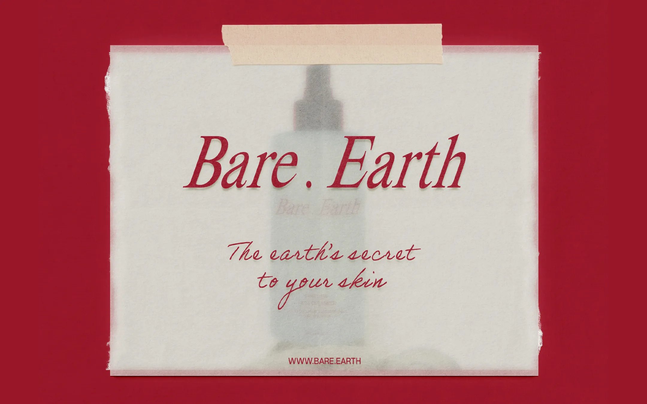
Bare . Earth hero image

The connection between earth and skin became the starting point for an identity that could make natural care feel more tactile and distinctive.
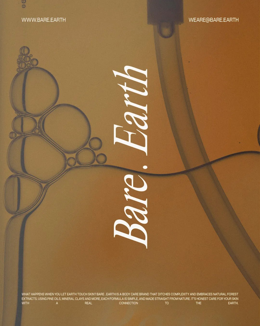
About Bare. Earth

The Challenge

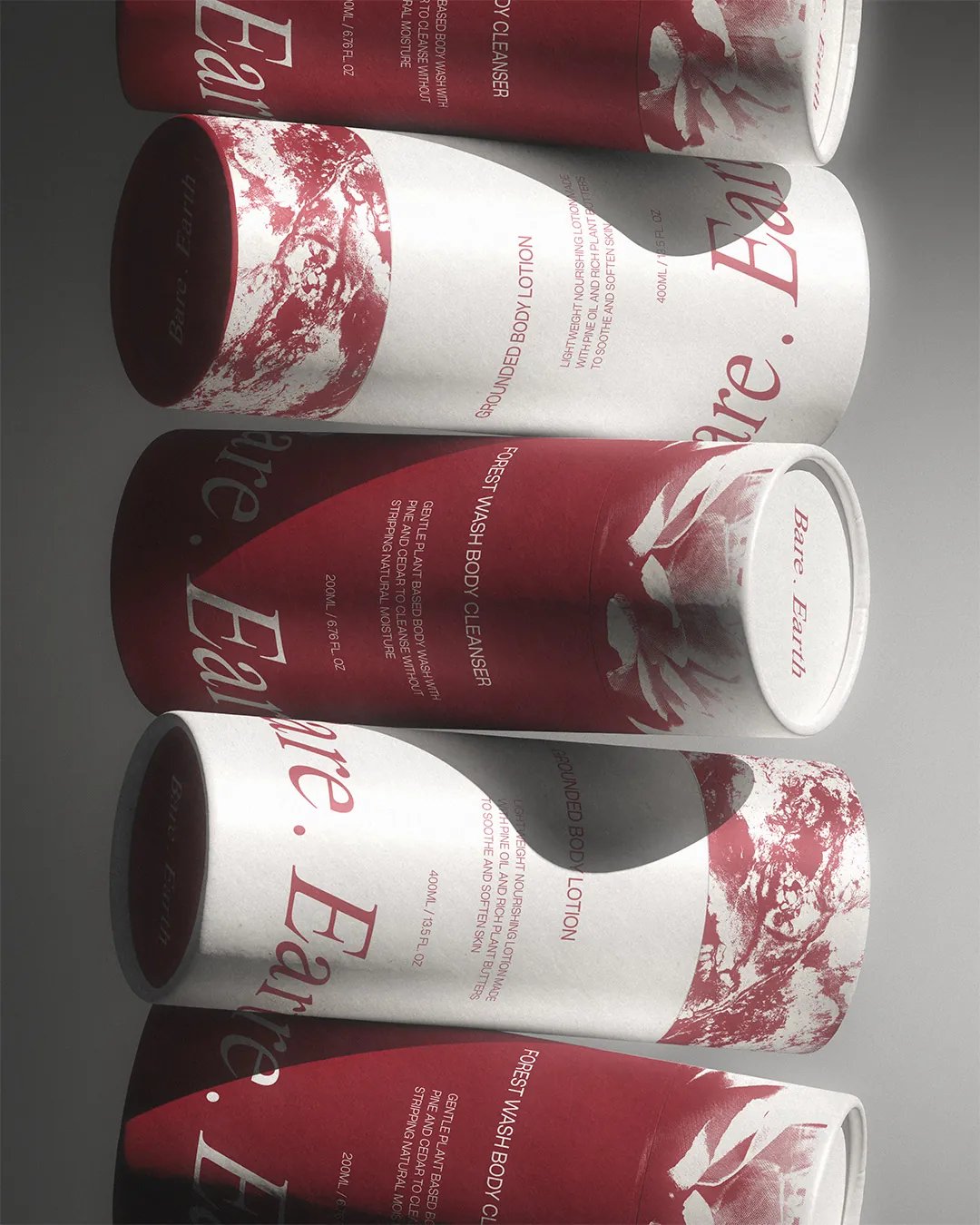
Natural body care often relies on green palettes and botanical imagery. Bare. Earth needed a different expression of nature, one that felt closer to the ingredients while giving the range enough character to stand apart within a crowded category.

The Approach

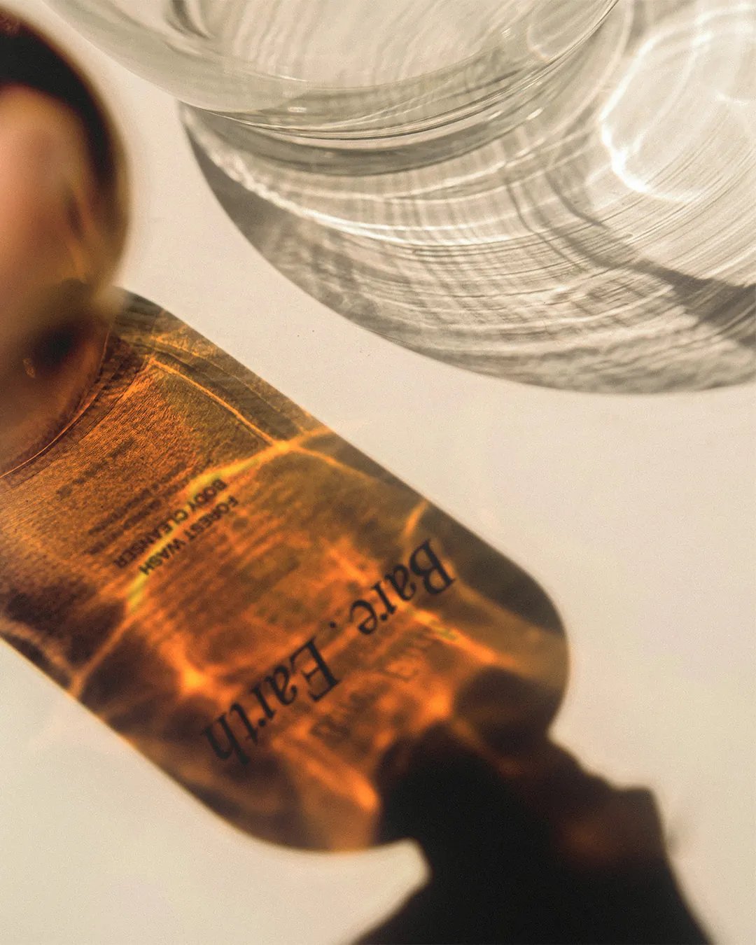
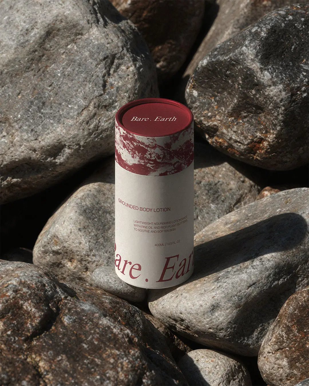
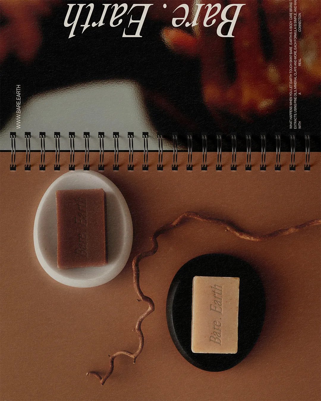
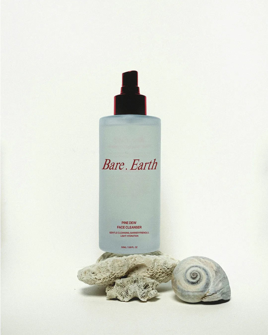
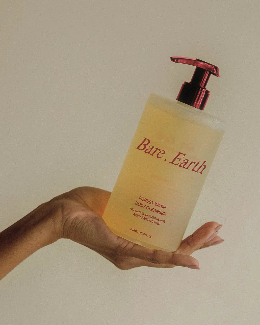
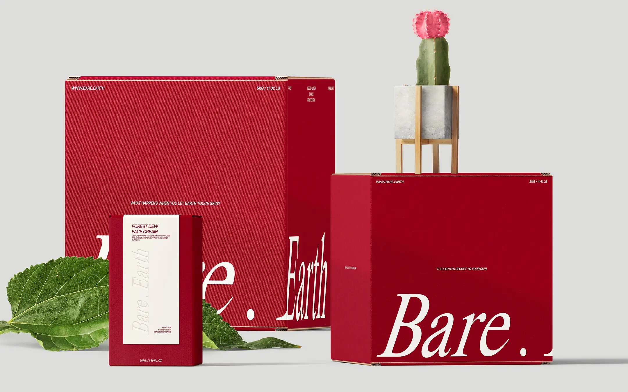
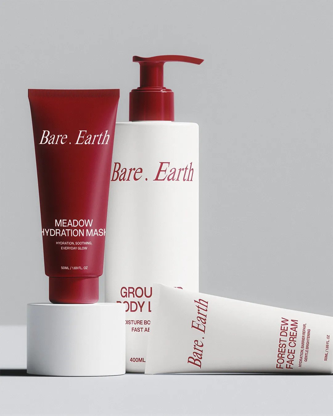
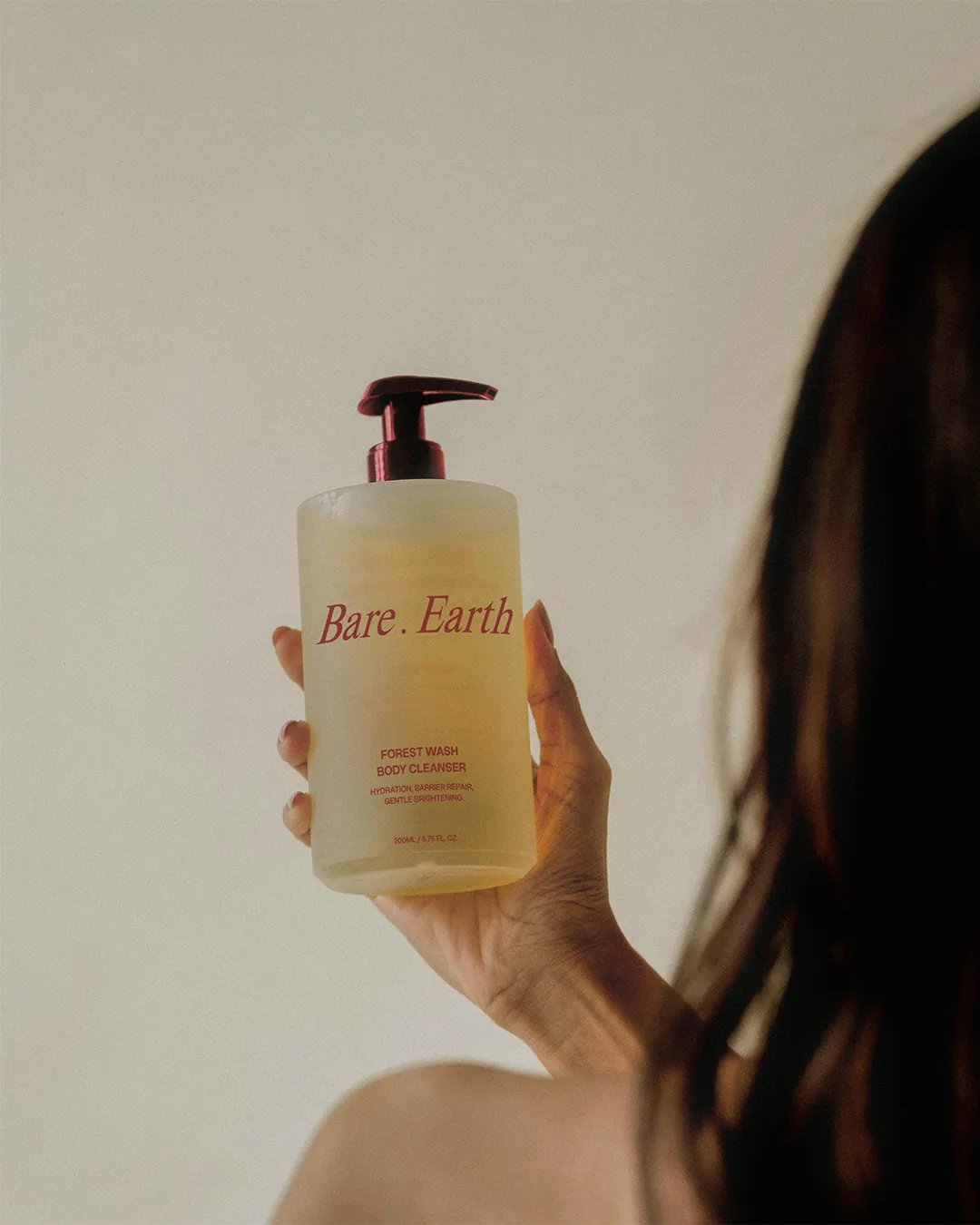
The first uppercase sans-serif wordmark felt too familiar, so the direction shifted towards a serif with a slight tilt. Burgundy and off-white moved the palette away from expected botanical greens, while close-up imagery of stone and water introduced texture. Product names draw on natural references, and the label hierarchy keeps each formula easy to navigate across the range.

The Outcome

The concept brings the range together through a consistent label structure and a more tactile visual language. Each product keeps its own identity while the wider system holds the collection together.

Client

Self-initiated

Bare . Earth Poster
Bare . Earth Bottle Packaging
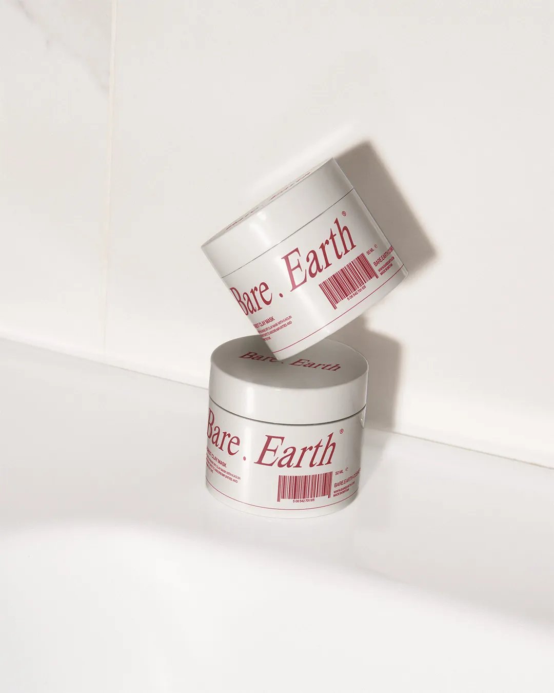
Bare . Earth Clay Mask
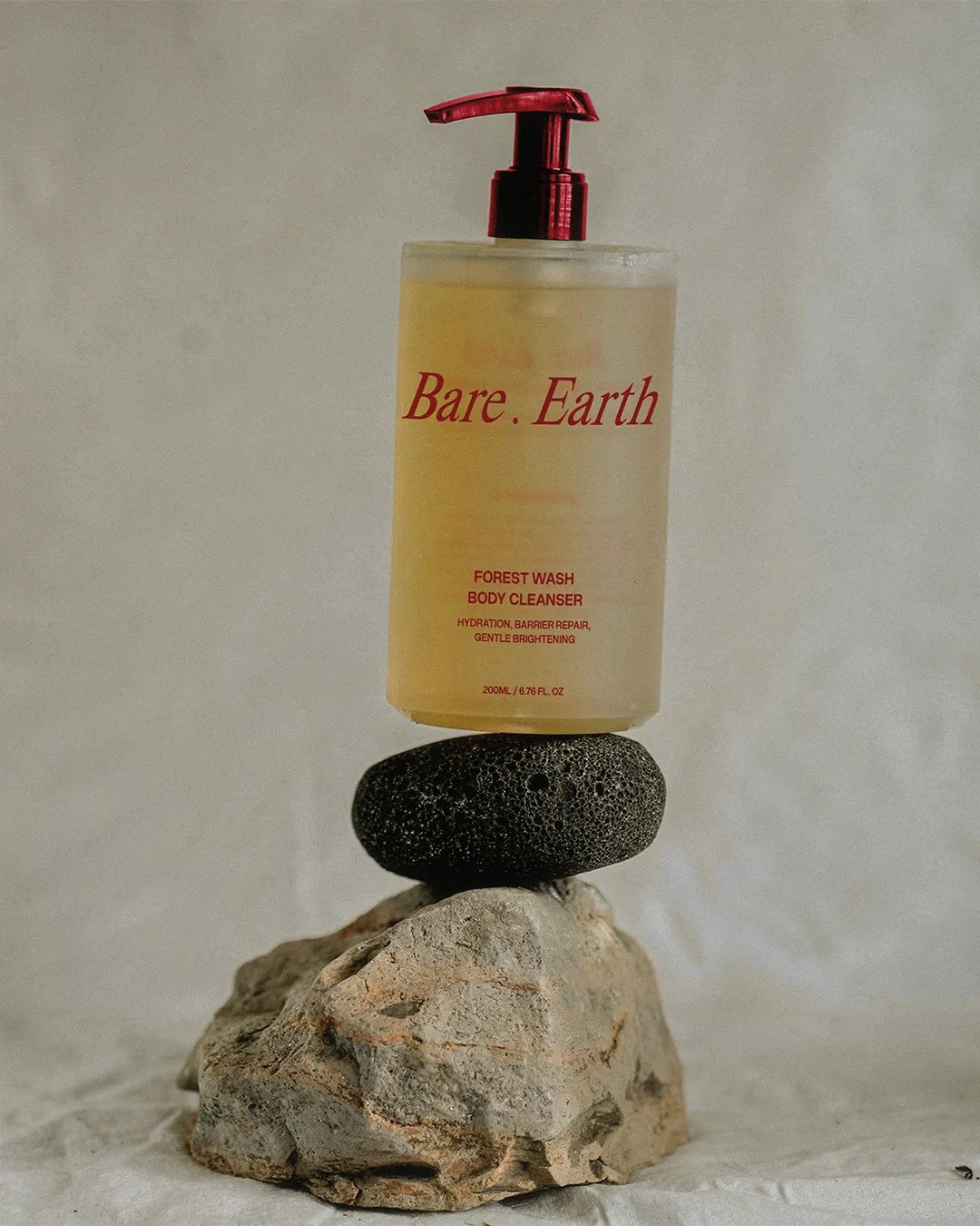
Bare . Earth Forest Wash Body Cleanser on Rocks
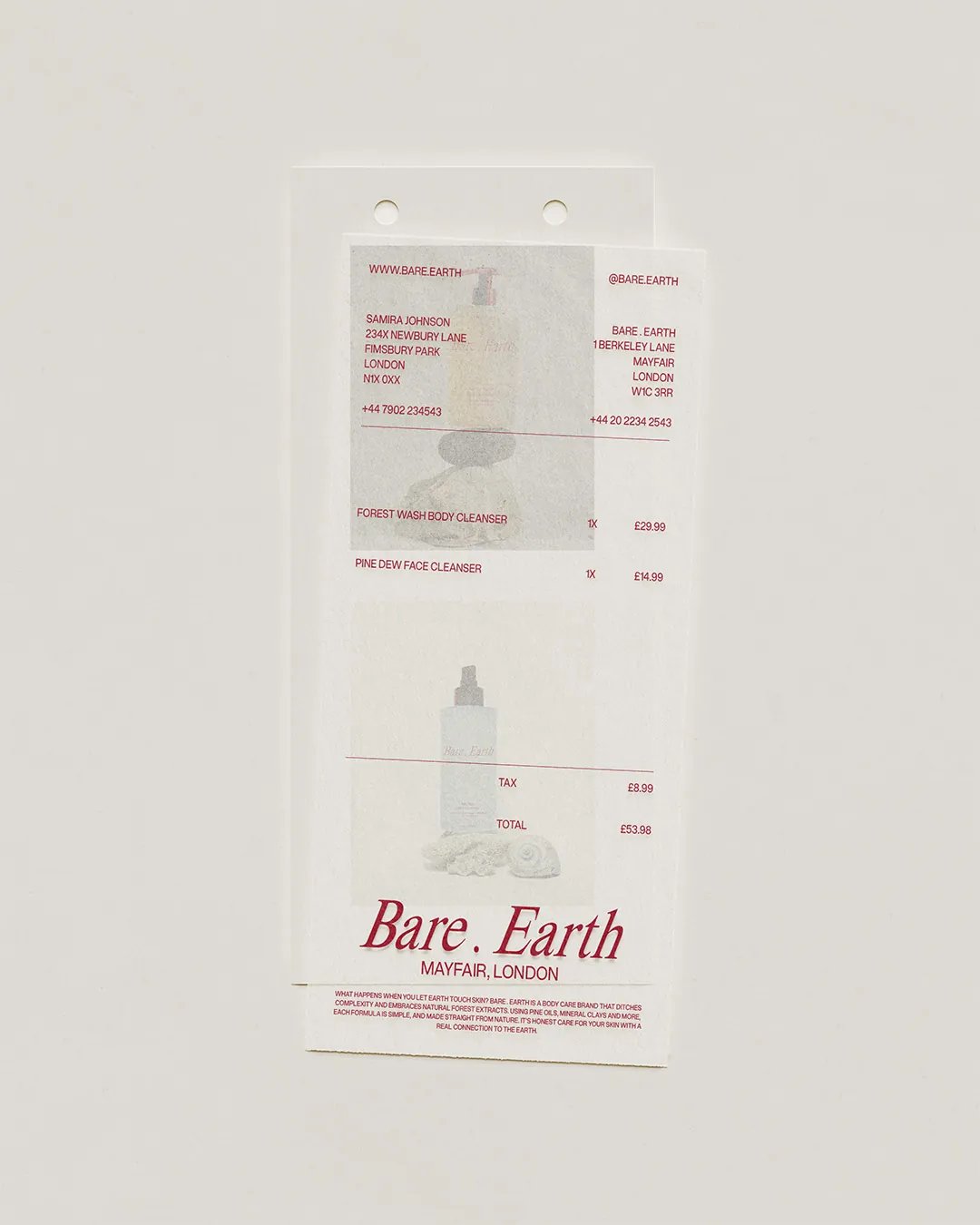
Bare . Earth Shopping Receipt
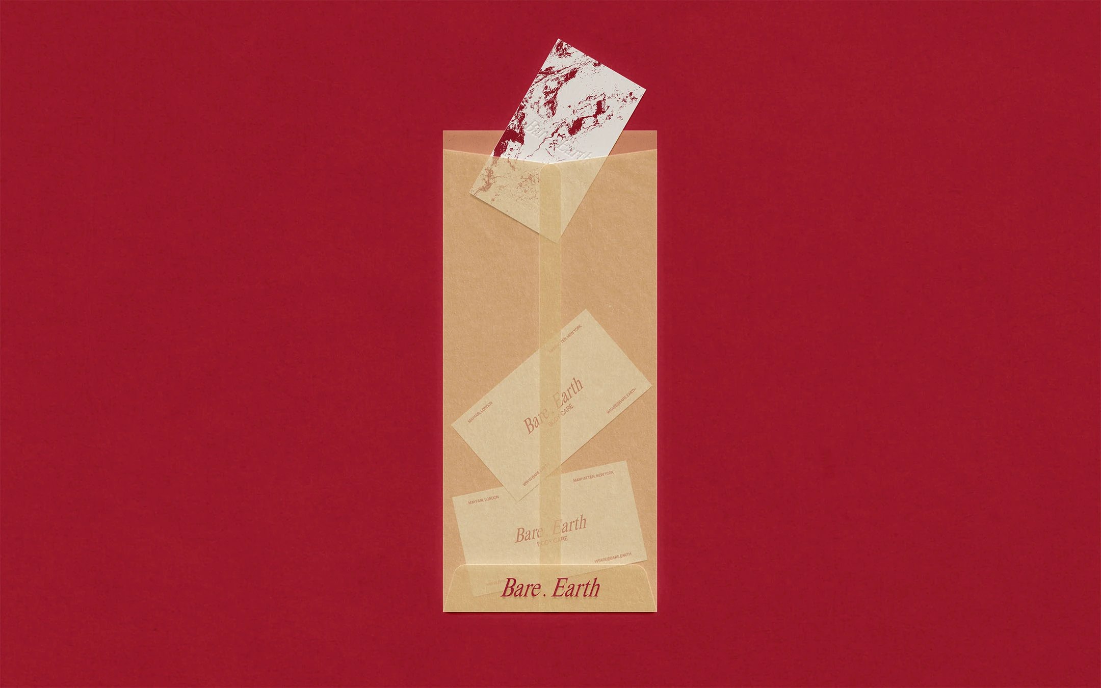
Bare . Earth Business Cards
Bare . Earth Shadow Visual Direction
Bare . Earth Grounded Body Lotion Tube Container
Bare . Earth Box Packaging
Bare . Earth Pine Dew Face Cleanser
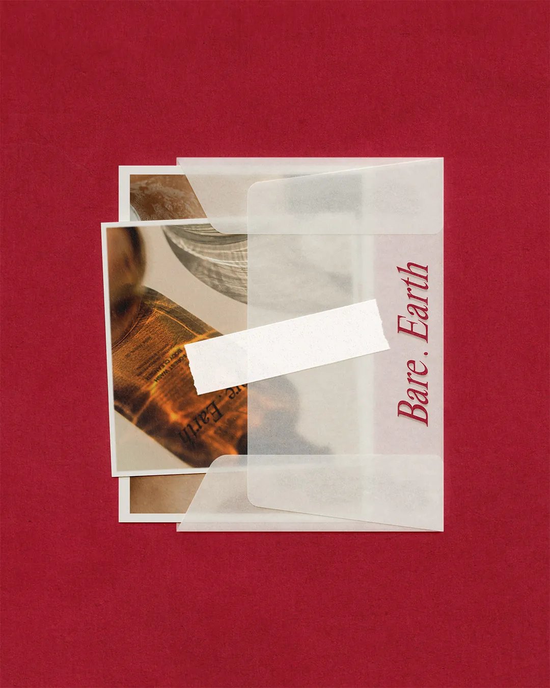
Bare . Earth Images & Letter
Bare . Earth Can Packaging
Bare . Earth Box Packaging
Bare . Earth Collection 2
Bare . Earth Grounded Body Lotion & Forest Wash Body Cleanser Tube Containers
Next Project

YOKŌ

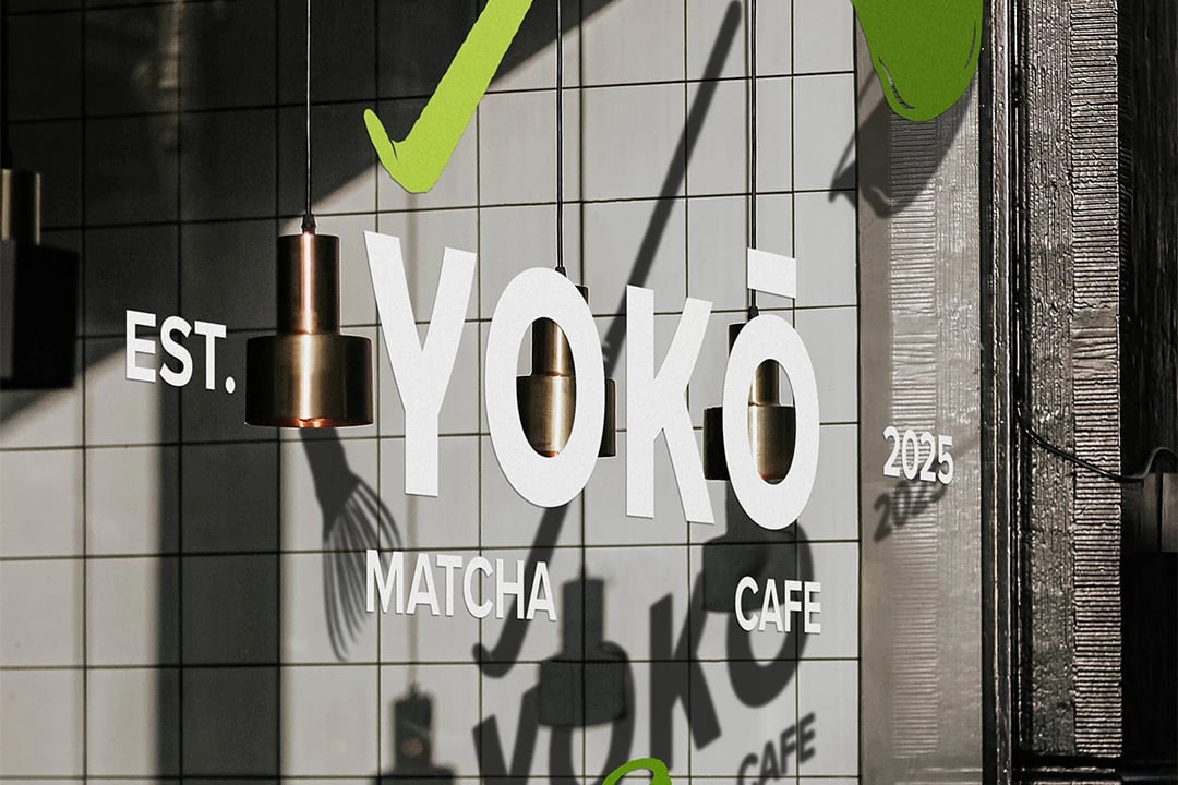
YOKŌ Landscape Preview Image

Thinking about what's next for your business? Let's talk about what you want to achieve and explore how we can make it happen.

Discuss your project