Loading portfolio

Case Study

  • Identity
  • Packaging

Peppa Please

© 2026

Hot Sauce

London, UK
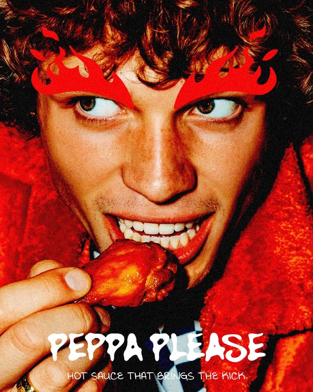
Peppa Please hero image

The packaging needed to communicate heat quickly and leave people with a personality they could remember after the bottle had left the table.
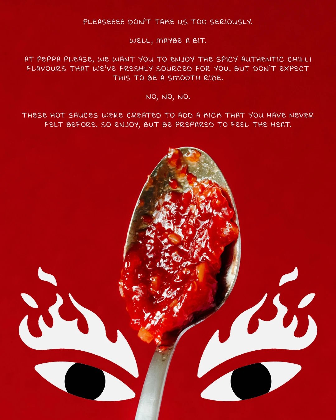
About Peppa Please

The Challenge

Hot sauce packaging often relies on dark labels and aggressive fire cues. Peppa Please needed to signal intensity without disappearing into the same visual language, leaving enough room for humour to become part of the reason people notice it.

The Approach

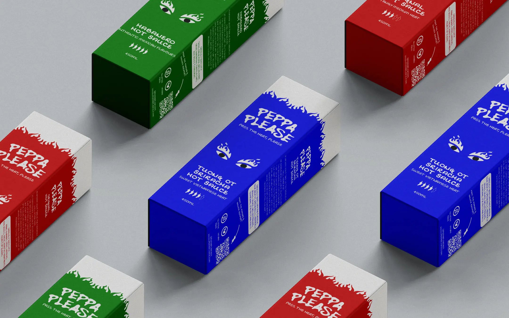
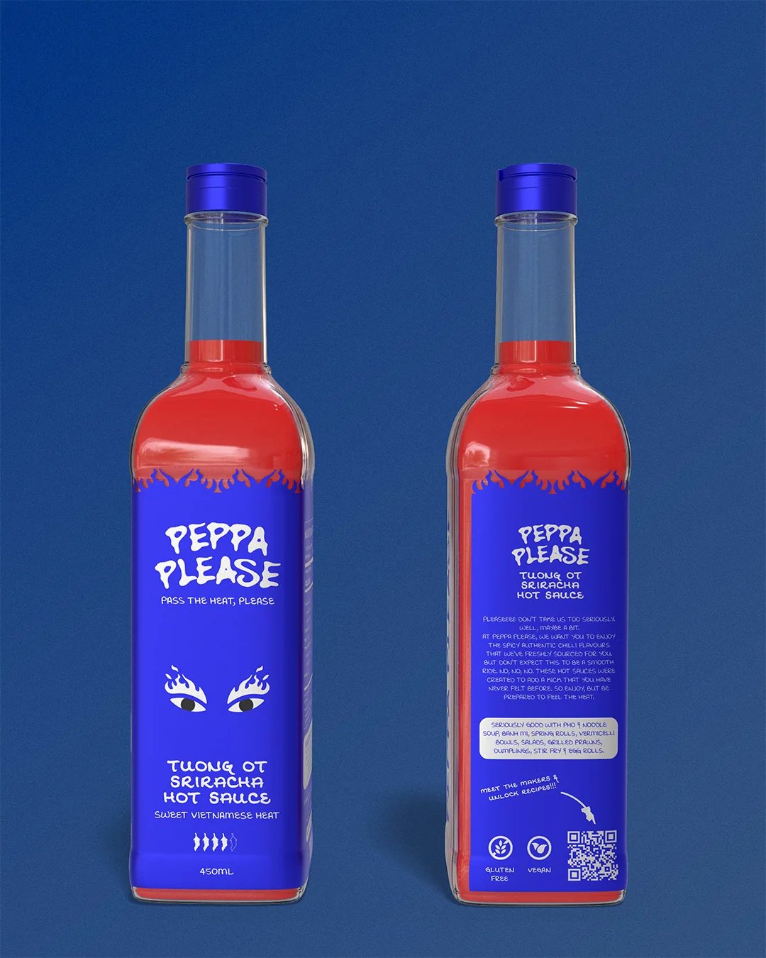
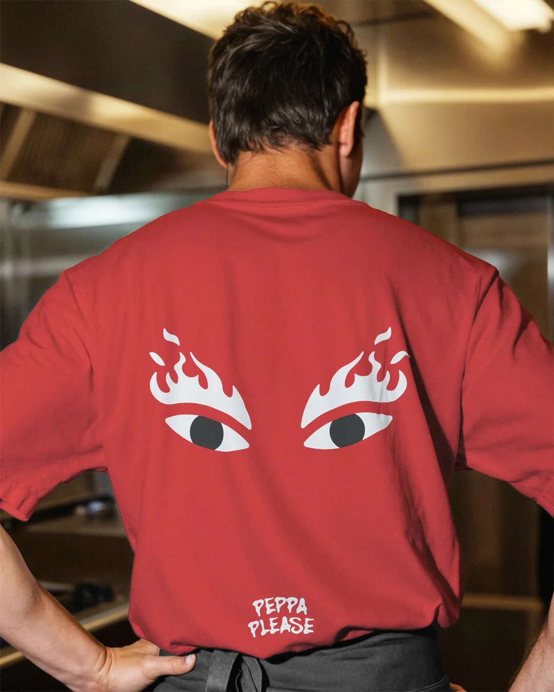
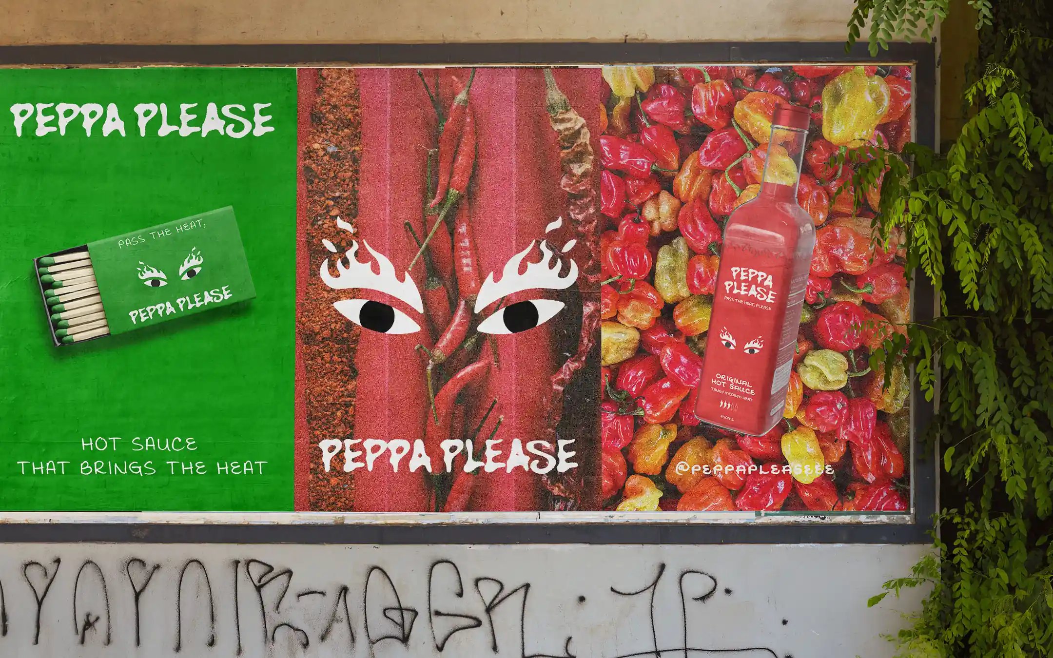
“Pass the heat, please” set the tone by giving the category's aggression a more playful twist. The first mascot was a whole chilli with flaming eyes, but the detail disappeared at bottle size. Reducing it to the eyes created a sharper symbol that could hold its own across the range. Irregular lettering and bold colour complete the system without overloading the label.

The Outcome

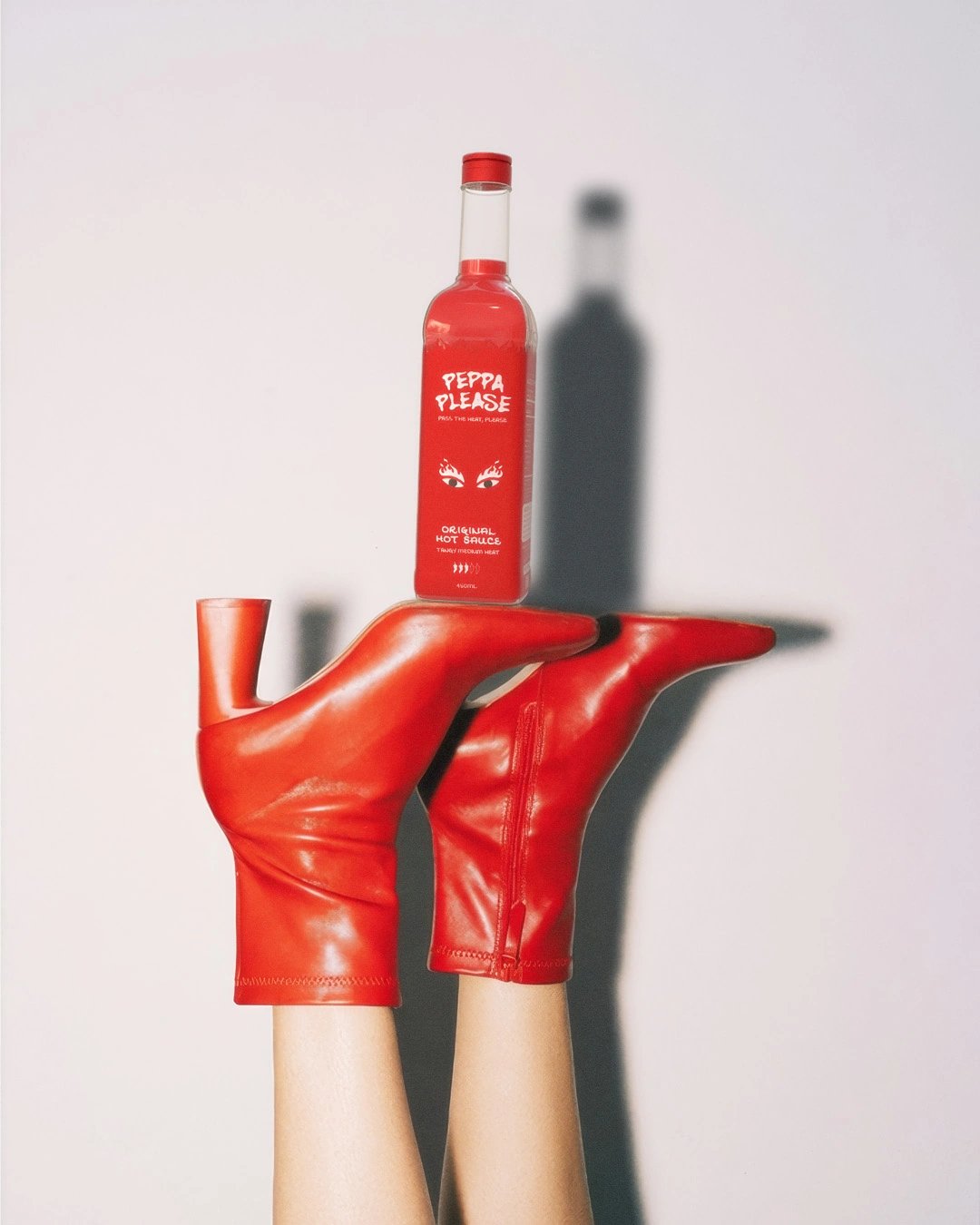
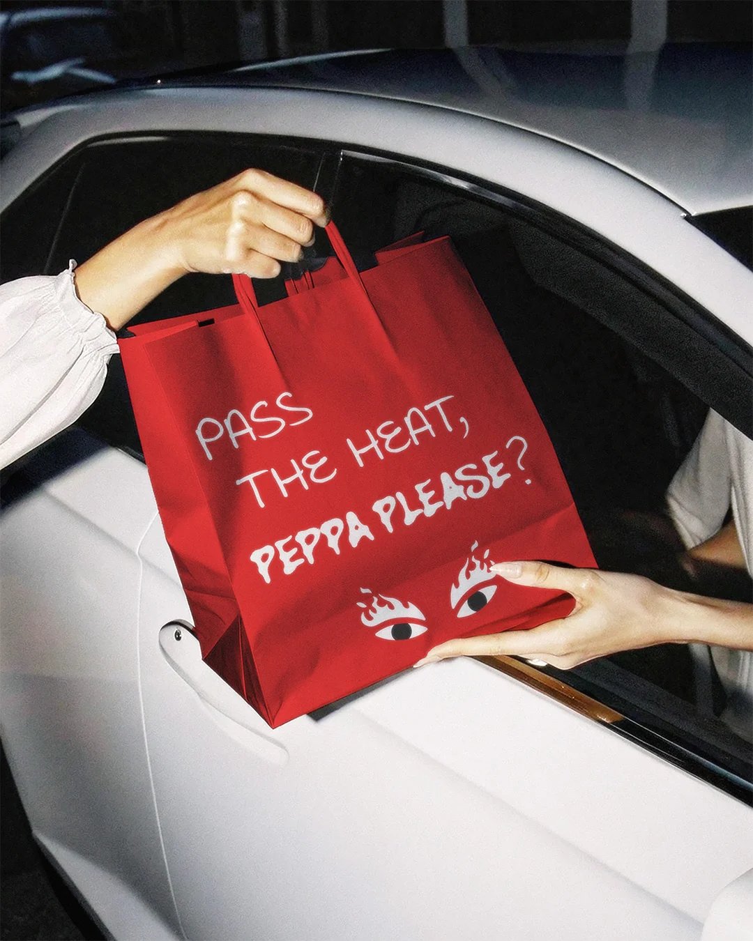
The flaming eyes give Peppa Please a device that works at bottle size and can take over larger applications. Combined with the language and colour system, they give the concept a personality that travels beyond packaging.

Client

Self-initiated

Peppa Please Poster
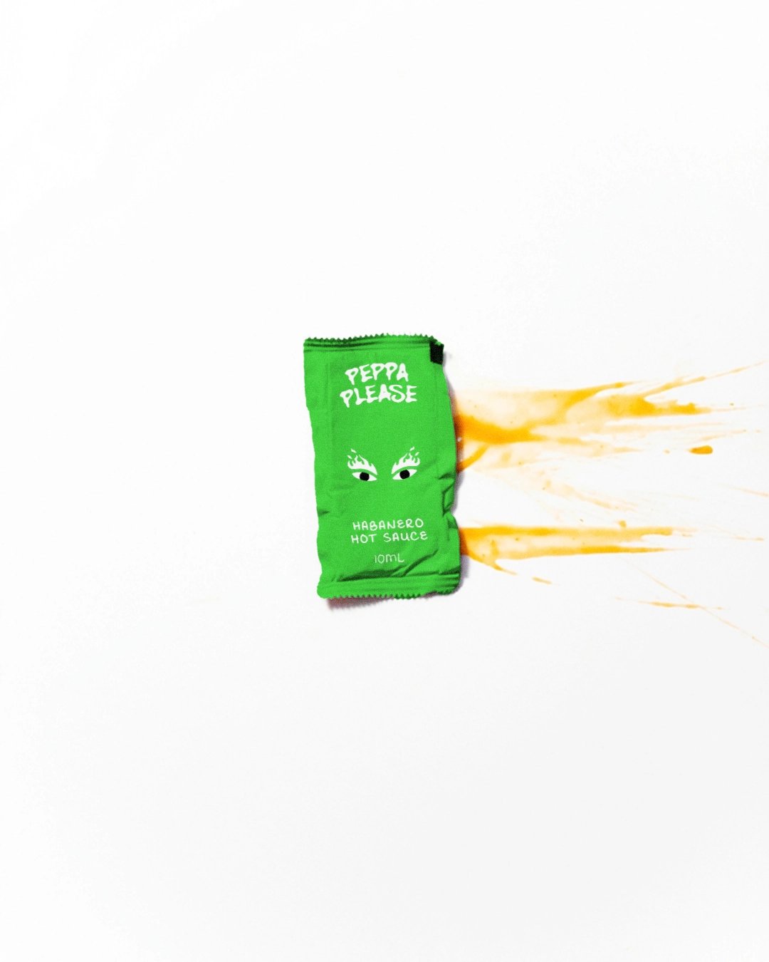
Burst Peppa Please Habanero Sachet
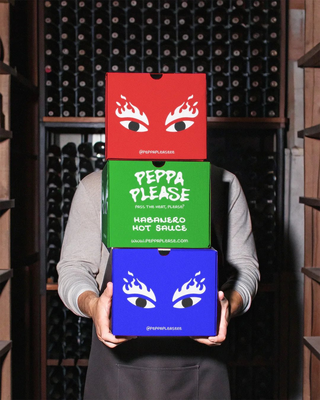
Peppa Please Bottle Box Packaging
Peppa Please Bottle Balanced On Heels
Peppa Please - Handing Bag into Car
Peppa Please Tương ớt Sriracha Bottle and Back Label
Peppa Please T-shirt Print
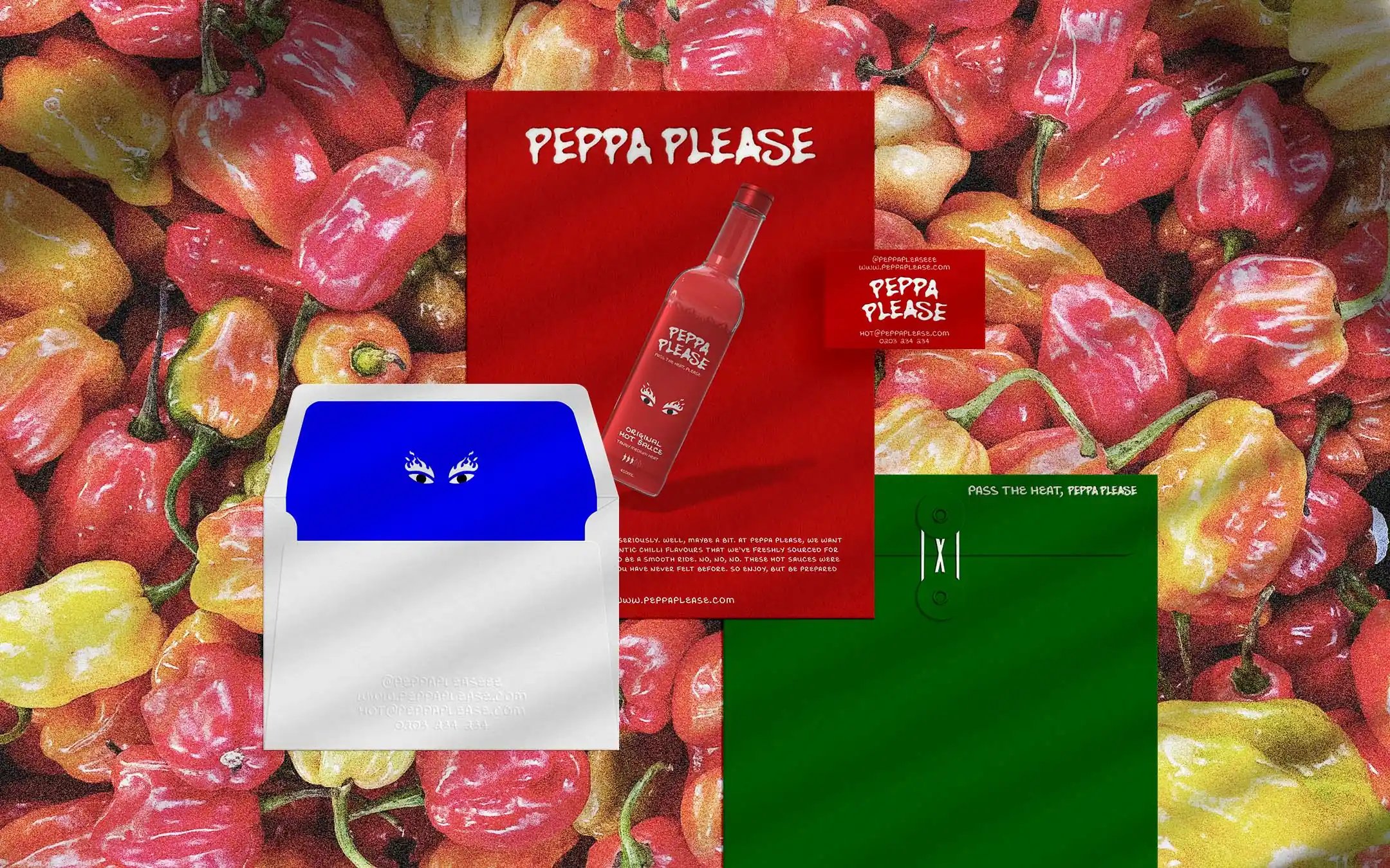
Peppa Please Letters & Paper Material
Peppa Please Hoodie
Peppa Please Boxes
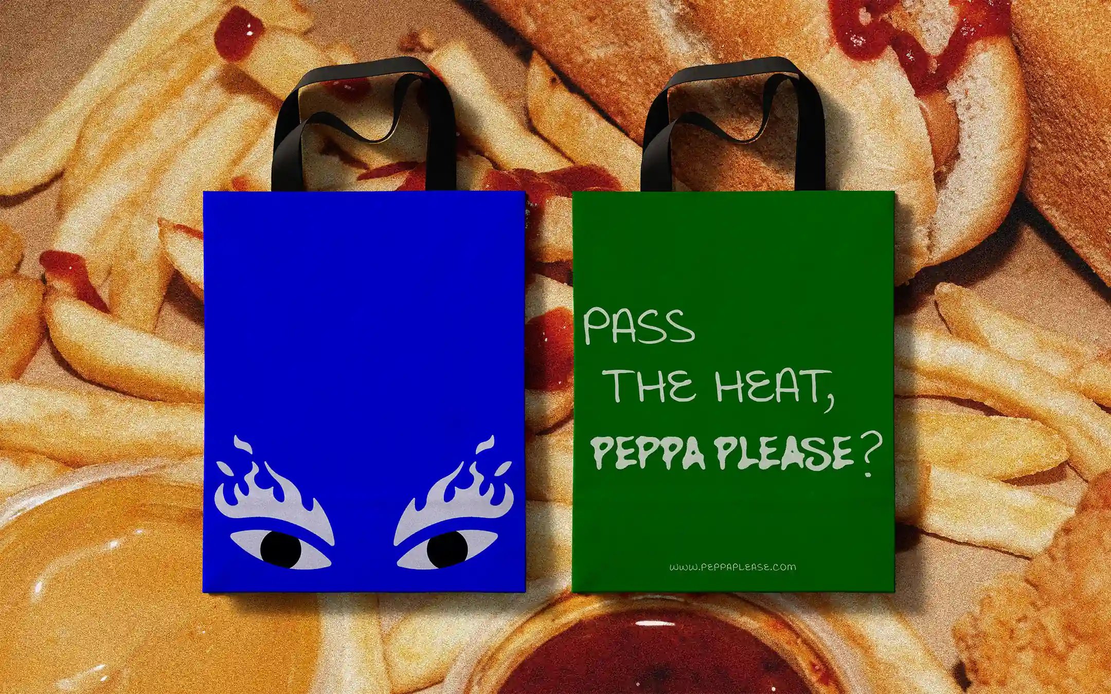
Peppa Please Carrying Bags
Peppa Please Poster
Next Project

ZAHRA

Thinking about what's next for your business? Let's talk about what you want to achieve and explore how we can make it happen.

Discuss your project