Loading portfolio

Case Study

  • Identity
  • Art/Creative Direction

BLNK

© 2025

Padel Club

Berlin, Germany
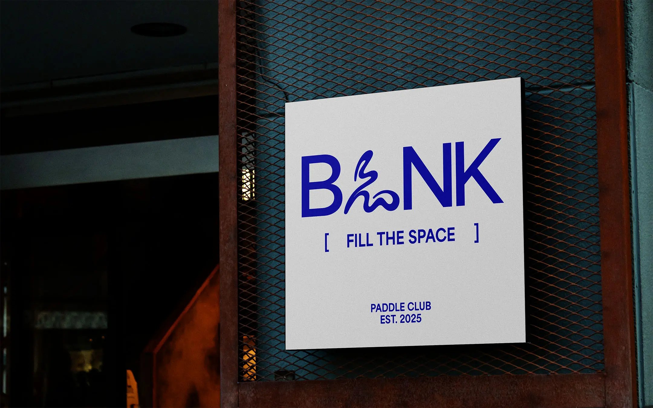
BLNK hero image

Padel is defined by movement. BLNK needed a visual system that could carry that energy beyond the court and into the wider club experience.
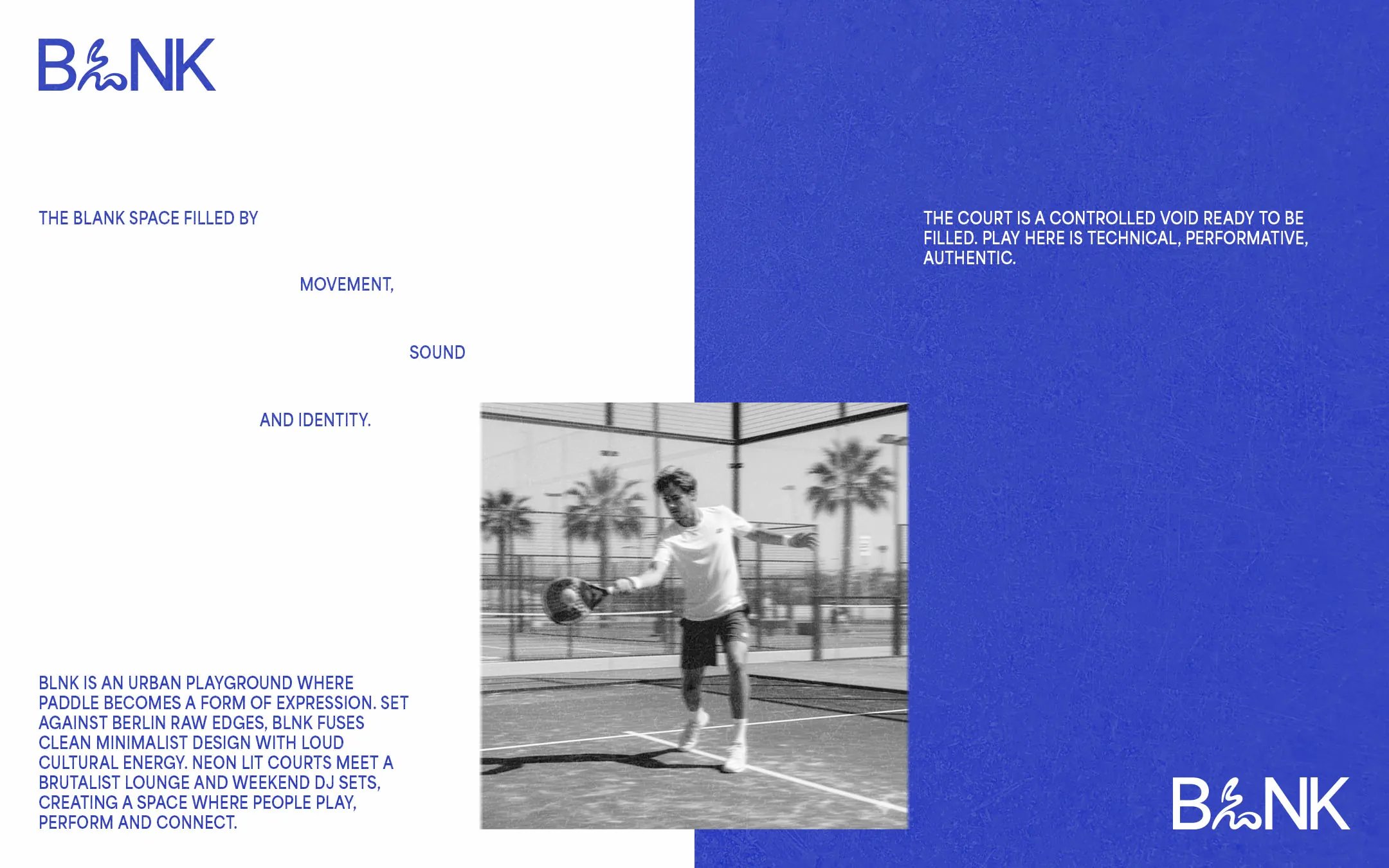
About BLNK

The Challenge

The club was imagined as a place where regular play could build a sense of belonging. Its identity needed enough presence to feel part of city life while still feeling rooted in the sport itself.

The Approach

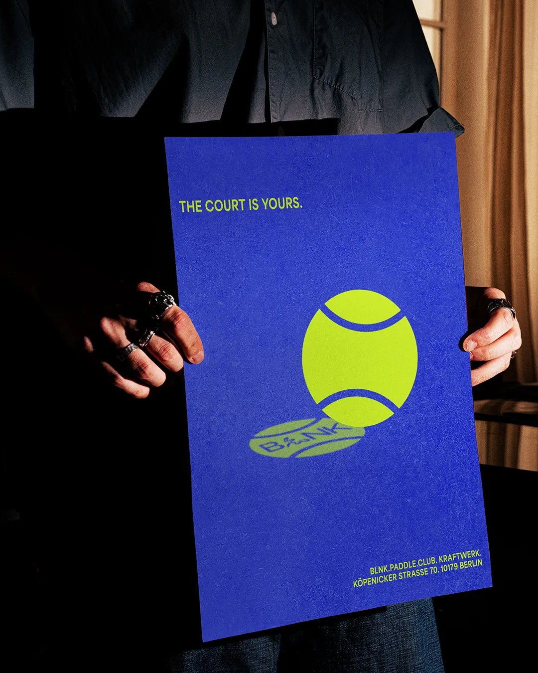
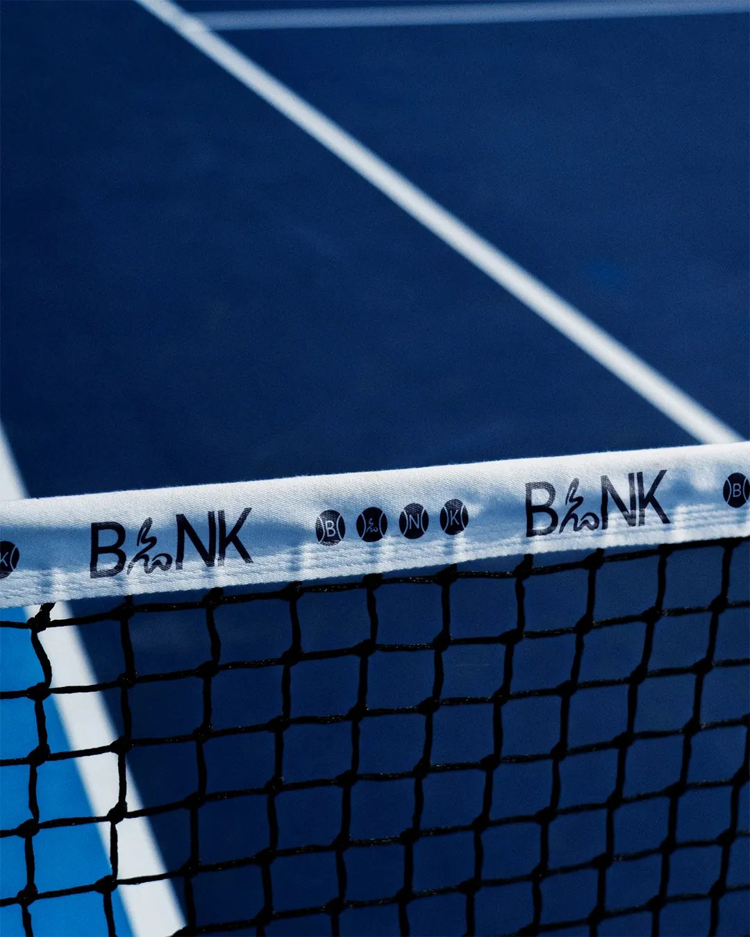
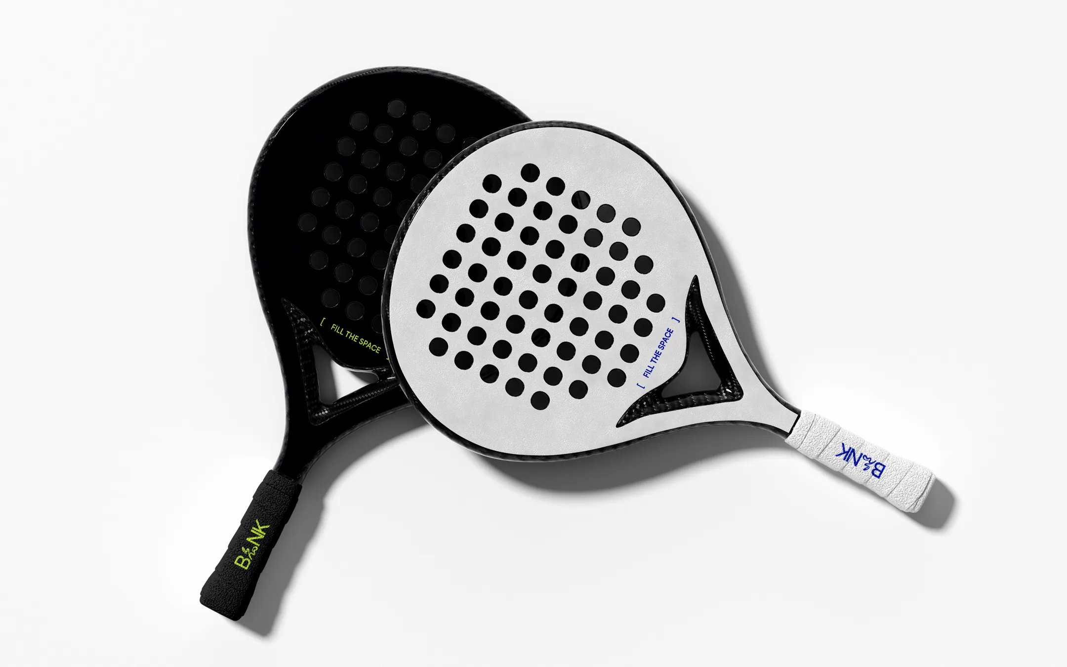
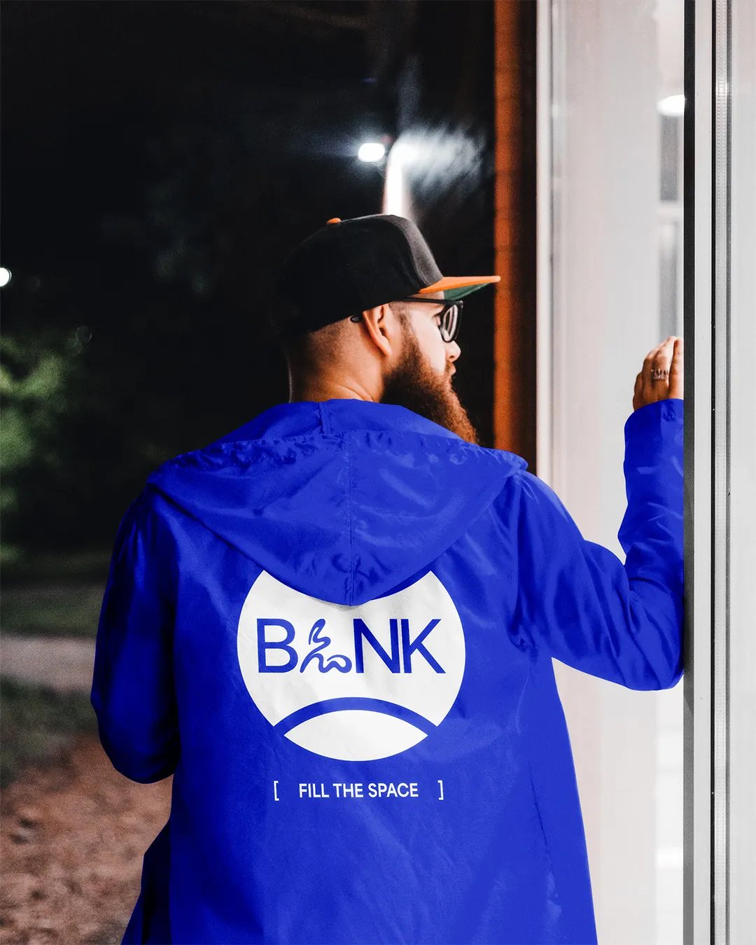
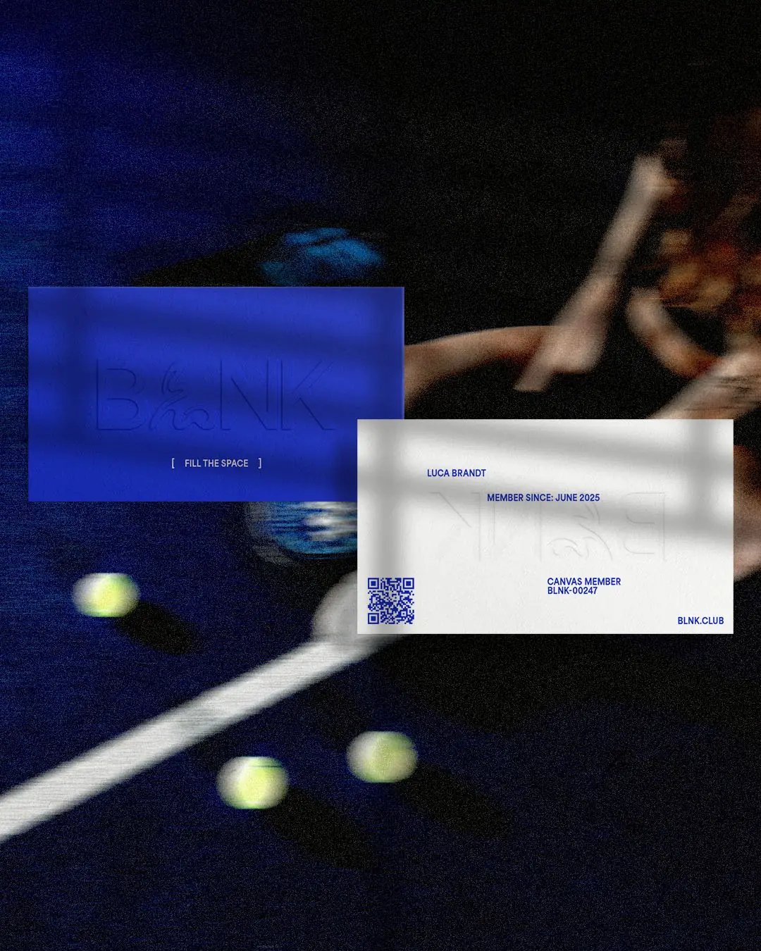
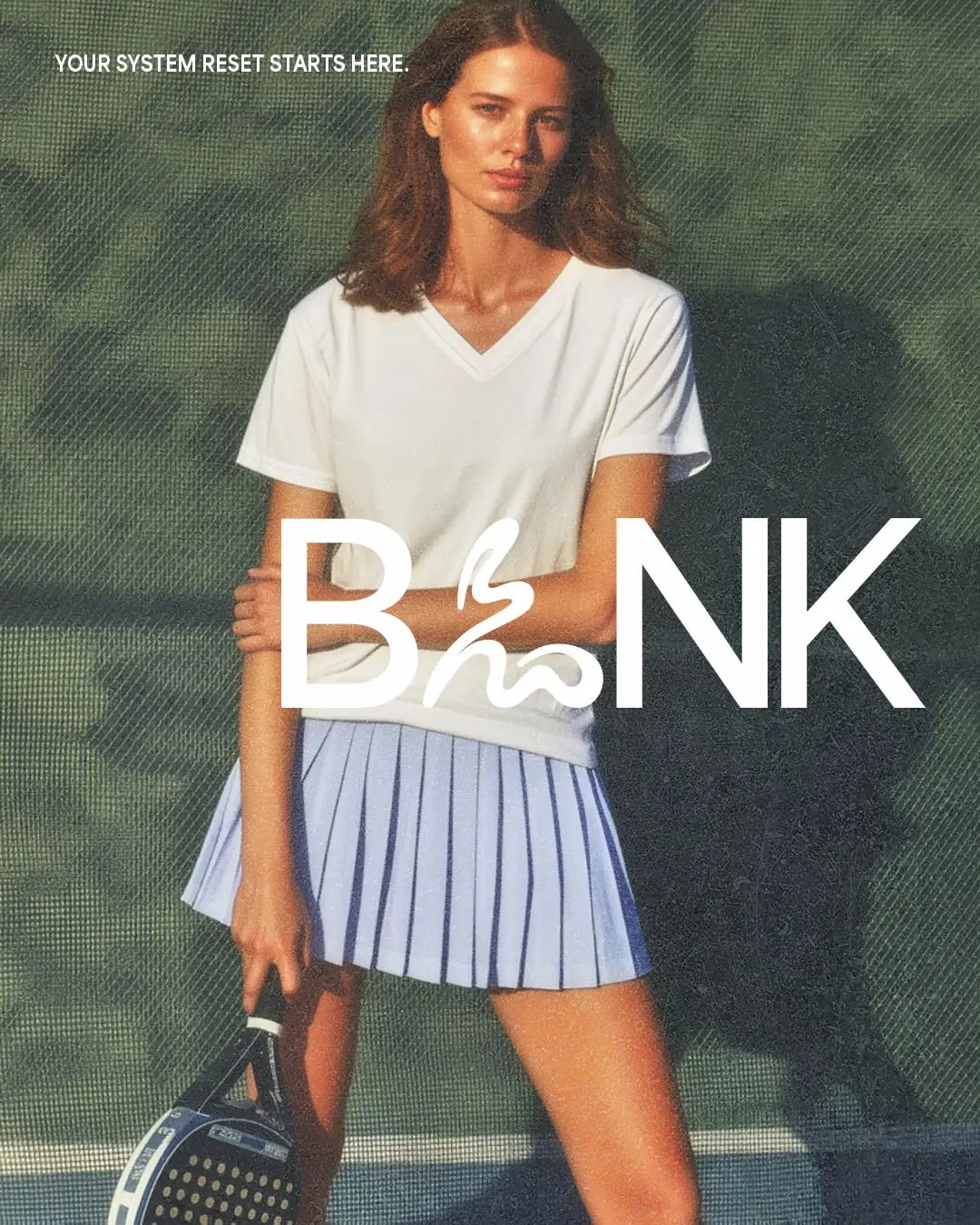
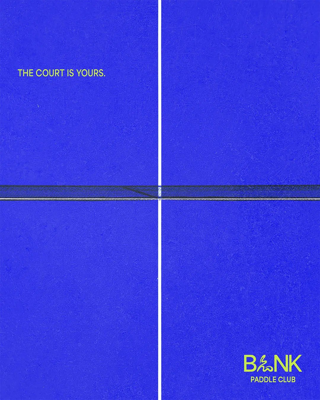
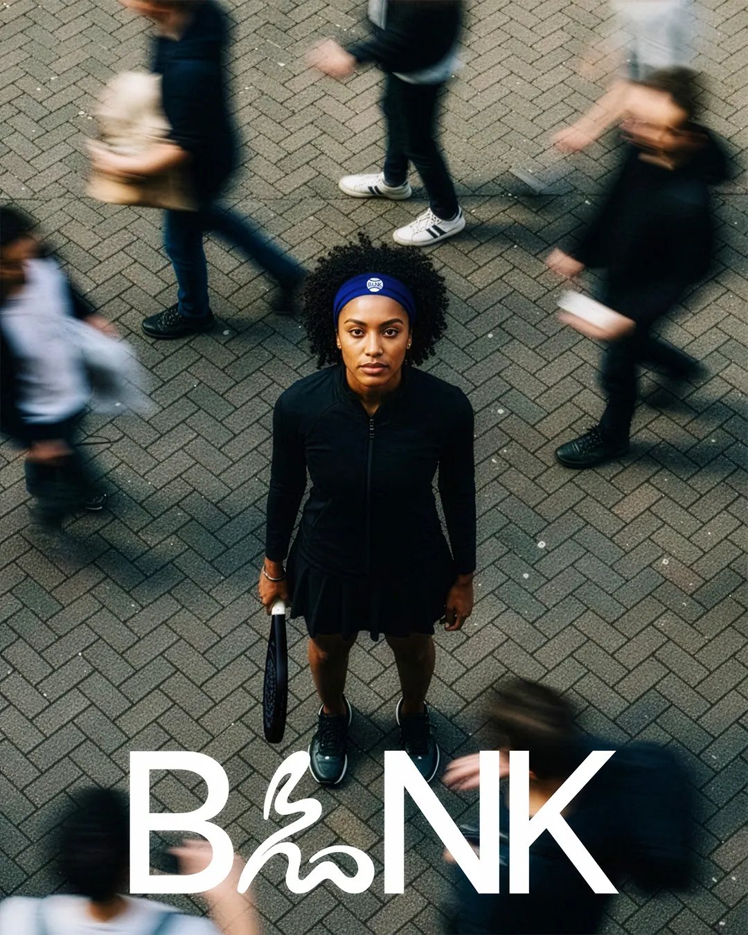
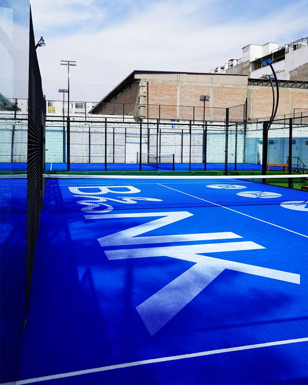
The court became the starting point: an open space filled by the people playing on it. That led to the idea Fill the Space. An early uppercase wordmark felt static, so the L was redrawn around the movement of a serve. The letterforms then informed graphics for padel balls, while oversized type and deep blue surfaces gave the proposed club environment a stronger visual presence.

The Outcome

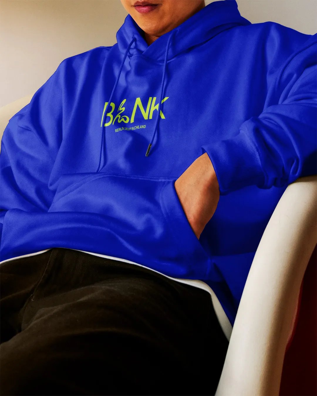
The modified lettering gives BLNK a visual language tied directly to the game. Across the court environment and club merchandise, the system explores how the identity could become part of the experience itself.

Client

Self-initiated

Accolades

  • Braaands - Brand Of The Day
  • Contra - Honourable Feature
BLNK Editorial Poster
BLNK Courts
BLNK Event Poster
BLNK Padel Athlete
BLNK Court Net
BLNK Hoodie
BLNK Paddle Rackets
BLNK Rain Jacket
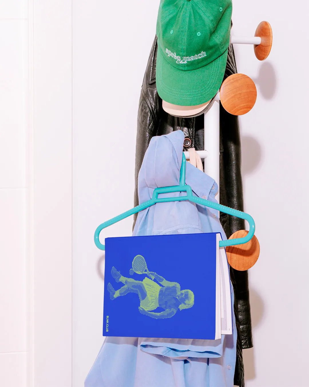
BLNK Book Cover
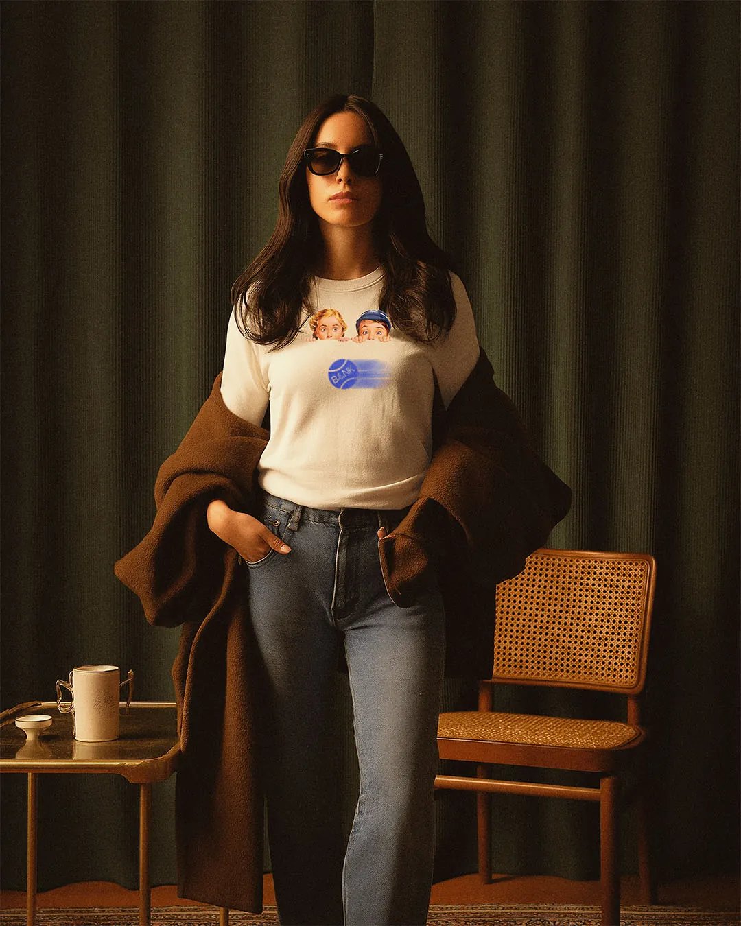
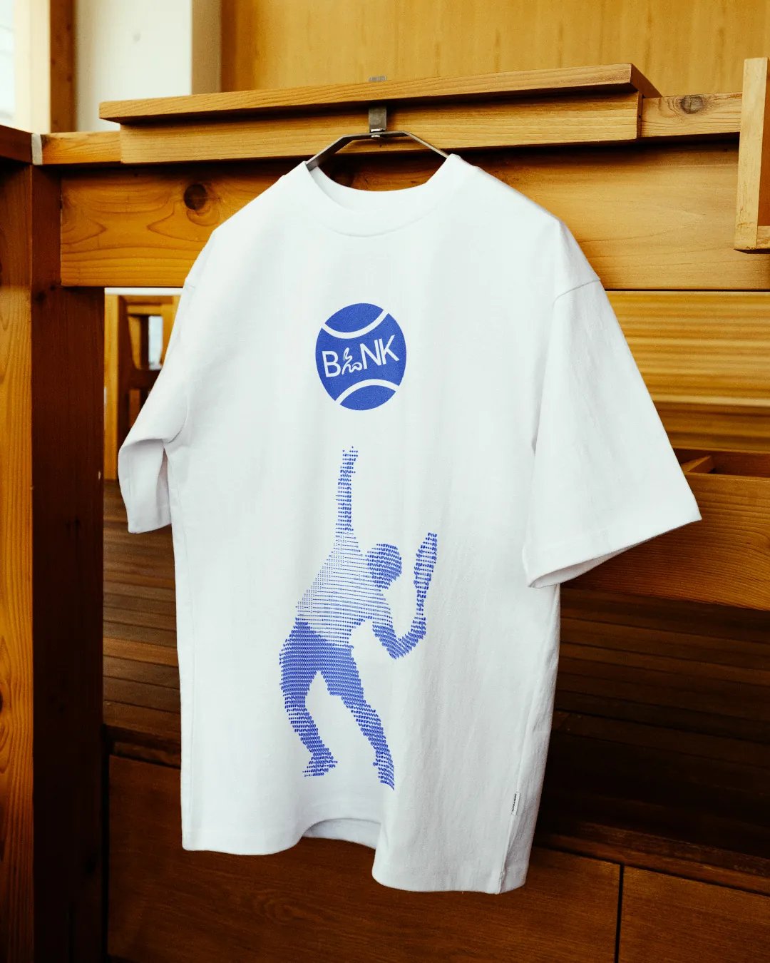
BLNK T-shirt
BLNK T-shirt
BLNK Business Cards
BLNK Paddle Player Poster
BLNK Court Poster
BLNK Creative Poster
Next Project

Bare. Earth

Thinking about what's next for your business? Let's talk about what you want to achieve and explore how we can make it happen.

Discuss your project