Loading portfolio

Case Study

  • Identity
  • Art/Creative Direction
  • Packaging
  • Illustration

Nocaff

© 2026

Decaf Canned Coffee

London, UK
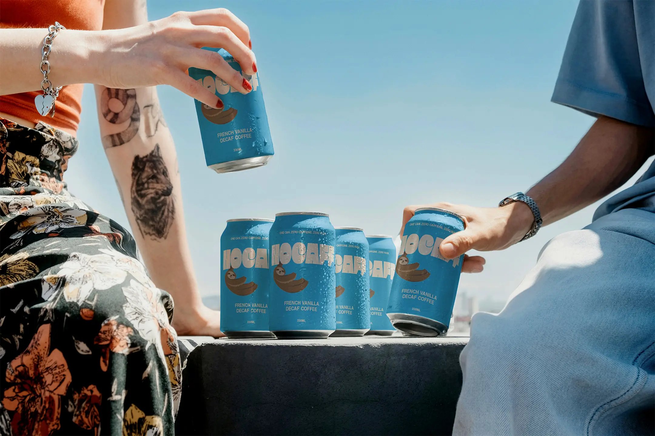
Nocaff hero image

Nocaff needed to make decaf desirable on its own terms, with packaging that could stand out in a category built around energy and speed.
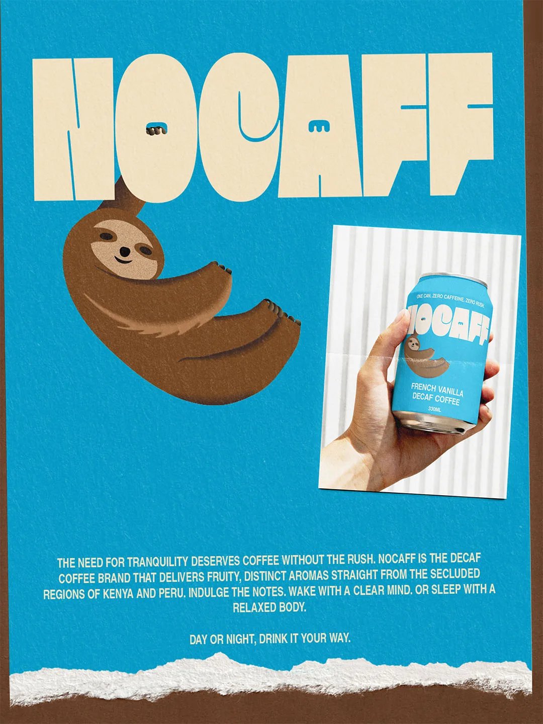
About Nocaff

The Challenge

Ready-to-drink coffee is often sold as a quick boost. Nocaff takes the opposite pace, so the identity had to make that difference feel appealing while still giving the can enough presence to compete on a busy shelf.

The Approach

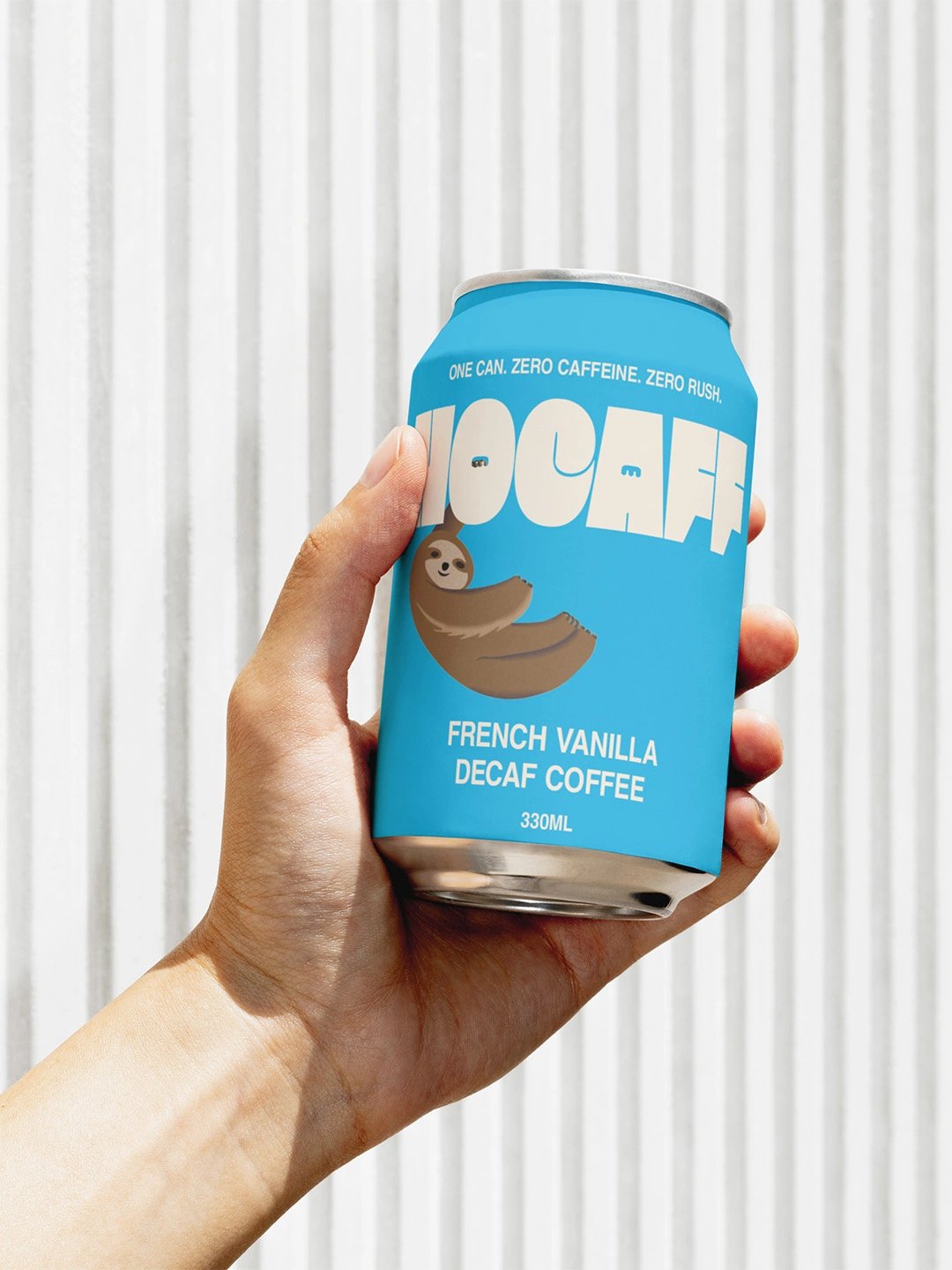
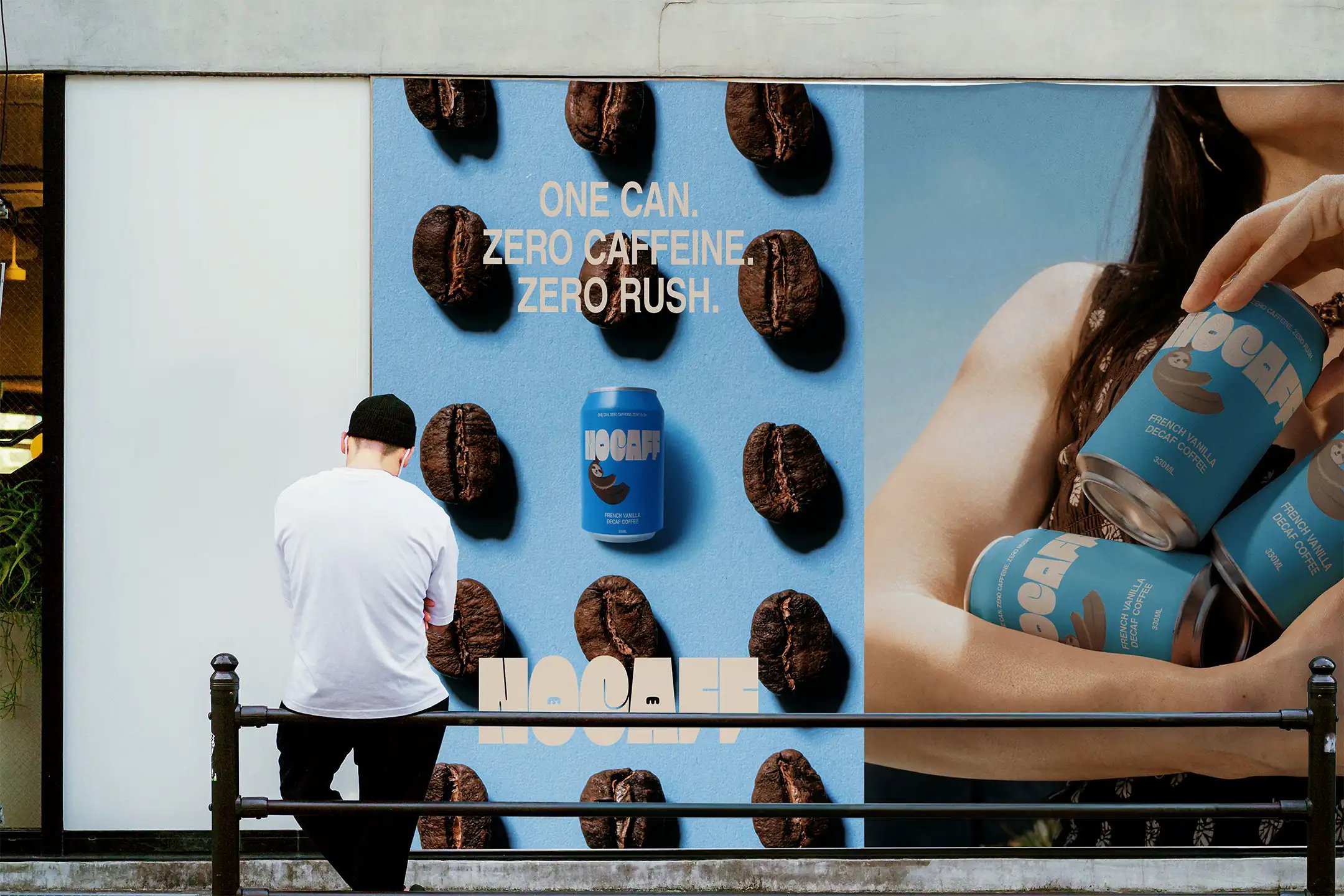
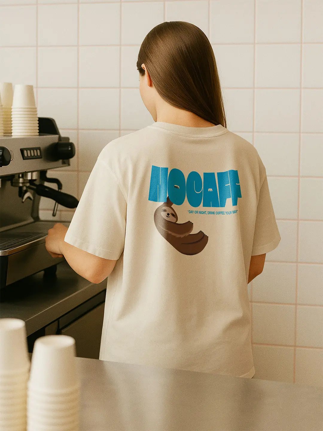
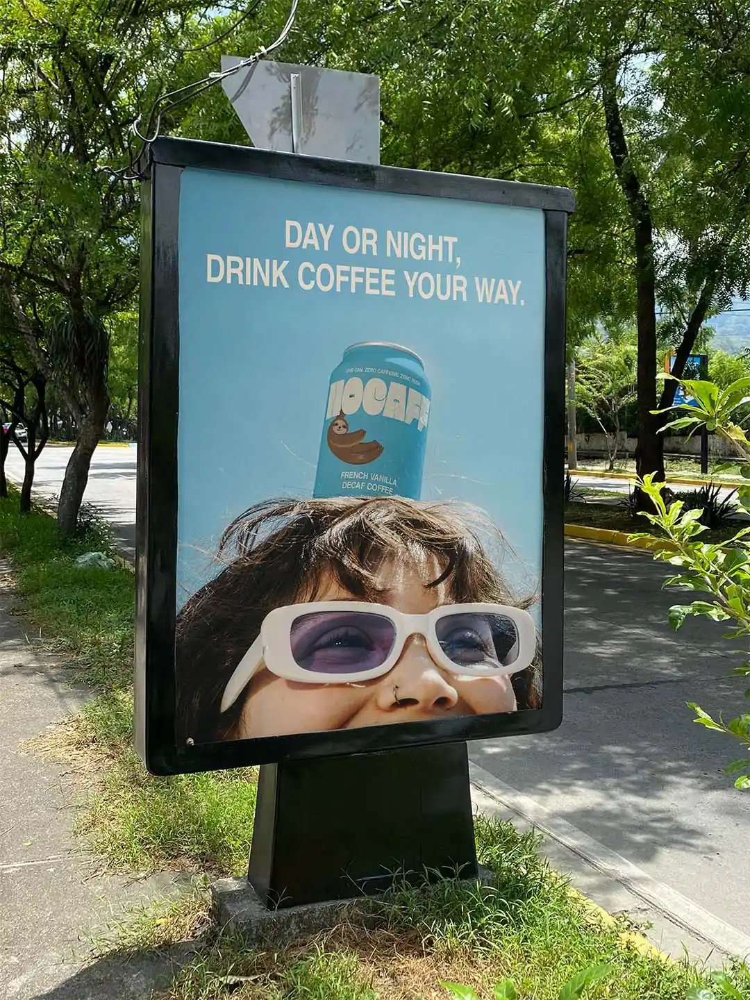
The first cream can with blue lettering felt too subdued, so the colours were reversed and bright blue became the dominant shelf cue. A weighty wordmark keeps the pack direct, while the sloth gives the slower proposition a simple character with some humour. Campaign copy and relaxed lifestyle imagery extend the same attitude into moments where coffee is enjoyed without urgency.

The Outcome

The system turns the slower pace of decaf into the brand's main source of character. The blue can carries the shelf presence, while the sloth and campaign direction give Nocaff a voice that can extend beyond packaging.

Client

Self-initiated

Accolades

  • Braaands - Brand Of The Day
  • Brand Brainy - Honourable Feature
  • Contra - Honourable Feature
Nocaff Print
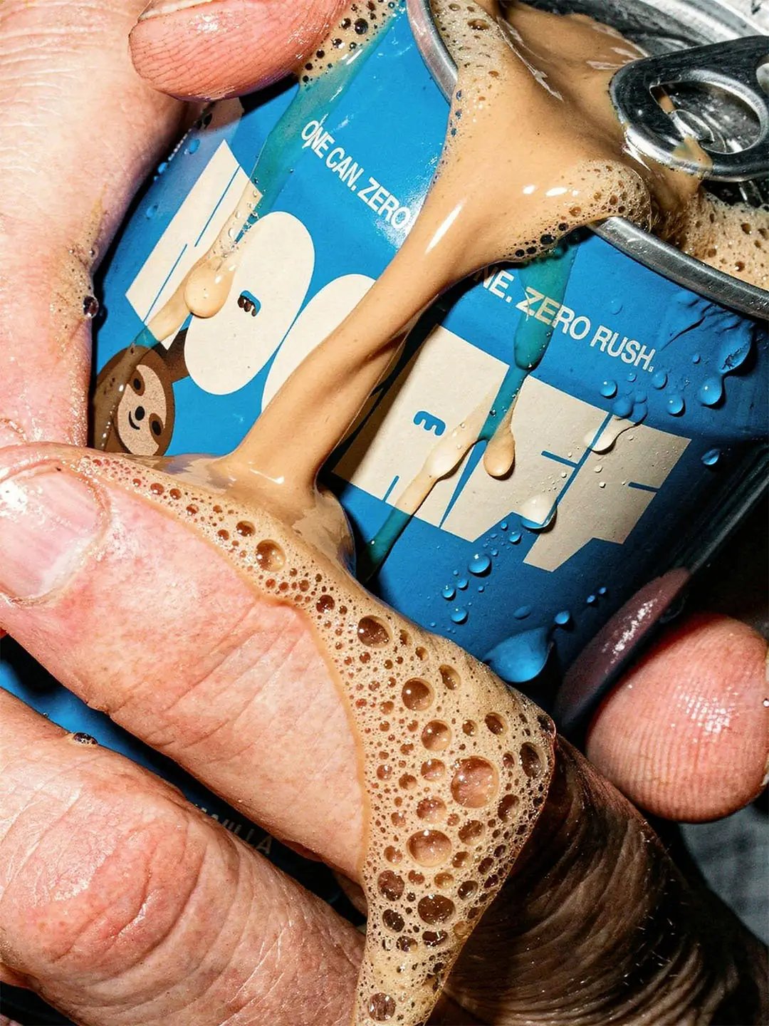
Nocaff Can Crushed in Hand
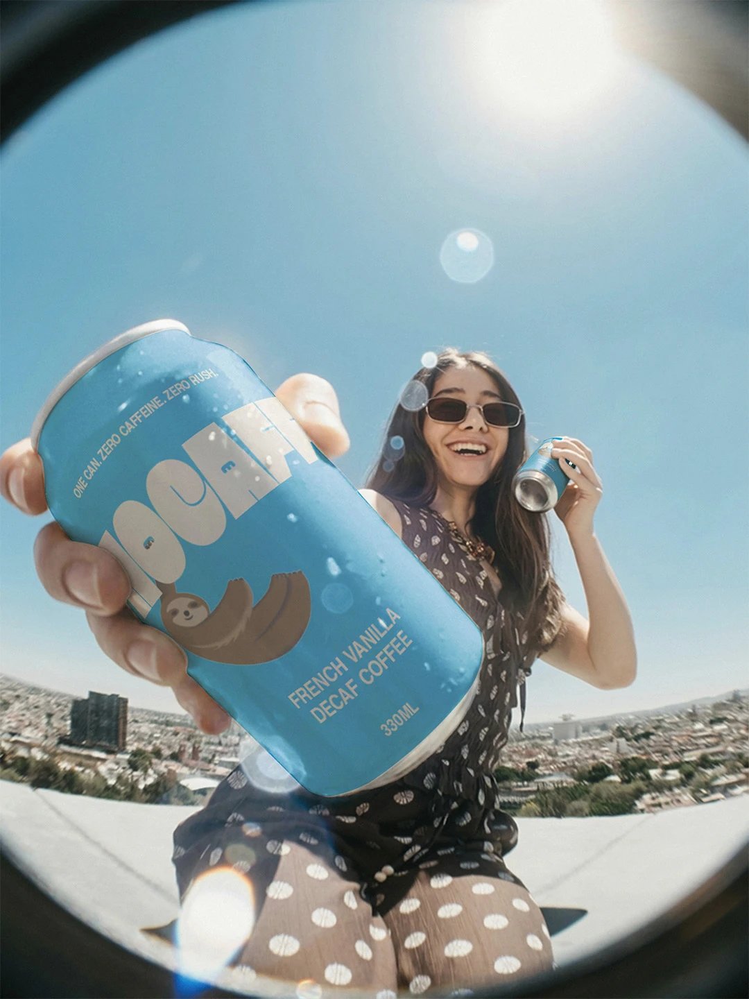
Nocaff Can Packaging - Fish bowl View
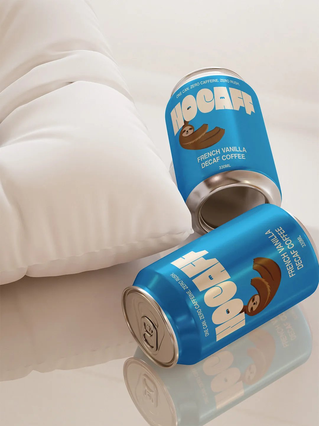
Nocaff Cans On Pillow
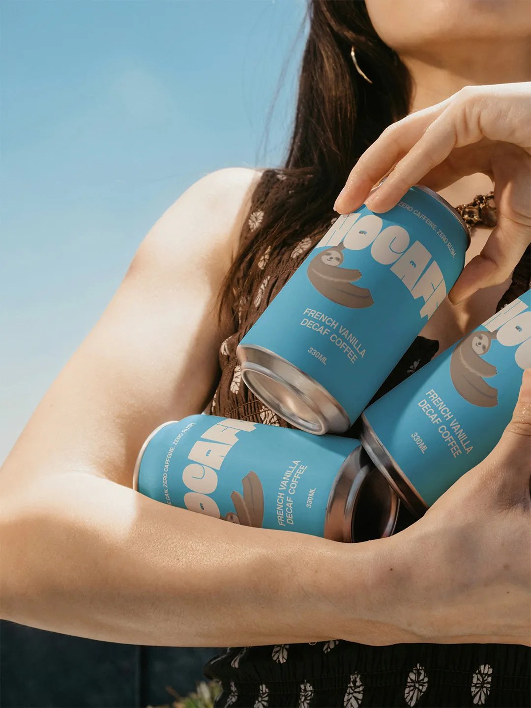
Nocaff Cans Held in Person's Arms
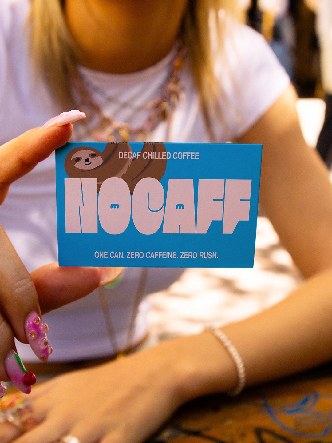
Nocaff Business Card
Nocaff Can Held Up by Hand
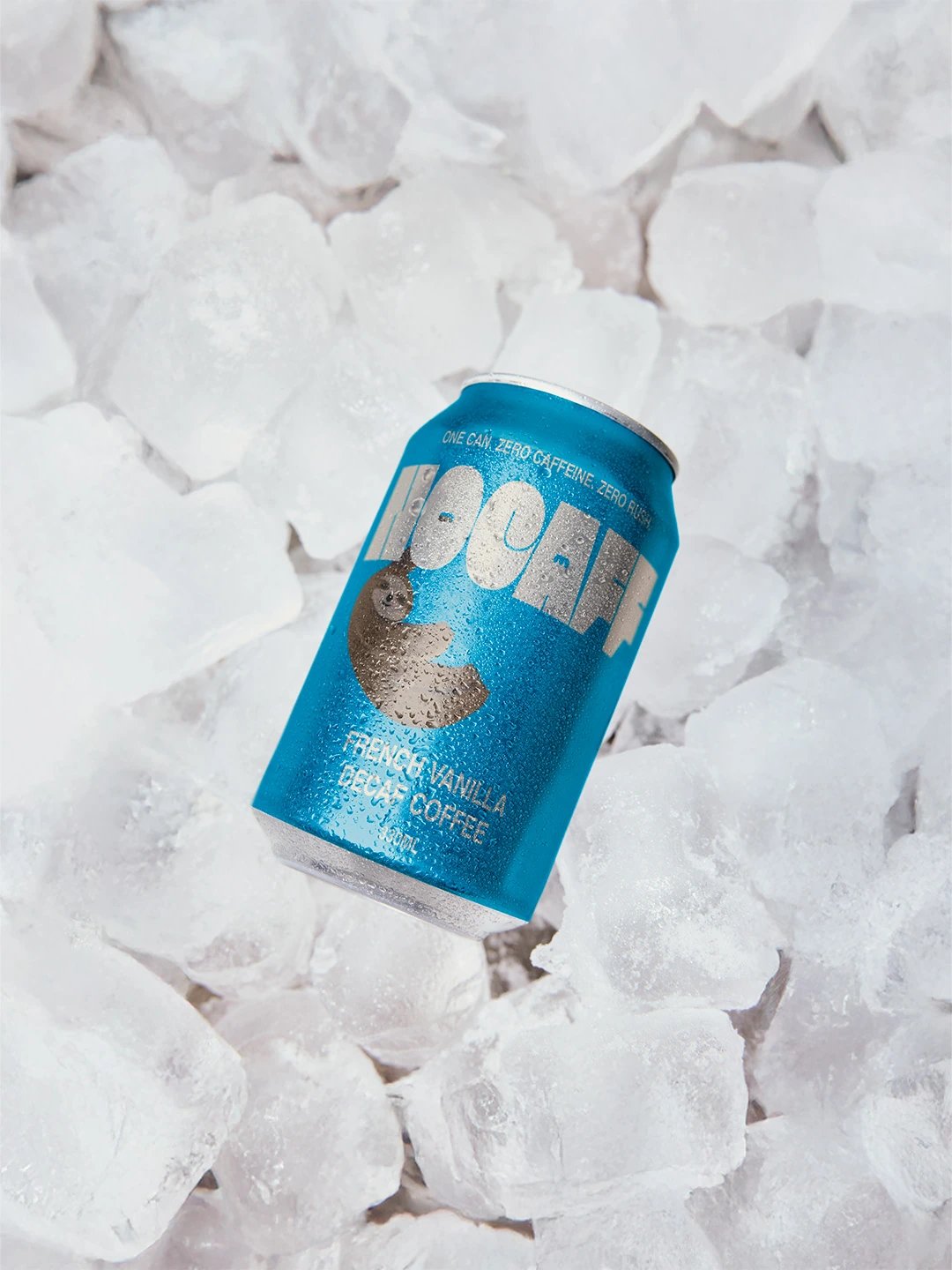
Nocaff can on ice
Nocaff Billboard
Nocaff - Person Drinking Can
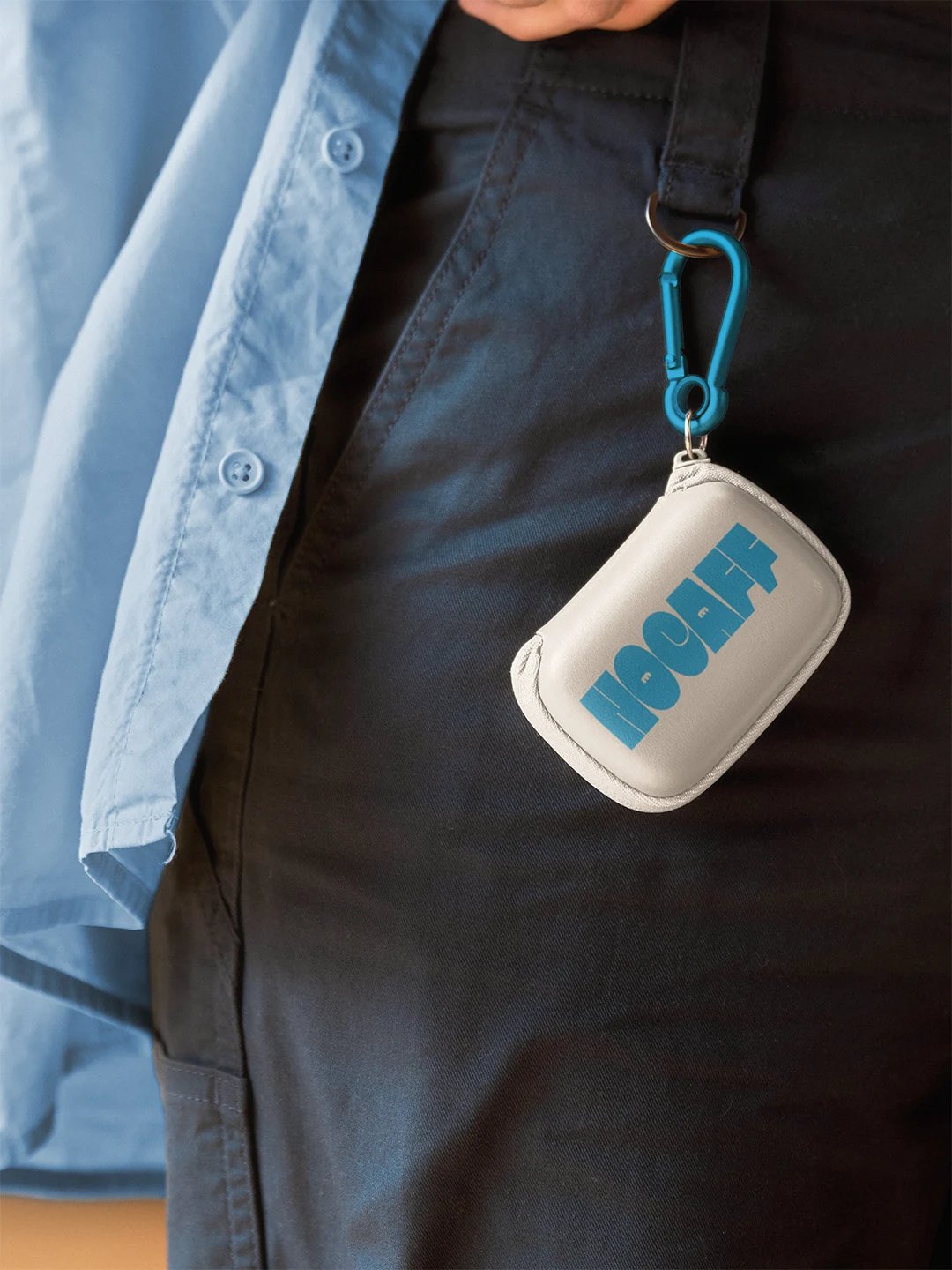
Nocaff key chain
Nocaff T-shirt Print
Nocaff Poster With Can on Top of Head
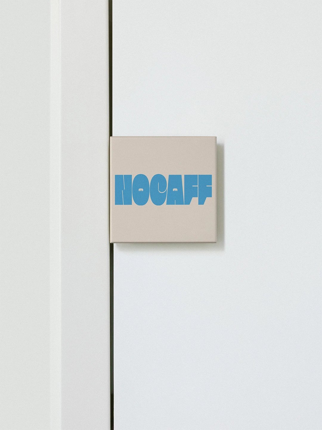
Nocaff Door Sign
Next Project

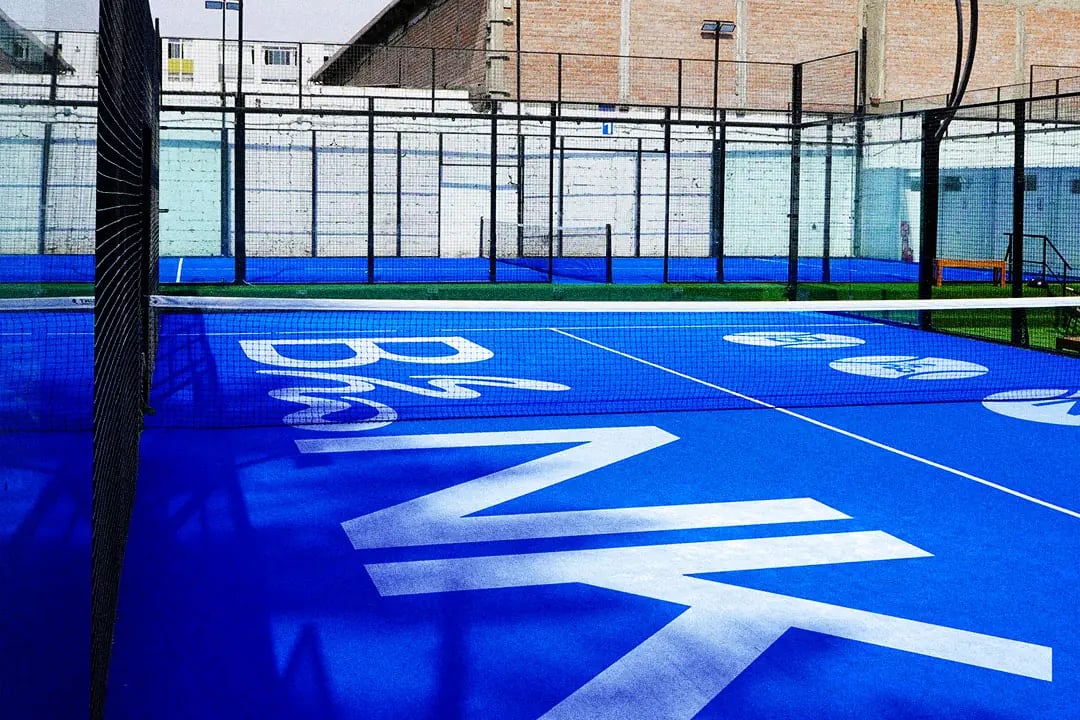
BLNK

BLNK Landscape Preview Image

Thinking about what's next for your business? Let's talk about what you want to achieve and explore how we can make it happen.

Discuss your project