Loading portfolio

Case Study

  • Identity
  • Art/Creative Direction
  • Packaging

Oh Belly

© 2026

Prebiotic Soda

London, UK
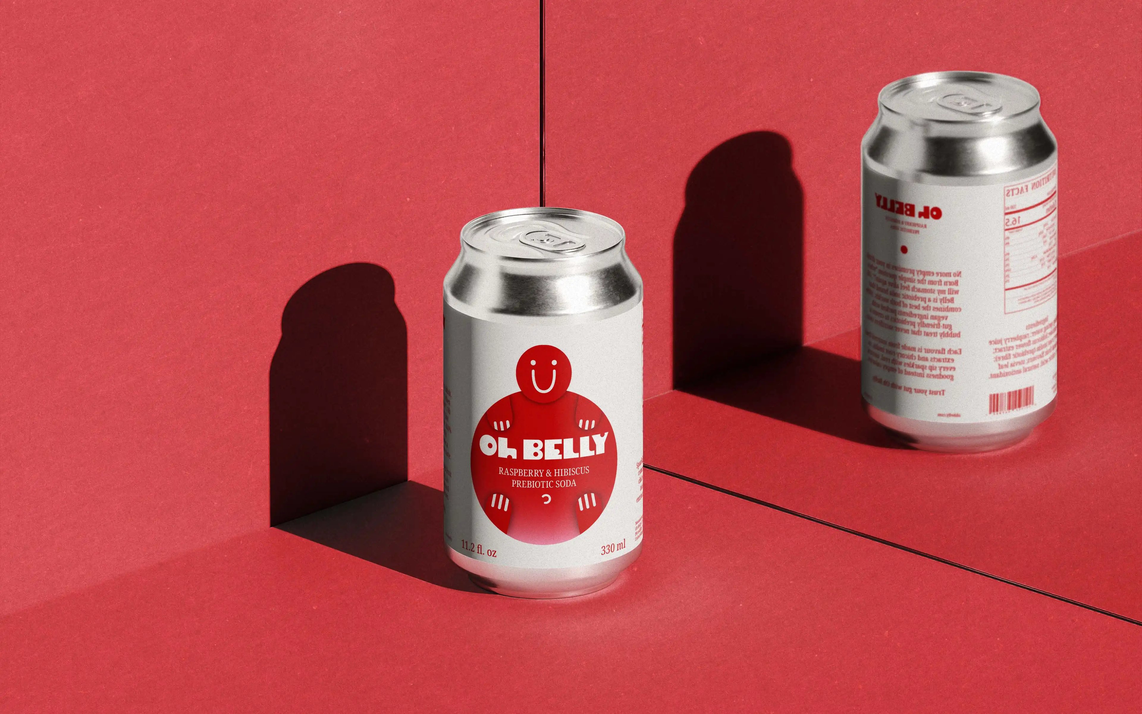
Oh Belly hero image

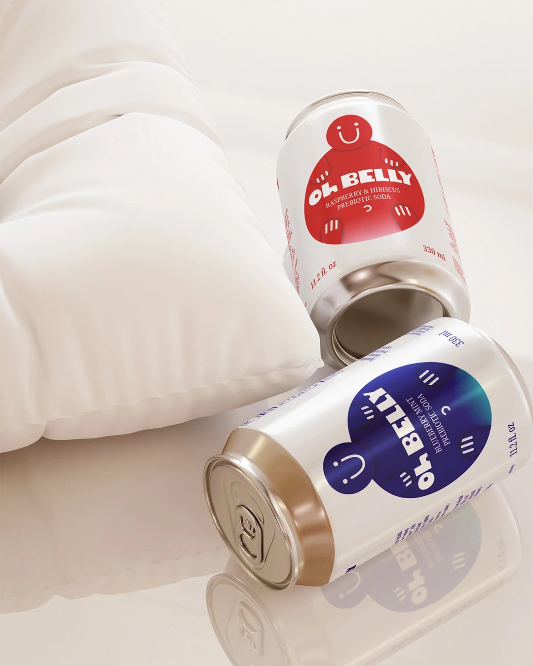
One look needed to communicate the flavour and make the product inviting, while still leaving enough room for the information people need on pack.
About Oh Belly

The Challenge

Prebiotic soda sits beside familiar soft drinks while carrying an additional wellness proposition. Oh Belly needed to explain the product without letting functional messaging dominate the experience. A strong character could attract attention, but the packaging still had to keep flavour and product information easy to find.

The Approach

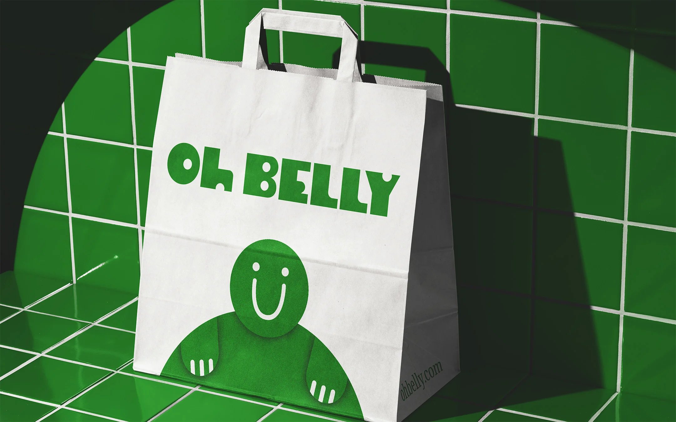
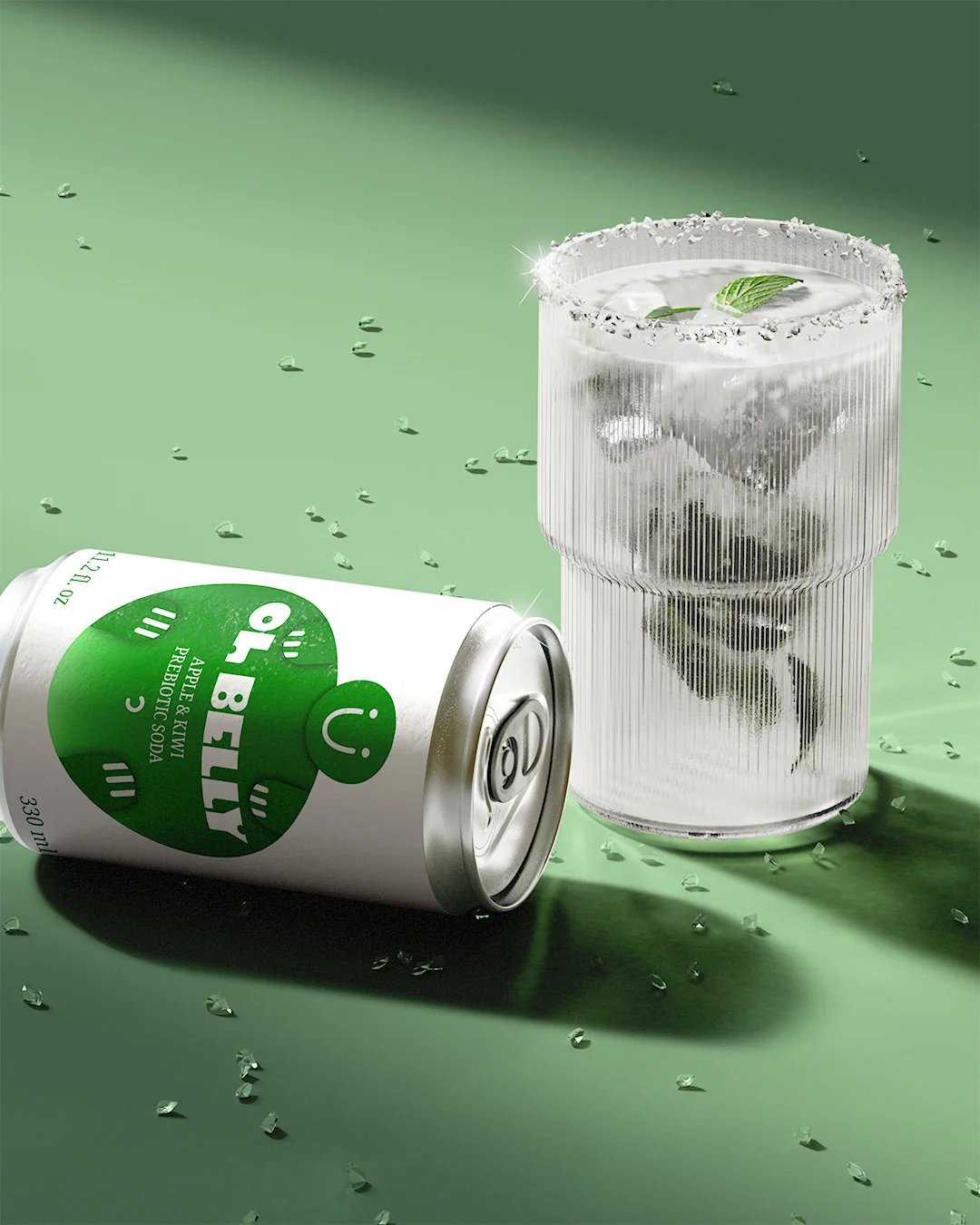
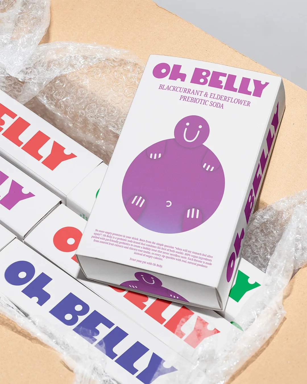
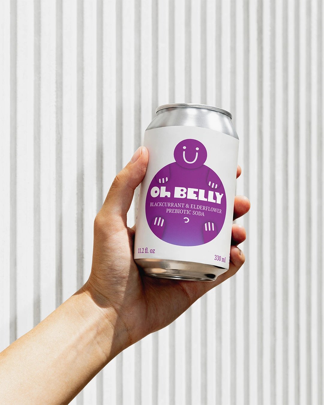
The name suggested a rounded character with an open smile, linking the visual idea back to the belly without turning the pack into a health lecture. Each flavour changes the character's colour, while the white can keeps the system spacious. Pointing arms guide attention towards the flavour name and key information, and the character extends easily into boxes and promotional material.

The Outcome

The character gives the range an immediate focal point while colour separates each flavour. Because the same visual device can move beyond the can, the concept has room to extend into future packaging and campaign work.

Client

Self-initiated

Accolades

  • Braaands - Brand Of The Day
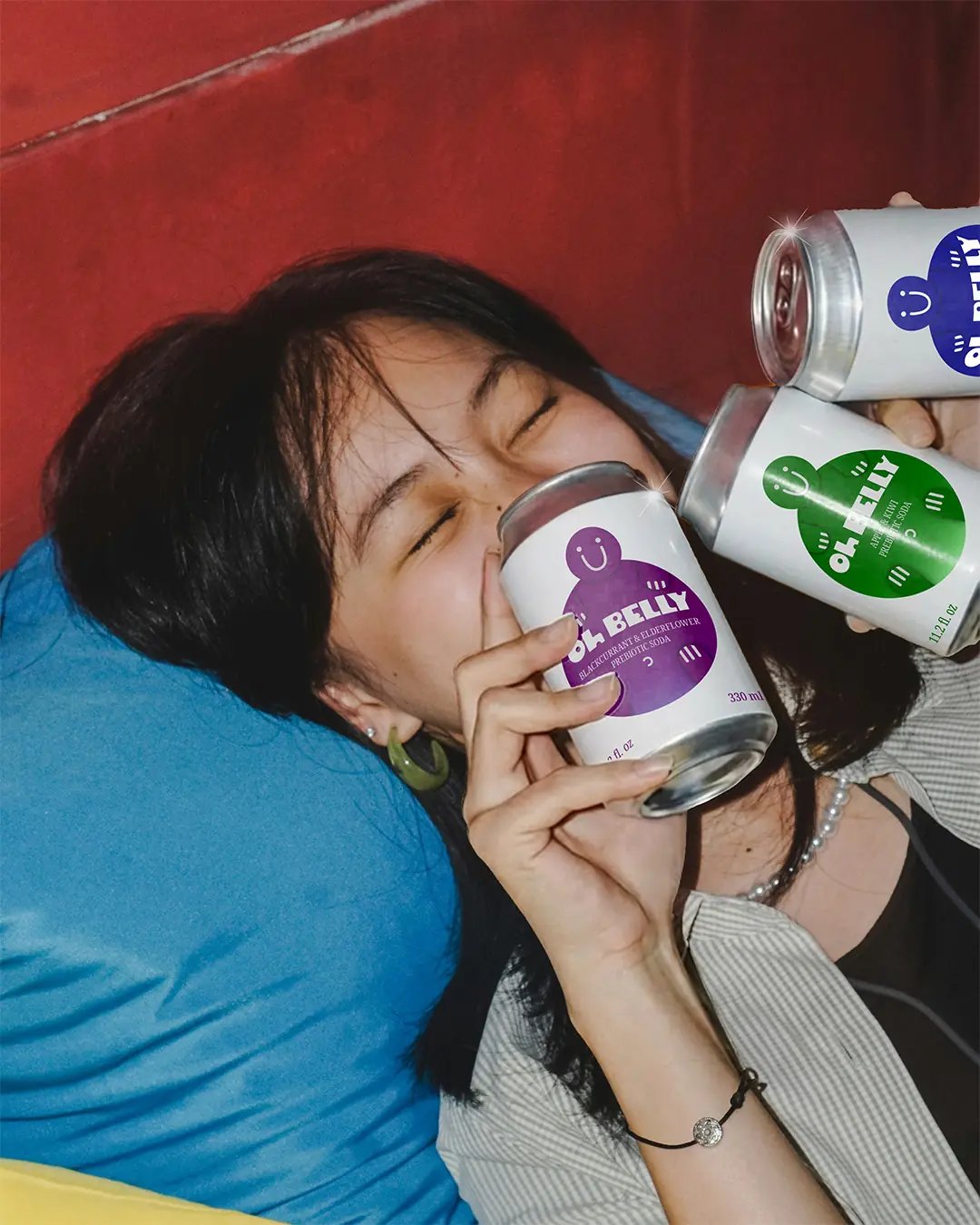
Oh Belly - Woman Posing with 3 Cans
Oh Belly Can in Hand
Oh Belly Cans on Pillow
Oh Belly Bag Packaging
Oh Belly Apple & Kiwi Can & Glass
Oh Belly Box Packaging
Oh Belly Embossed Soap
Next Project

Peppa Please

Thinking about what's next for your business? Let's talk about what you want to achieve and explore how we can make it happen.

Discuss your project