Loading portfolio

Case Study

  • Identity
  • Packaging

Olura

© 2025

Women's Supplements

London, UK
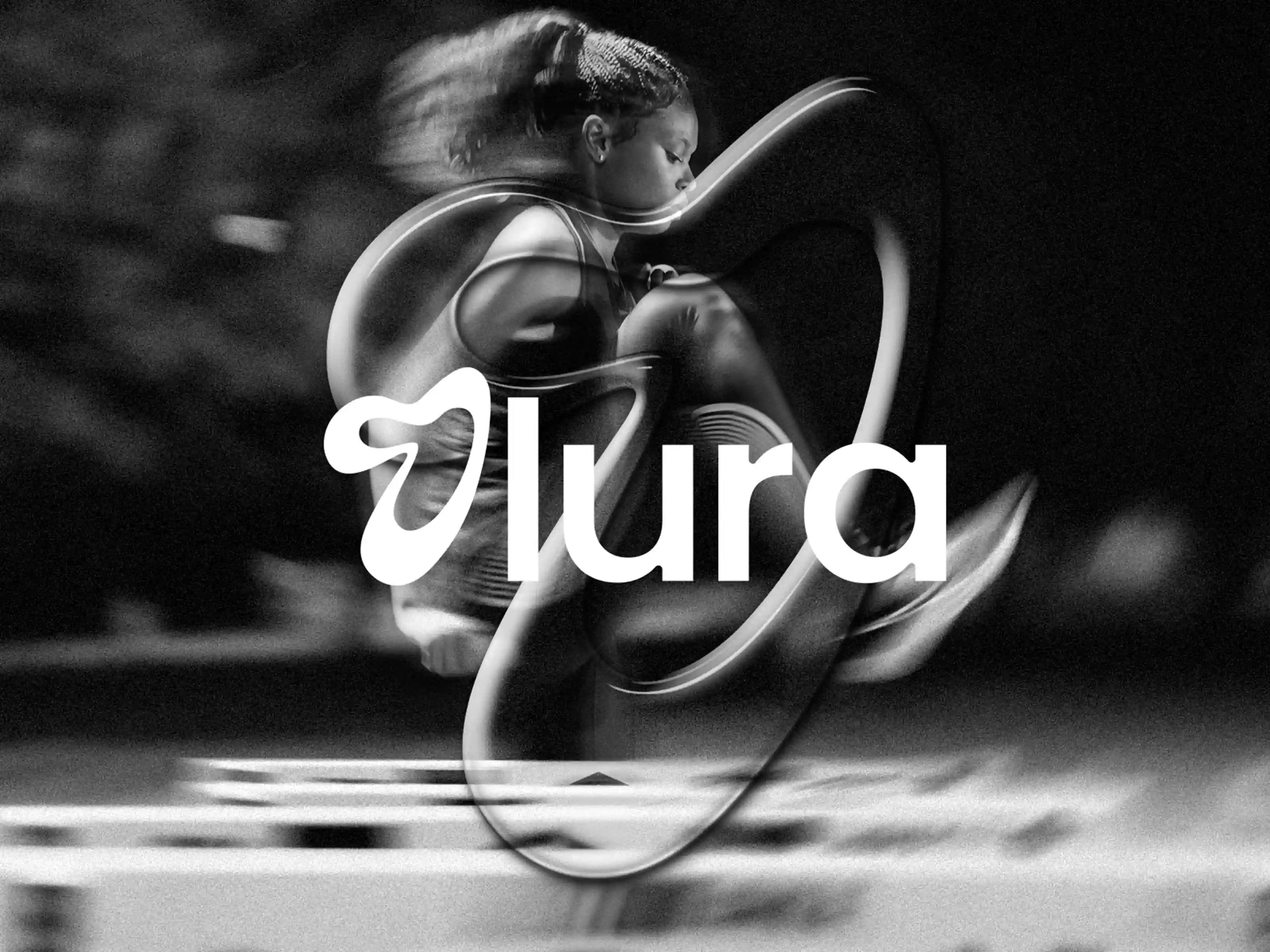
Olura hero image

Olura needed a flexible packaging system that could carry different formulas across changing formats without losing the energy of the wider brand.
About Olura

The Challenge

Women's supplements often sit between clinical language and softer wellness styling. Olura needed a direction with more movement, while keeping the range easy to navigate. The system also had to adapt across tubs and sachets without making each format feel like a separate product family.

The Approach

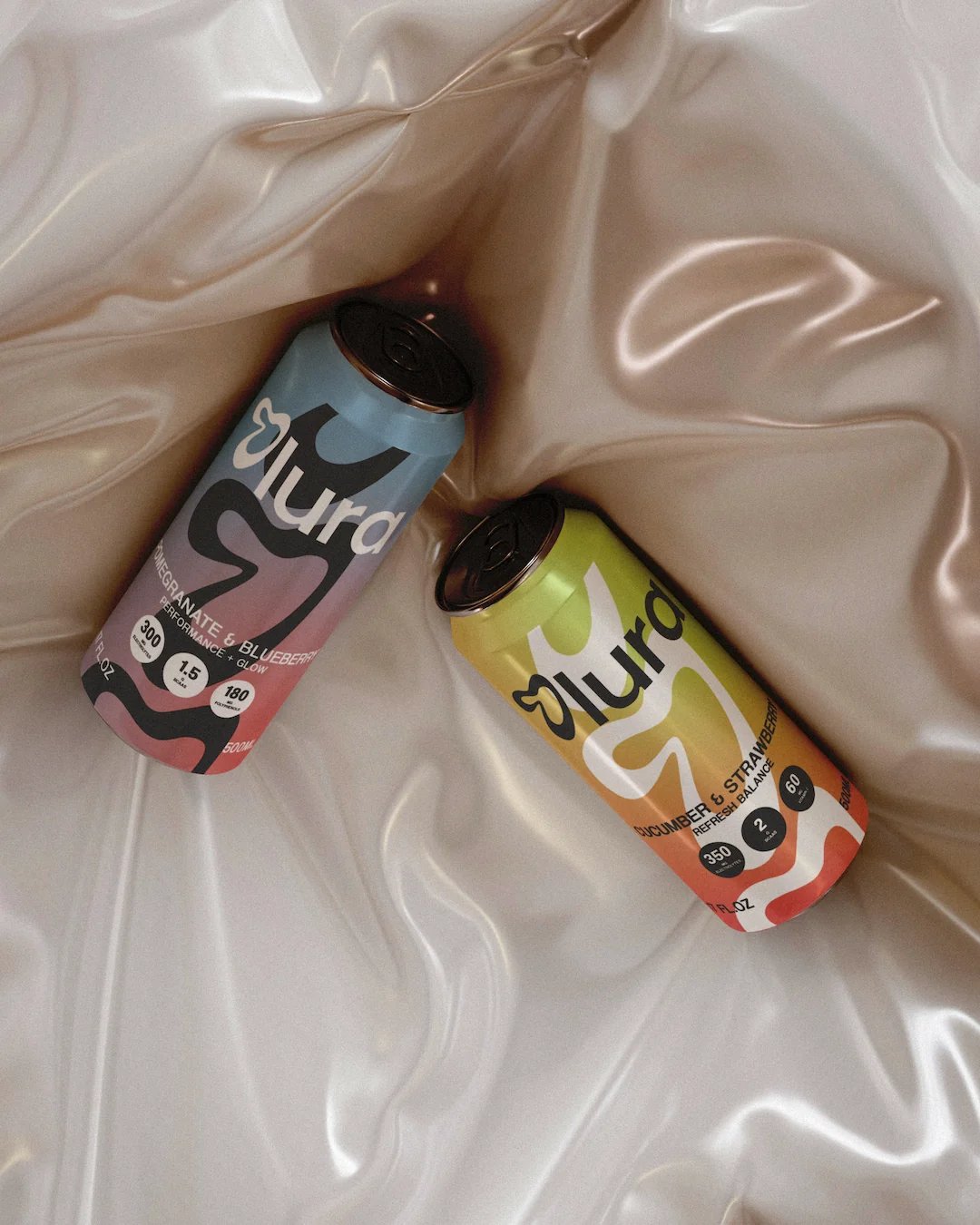
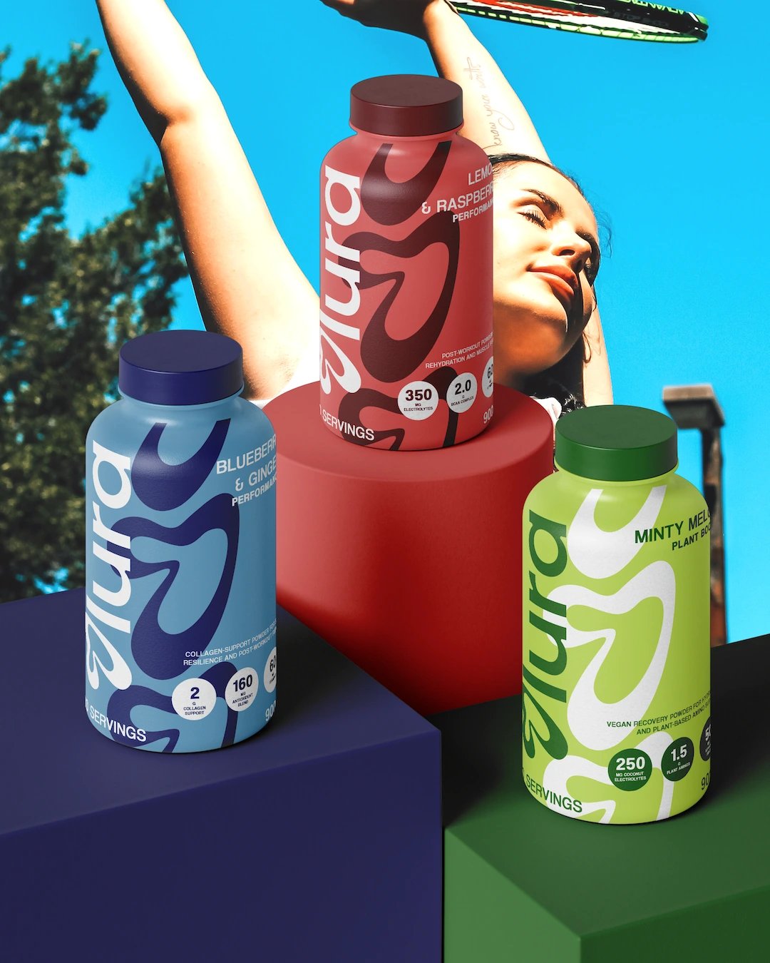
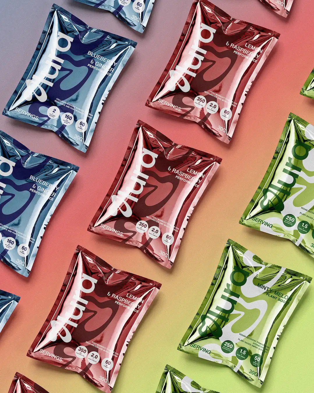
The curved O takes its cue from the changing rhythms of the body and becomes the main graphic device across the range. Repetition at different scales creates movement, while colour separates individual formulas. The layout was designed to adapt from tubs to sachets without losing its structure, and the photography shifts between training and recovery to place the products within a broader daily routine.

The Outcome

The curved O gives products of different sizes a shared visual language, while colour helps separate the formulas. The result is a proposed system that can stretch across a wider range without losing its structure.

Client

Self-initiated

Accolades

  • Contra - Honourable Feature
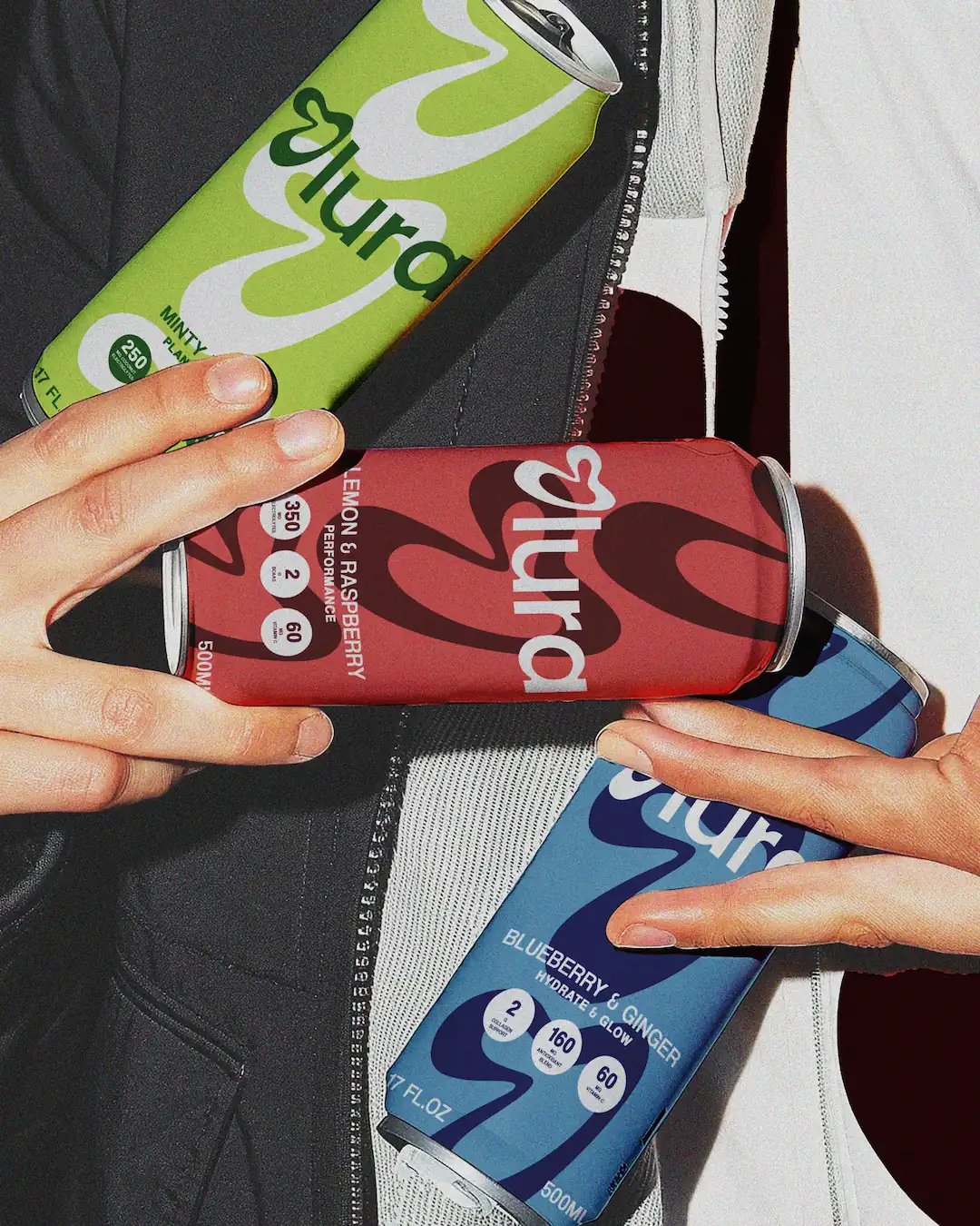
Olura Cans Held in Hands
Olura Supplement Sachets
Olura Cans Sit on Silk
Olura Supplement Pills
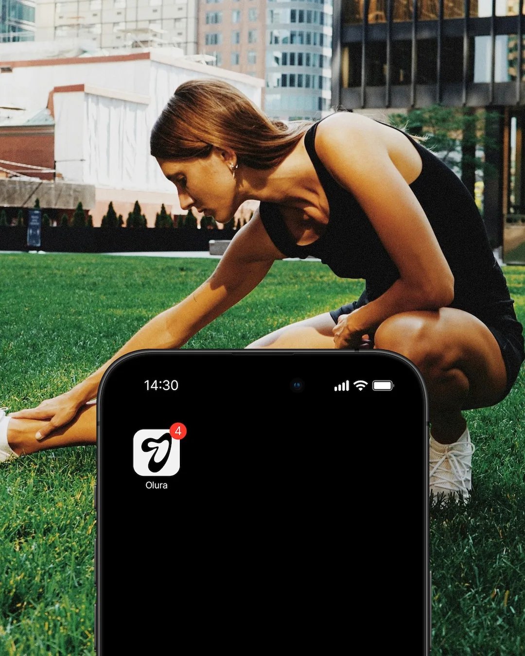
Olura Mobile App Icon
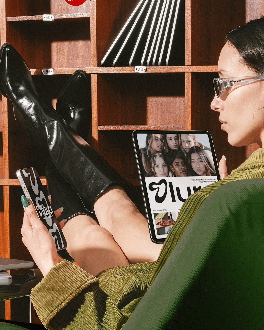
Olura Mobile App Loading Screen & Web App Hero Section on Tablet
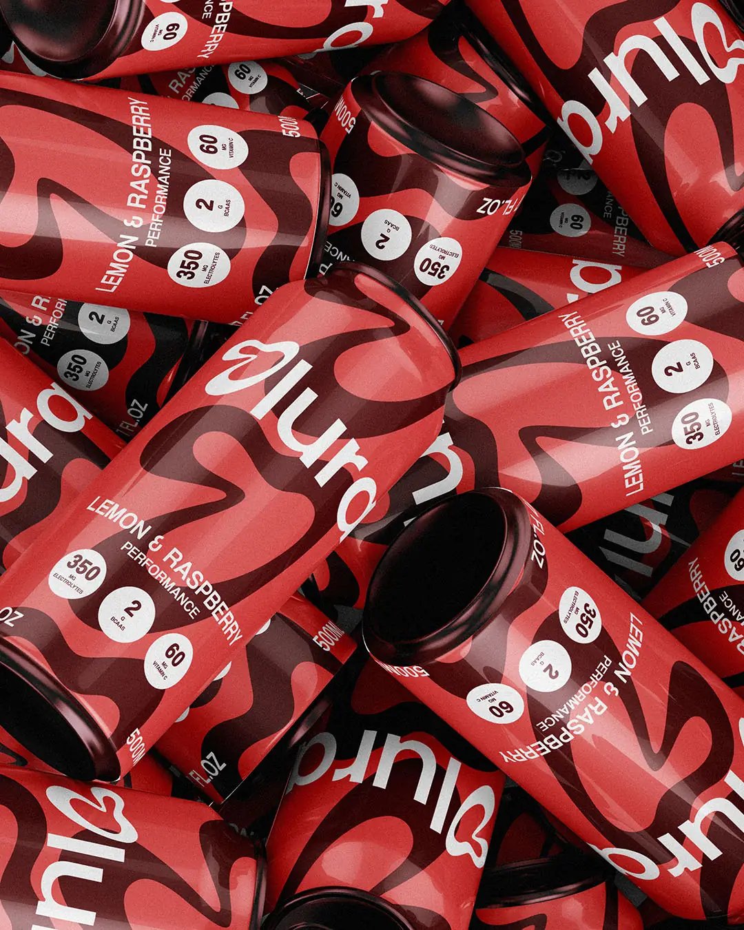
Pile of Olura Lemon & Raspberry Performance Cans
Next Project

Still

Still  Landscape Preview Image

Thinking about what's next for your business? Let's talk about what you want to achieve and explore how we can make it happen.

Discuss your project