Case Study
- Identity
- Experience
Pét Pals
© 2026
Rosé Pét-Nat
Montpellier, France
About
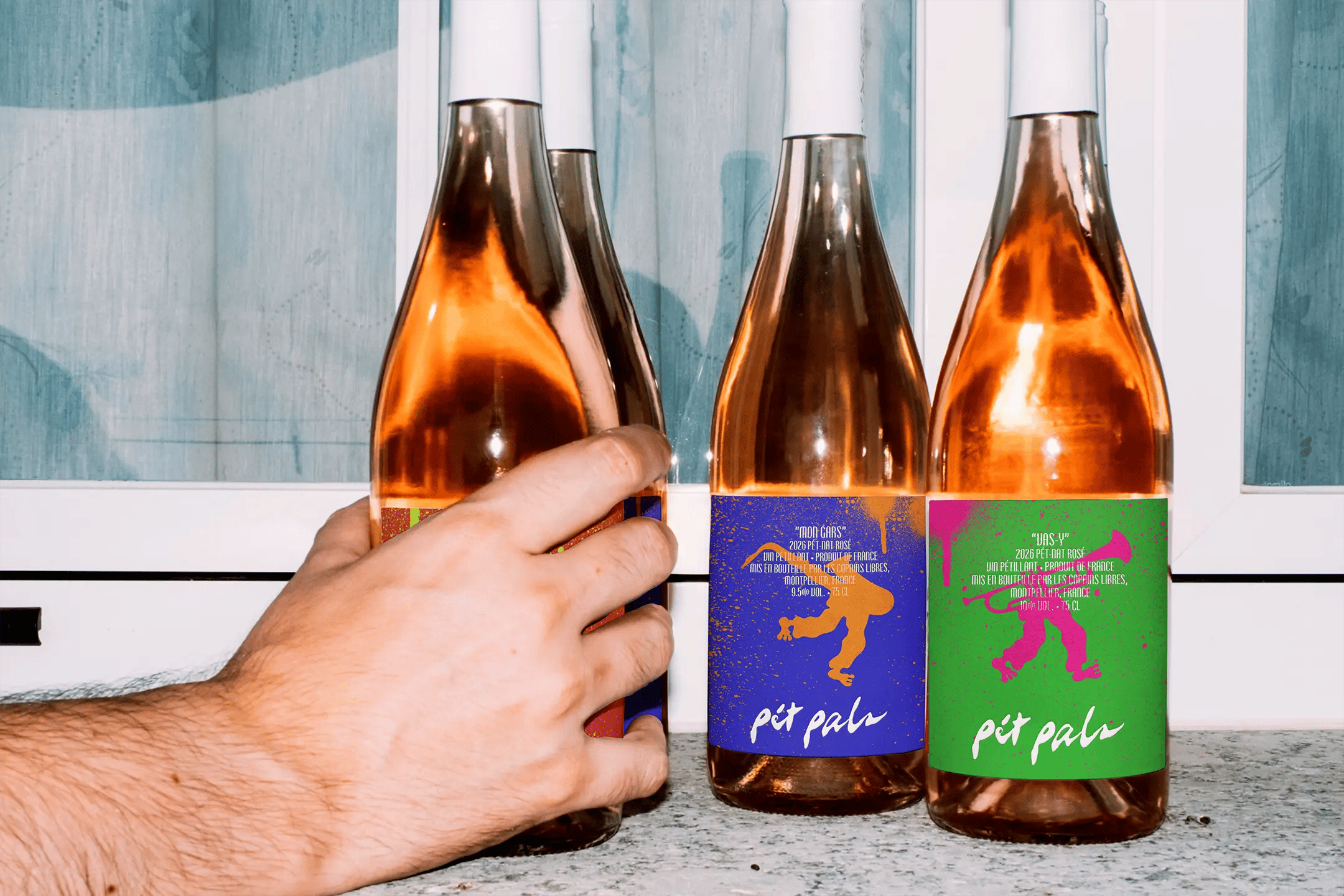
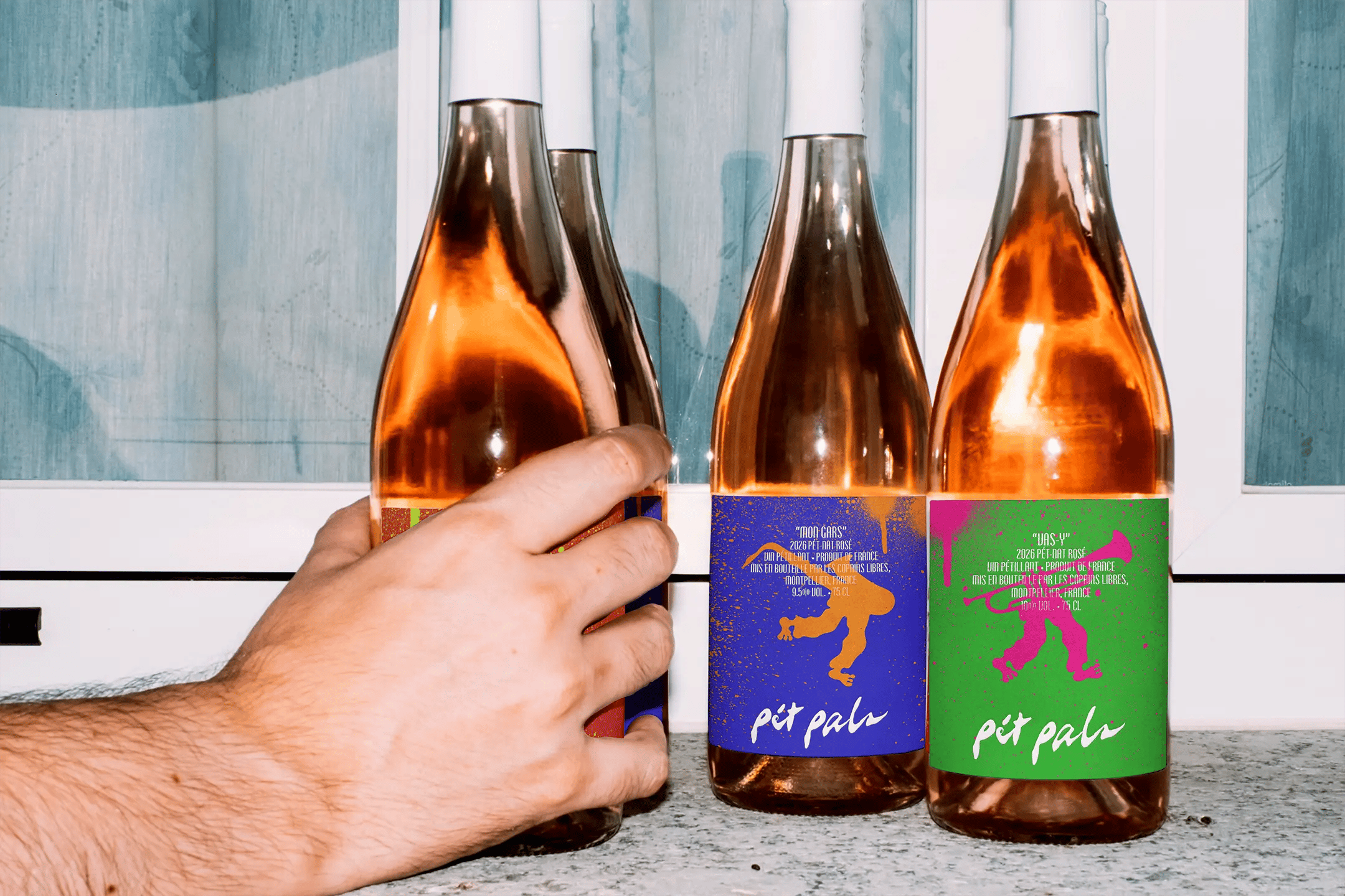
Pét Pals is a conceptual identity for three rosé pét-nats made for Fête de la Musique. Every 21 June, music moves through the streets, squares, bars and gardens of France. The occasion shaped the brief: create a low-intervention wine range that could belong in that atmosphere, feel credible on the shelf and stay approachable once the bottles reached a table, park or pavement.
Good wine. Loud music. Your pals.
Accolades
Brand Brainy - Honourable Feature
Made for 21 June
Fête de la Musique gave the brand a specific social setting from the beginning. The wine needed to feel easy to bring, easy to share and comfortable around people who know very different amounts about the category. That meant avoiding the formality often attached to wine while keeping enough product credibility for someone who already knows what they like.
The identity grew from that tension: a proper bottle of pét-nat with the energy of something passed between friends while following the music across the city.
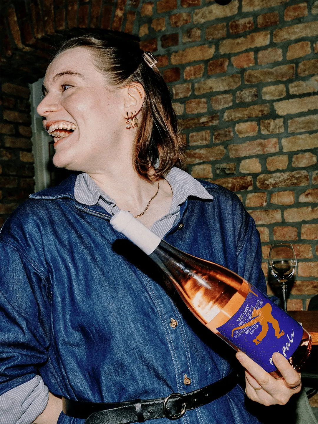
Three Drinkers, One Crowd
Three audience profiles tested the idea from different angles. Jean Pierre is a food-led host with high wine confidence. He looks for taste, credibility and something worth putting on the table. Juliette is a social creative who responds to packaging, recommendation and price. Timothée is a music-led drinker with lower wine confidence, where accessibility and group excitement carry more weight.
Their knowledge of wine changes. Their behaviour overlaps. They discover, bring, share and talk about what they are drinking. That shared behaviour became more useful than designing for one fixed idea of a “wine person”.
Meet the Pals
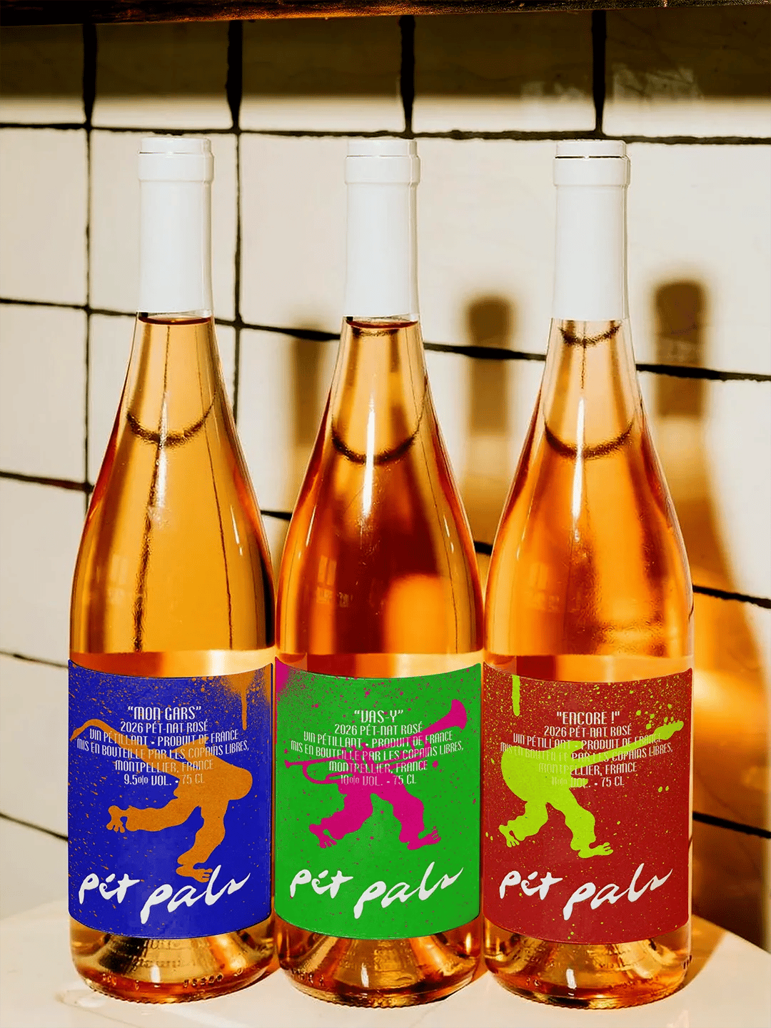
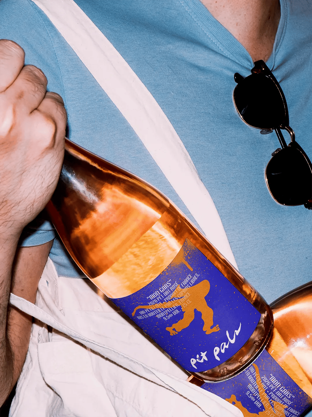
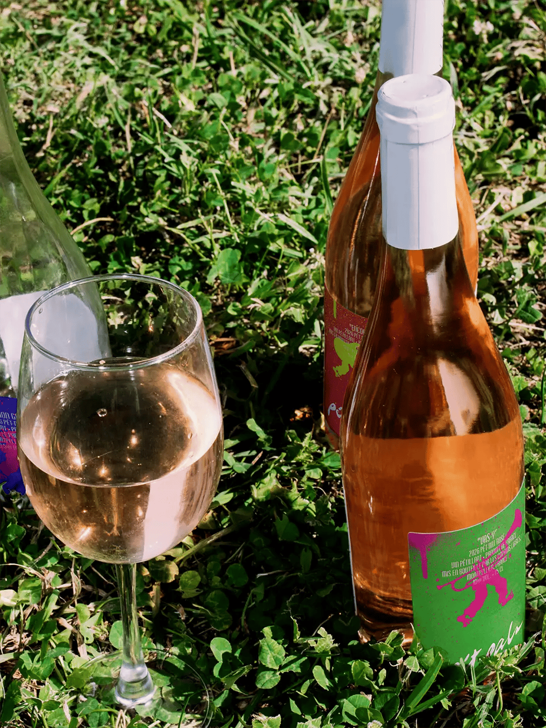
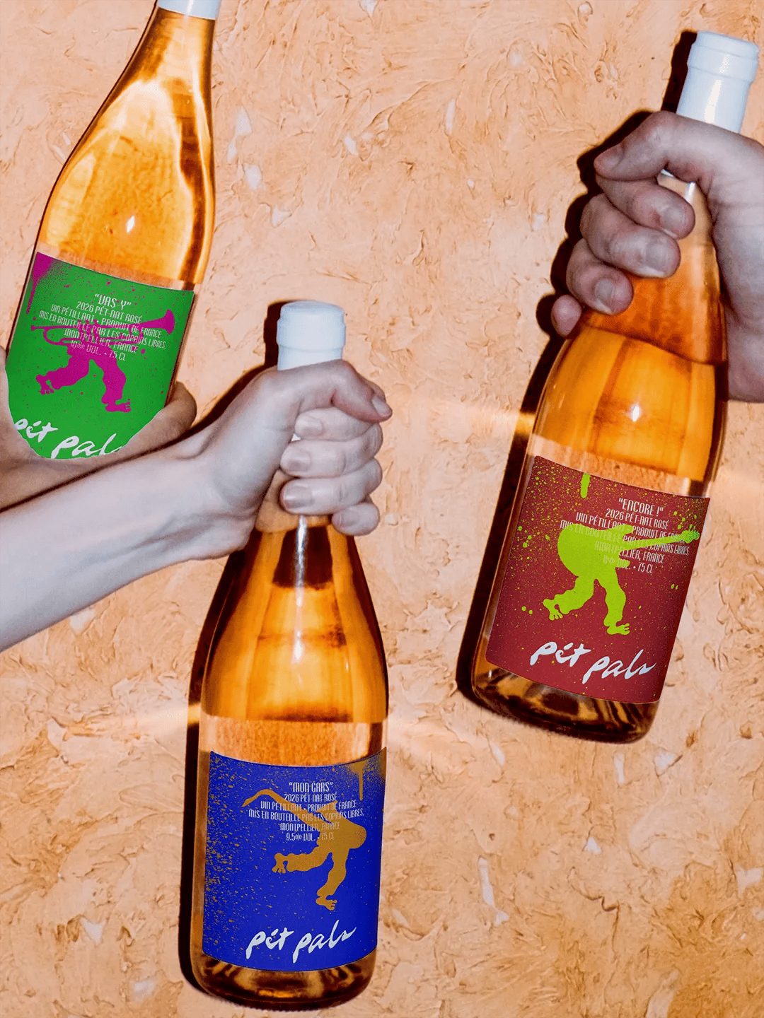
Mon Gars, Vas-y and Encore! give the three wines separate personalities within one group.
Early character studies relied too heavily on repeated saxophone poses. Changing the instruments, stance and movement gave each bottle its own character and made the trio feel more like a crew. The hand-drawn figures carry that personality across the labels. Bare feet, loose movement and imperfect linework keep them informal, while the changing colour combinations make each wine easy to recognise within the range.
A Little Noise on the Label
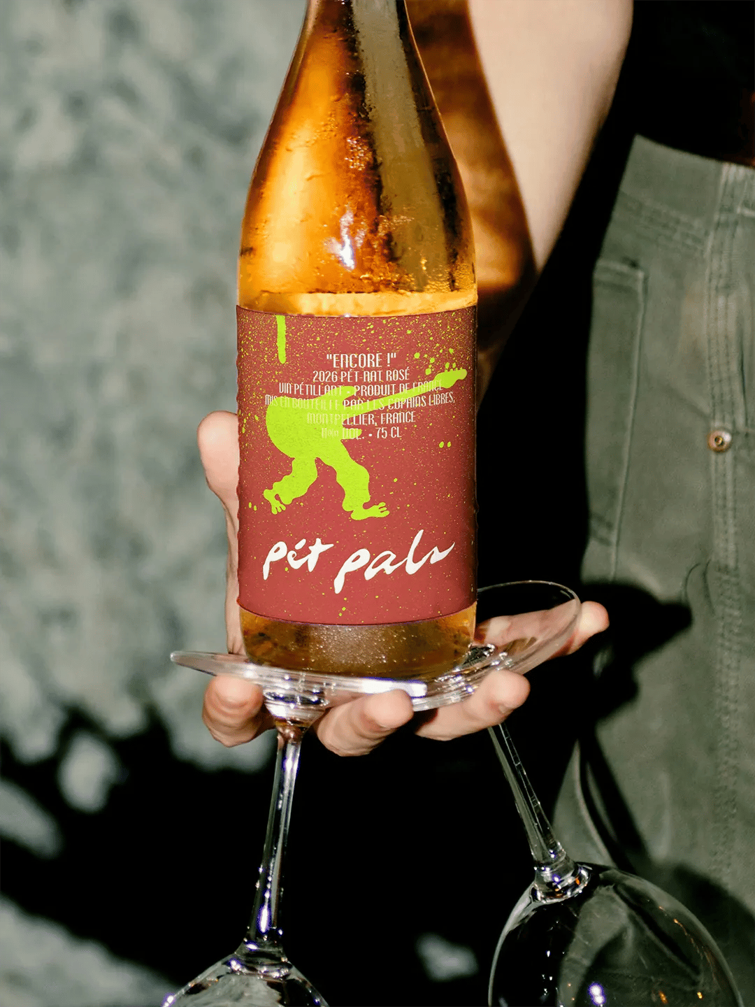
The labels borrow some of the visual disorder of the event itself.
Type overlaps. Spray marks interrupt the surface. Grain gives the artwork a printed texture. These elements were kept because a cleaner finish began to lose the energy that made the characters work.
The structure underneath stays controlled. The Pét Pals name anchors the range, while each character and colour pairing creates the variation. Product information remains readable where it matters, allowing the front of the bottle to carry more of the personality.
Following the Music
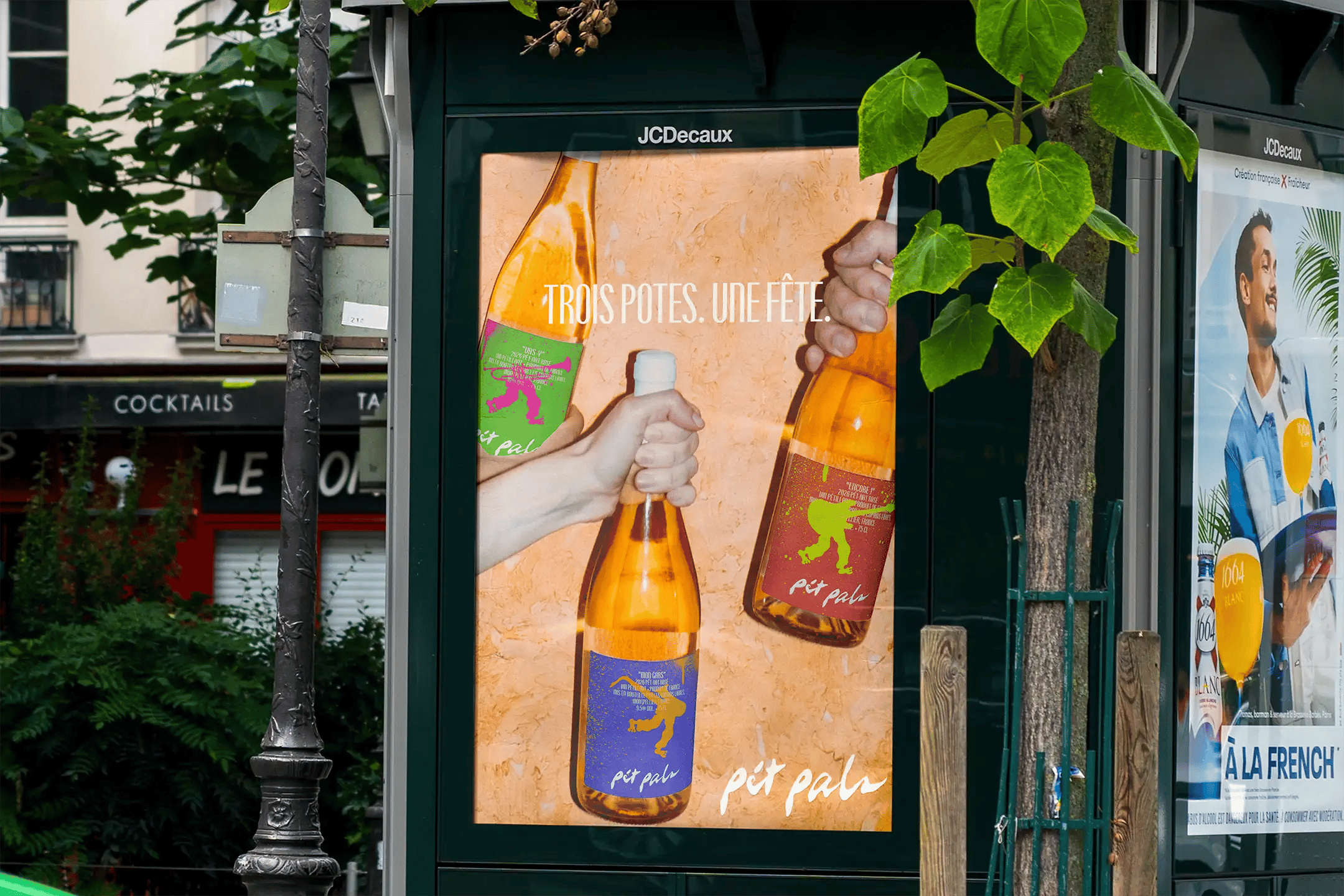
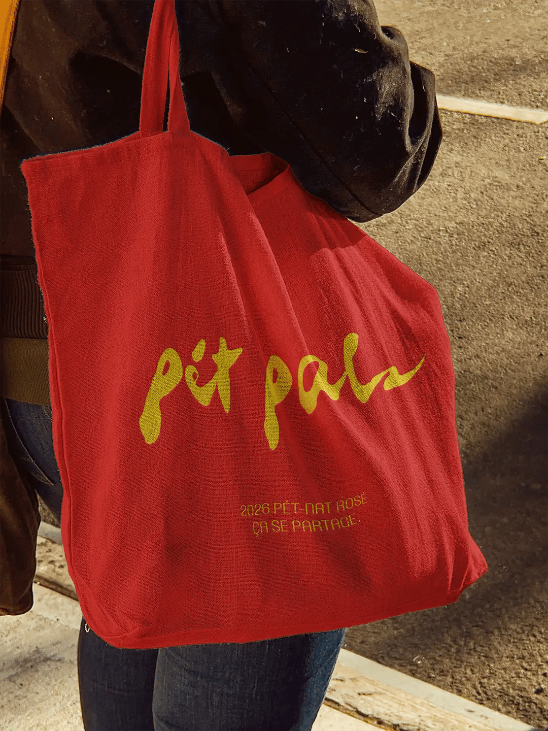
The identity extends naturally beyond the bottle because the original idea already belongs outside.
Posters and totes carry the same characters, colour clashes and loose graphic language into the places where the wine might be seen, carried and shared. The system can change in scale without losing the relationship between the three wines.
Outcome
Pét Pals turns a three-bottle range into a small cast of personalities shaped around the social rhythm of Fête de la Musique.
Each wine has enough character to be chosen on its own, while the complete range feels like one group arriving at the same party.
Working on something similar?