Case Study
- Identity
- Packaging
Poco A Poco
© 2026
Food Truck
New York, USA
About
Poco A Poco is a concept identity for a Venezuelan street-food truck in New York.
The project was created for a competition where each submission contributed €1 to earthquake relief in Venezuela. It explores how a food brand can carry cultural memory into a fast-moving street setting.
The identity needed to feel familiar to Venezuelans living abroad and inviting to New Yorkers discovering the food. As a non-Venezuelan designer, I began with research into San José de Barlovento and its Afro-Venezuelan culture.
Accolades
Contra - Honourable Feature
Little by Little
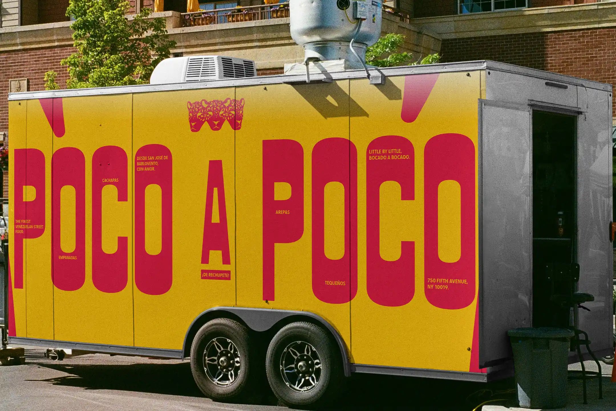
“Poco a poco” means “little by little.”
The name carries the pace of the brand, from food discovered bite by bite to recipes carried between generations and communities building new ties in a different city.
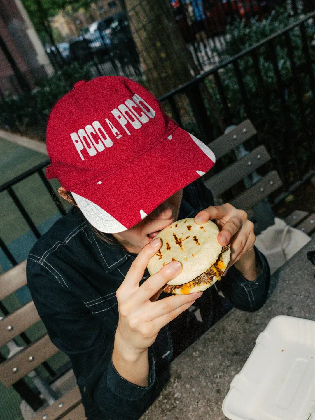
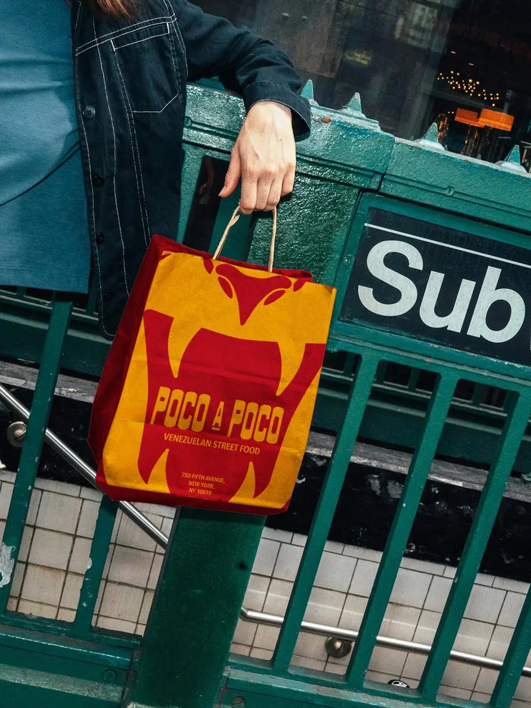
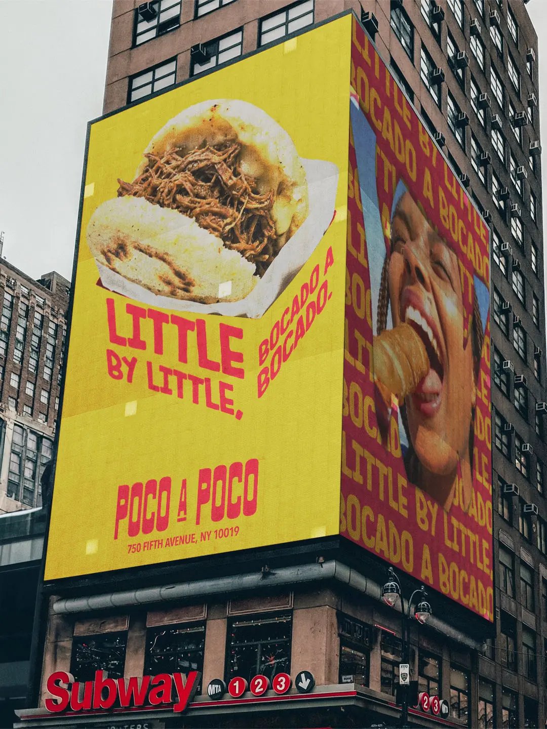
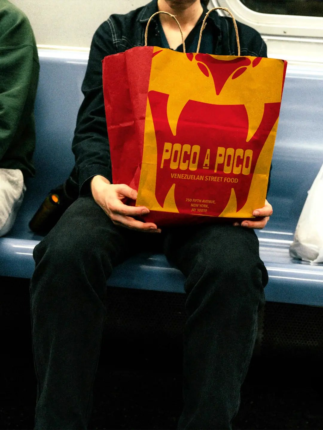
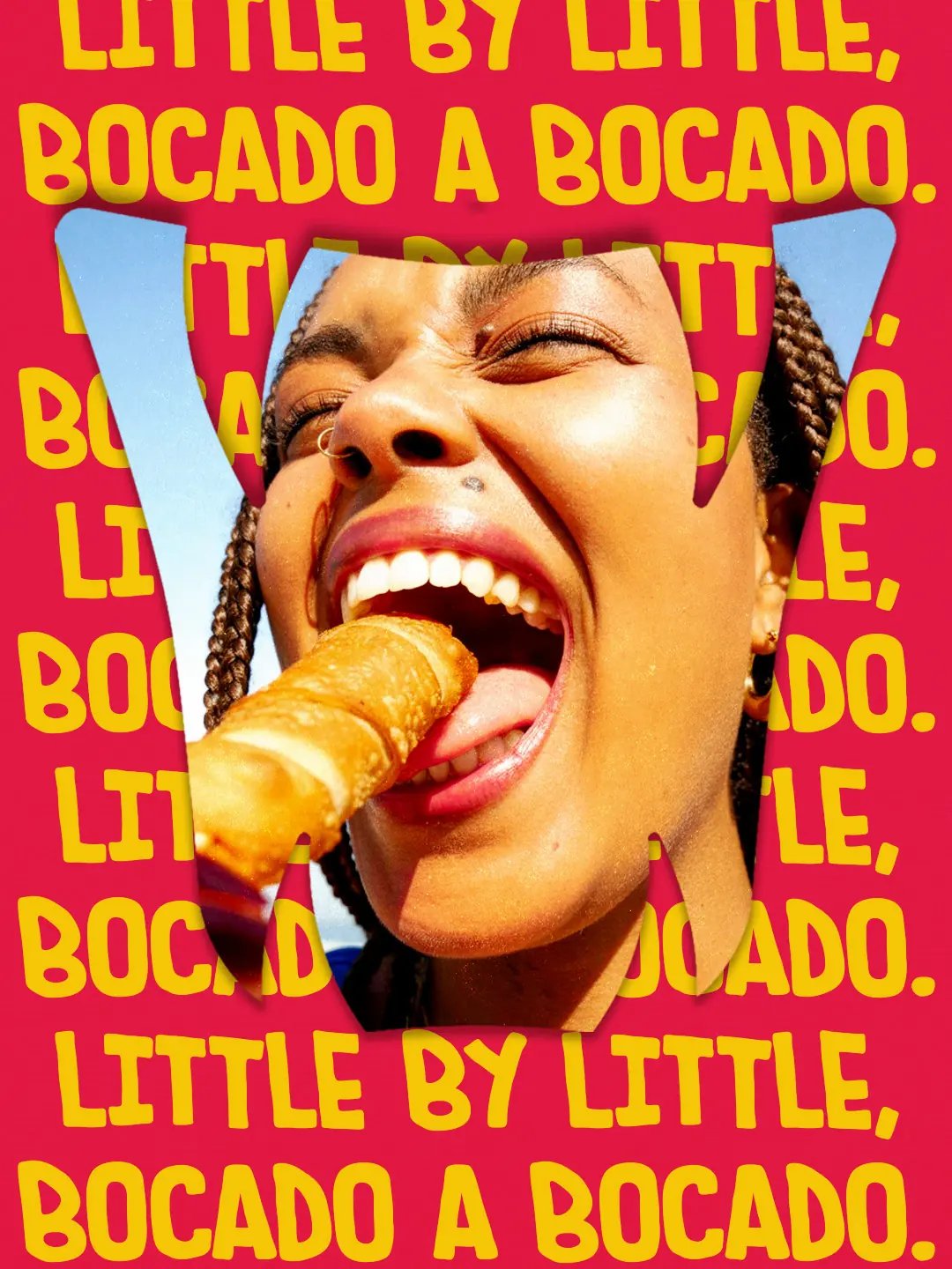
“Poco a poco. Bocado a bocado.” brings the idea back to eating: little by little, bite by bite. That rhythm shaped the merchandise and packaging designed to move through the city with the customer.
Origin, Adaptation and Community
San José de Barlovento sits within the Barlovento region of Miranda. Its history is tied to cacao agriculture and Afro-Venezuelan community life.
Three ideas guided the identity. Origin gave the brand a foundation in Barlovento’s food and agricultural history. Adaptation recognised how Venezuelan cuisine continues through movement and exchange. Community connects the two, because traditions live through the people who prepare and share them.
A Mark With Three Perspectives
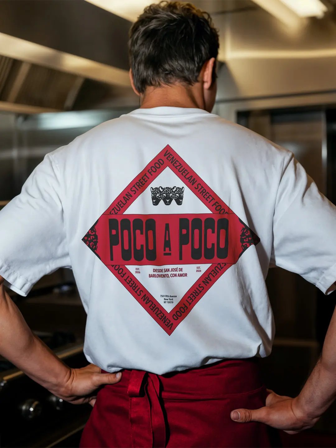
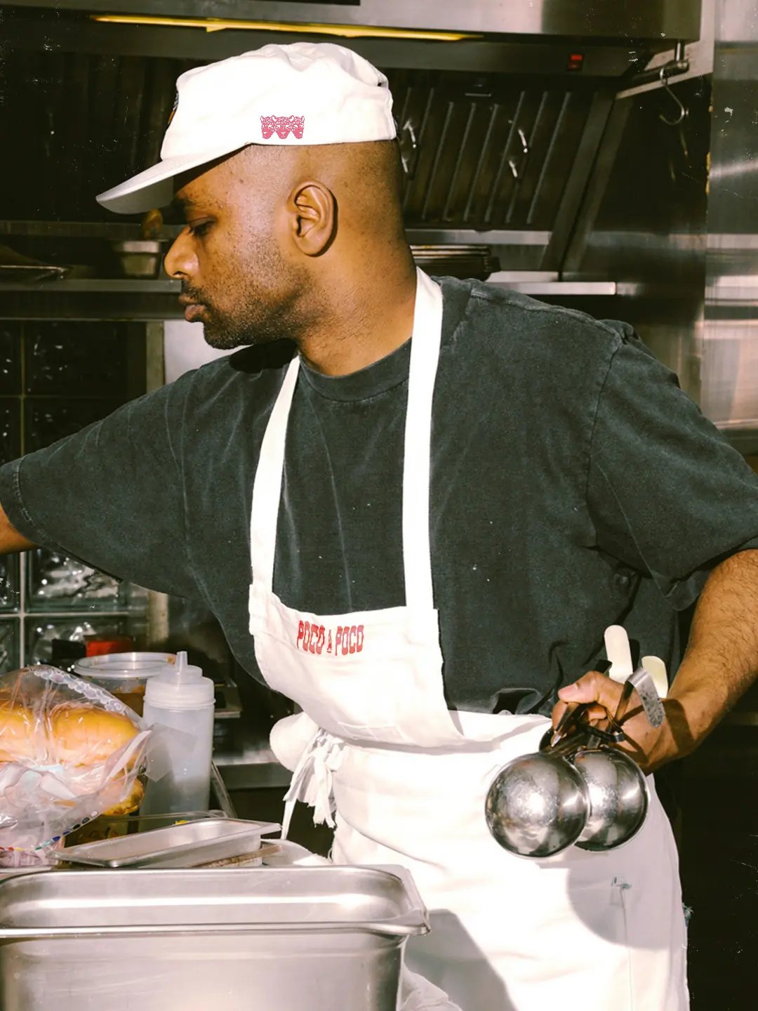
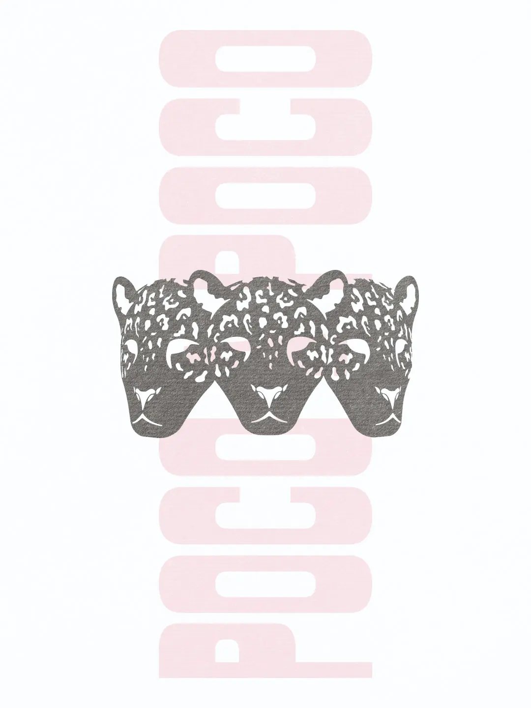
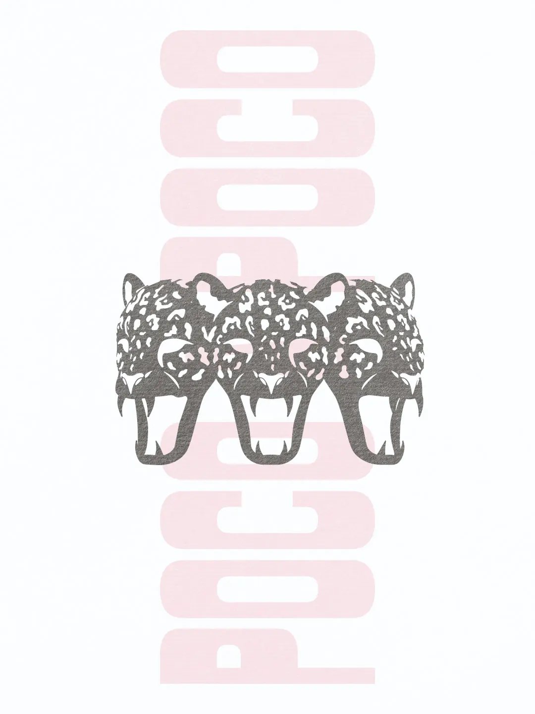
The jaguar has an ecological connection to Venezuela. The three-headed form is original to the brand. Its outer heads represent origin and adaptation. Community sits at the centre, holding the two together.
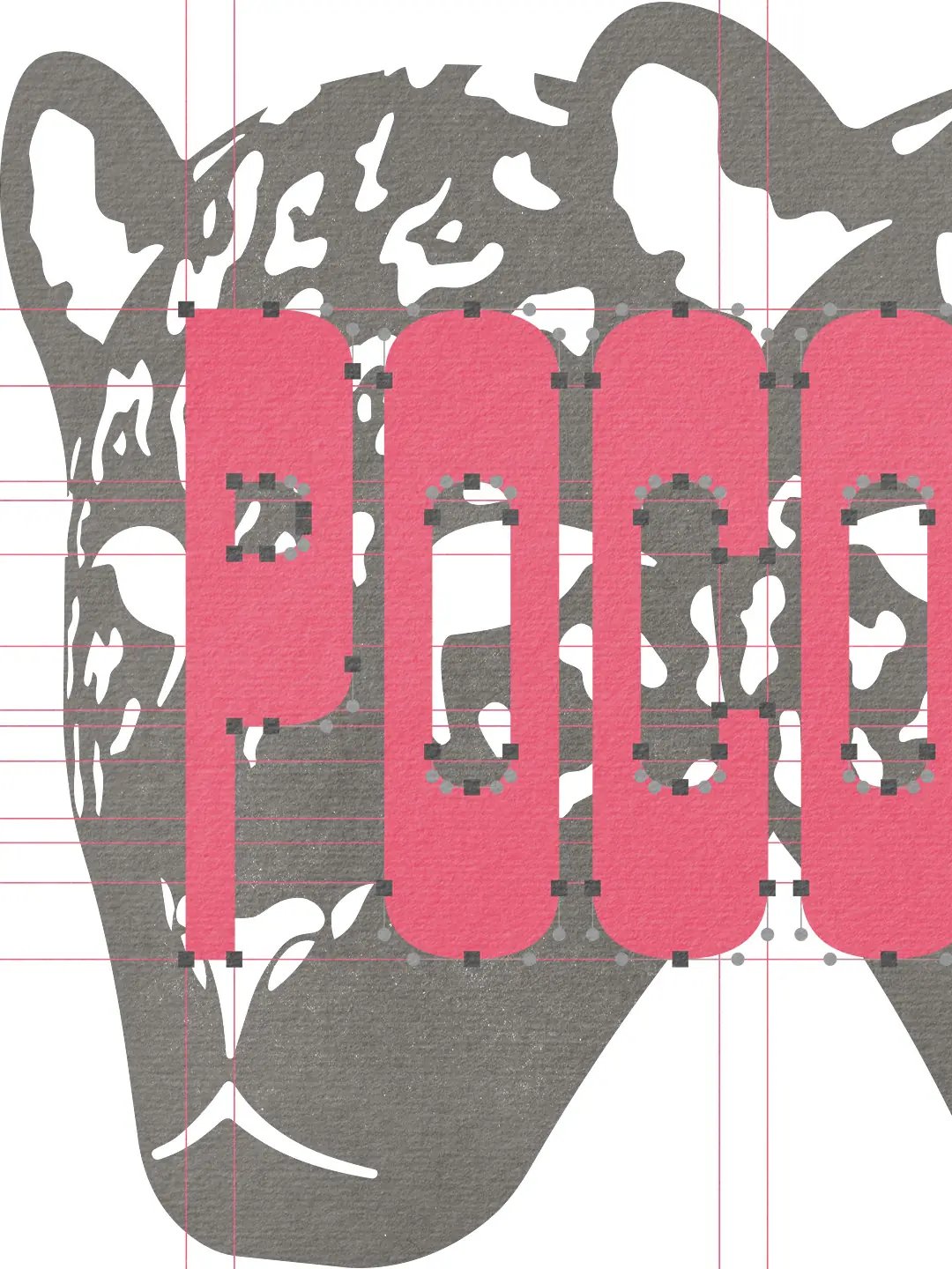
Early versions contained more facial detail. At smaller sizes, the three heads began to merge. Reducing the linework gave each head a clearer silhouette.
The closed-mouth version acts as the primary mark. The open-mouth version brings appetite and movement to posters. Its inner shape frames photography, allowing the symbol to shape the composition.
Built for the Street
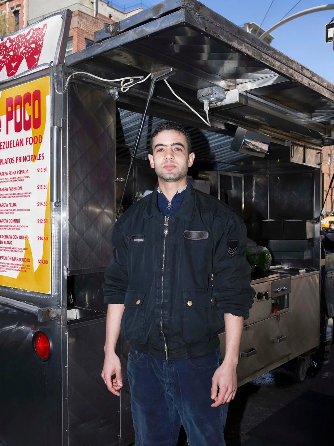
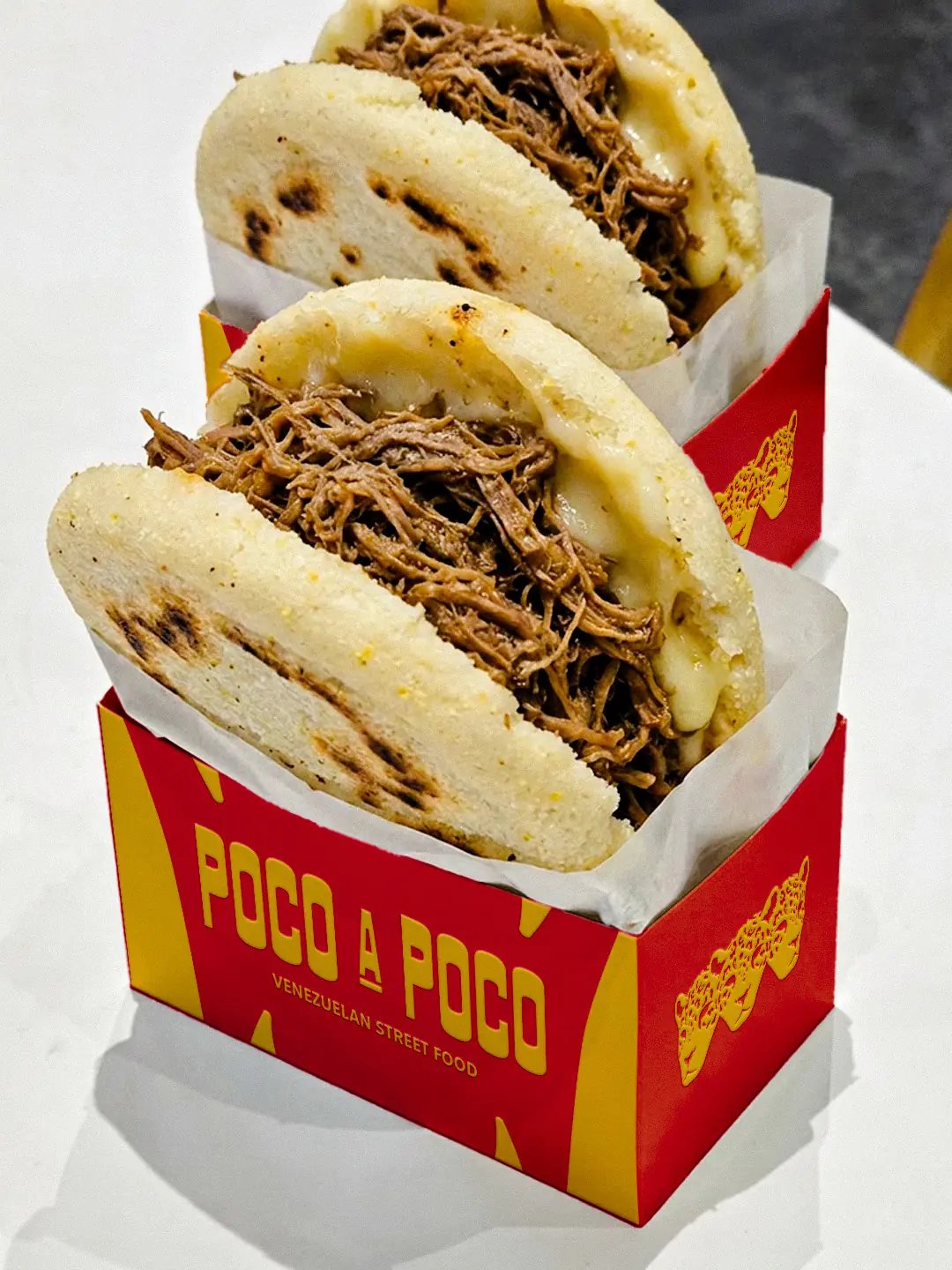
On New York’s fast-moving streets, the system needed to hold attention and make unfamiliar food easy to understand. Street applications use scale and repetition to build recognition quickly. Packaging carries that recognition beyond the truck.
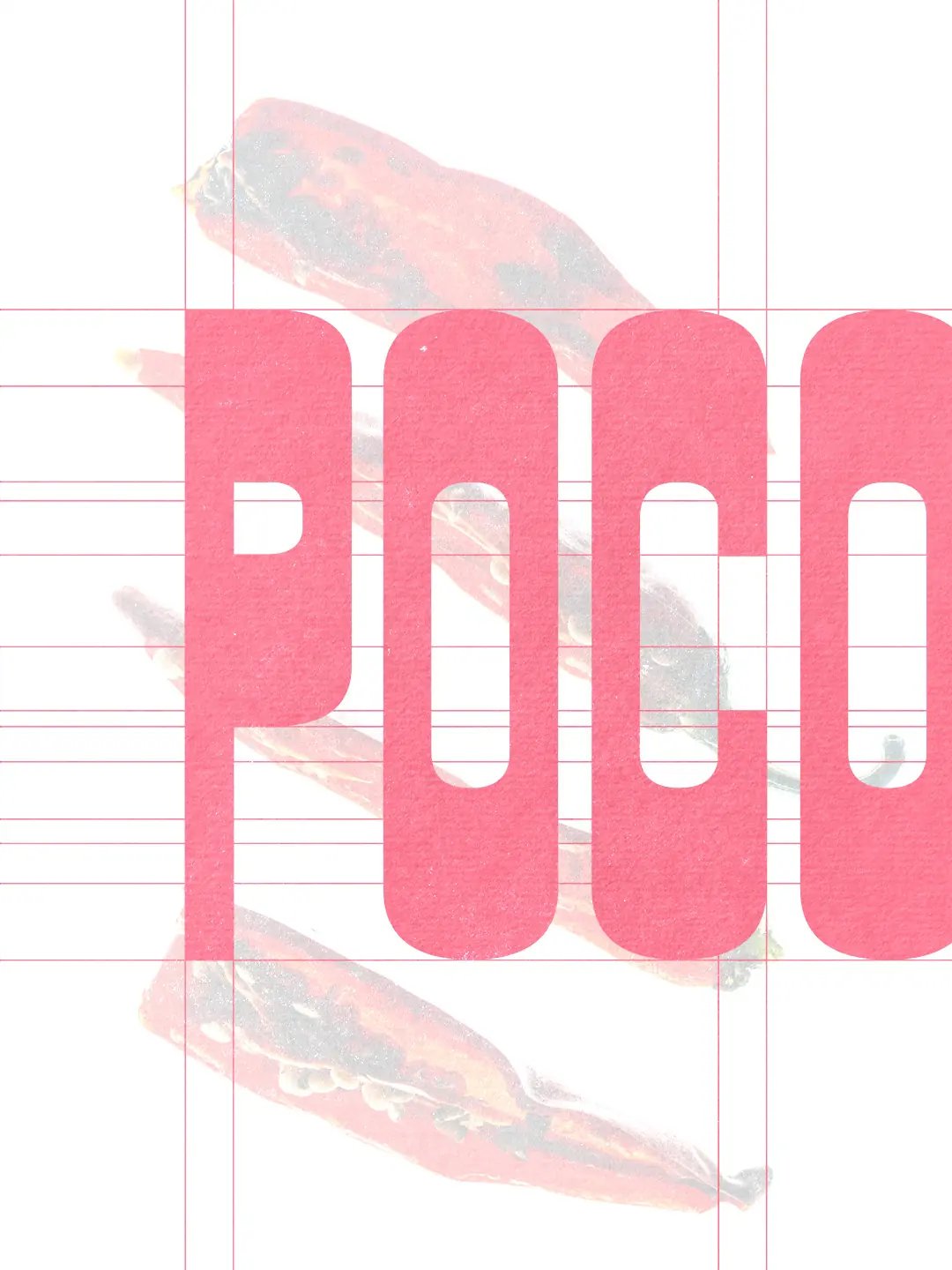
The palette began with the colours of the Venezuelan flag. As the system developed, that national reference felt too broad for a brand rooted in Barlovento. Blue also pulled the applications away from the warmth of the food.
Red and yellow held their presence against the truck’s stainless steel and sat naturally beside the photography. Yellow echoes maize. Red gives the system energy at street level. Black and off-white give the editorial layouts room to breathe.
Food, People and the City
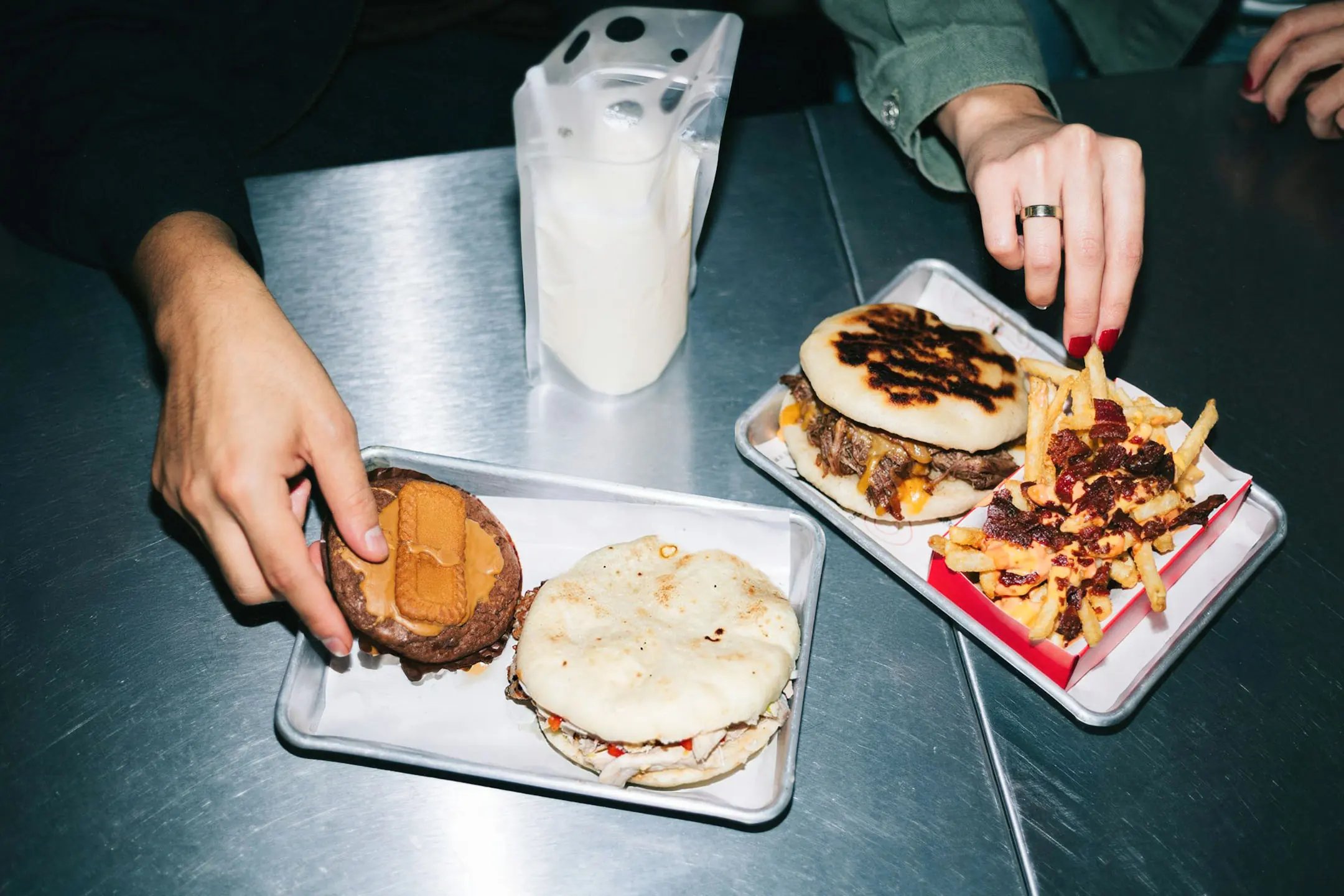
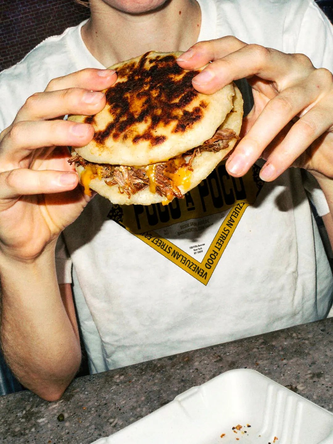
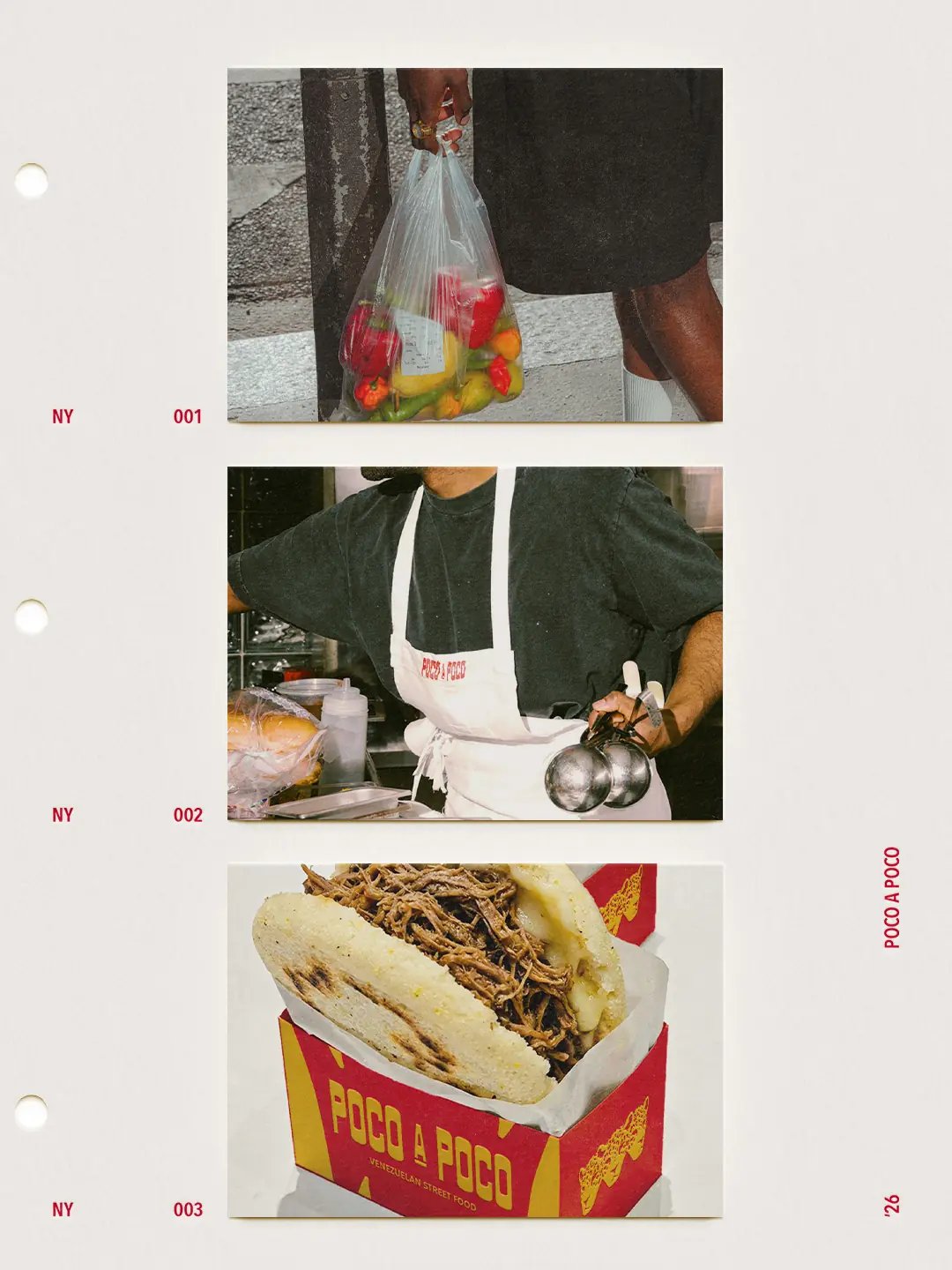
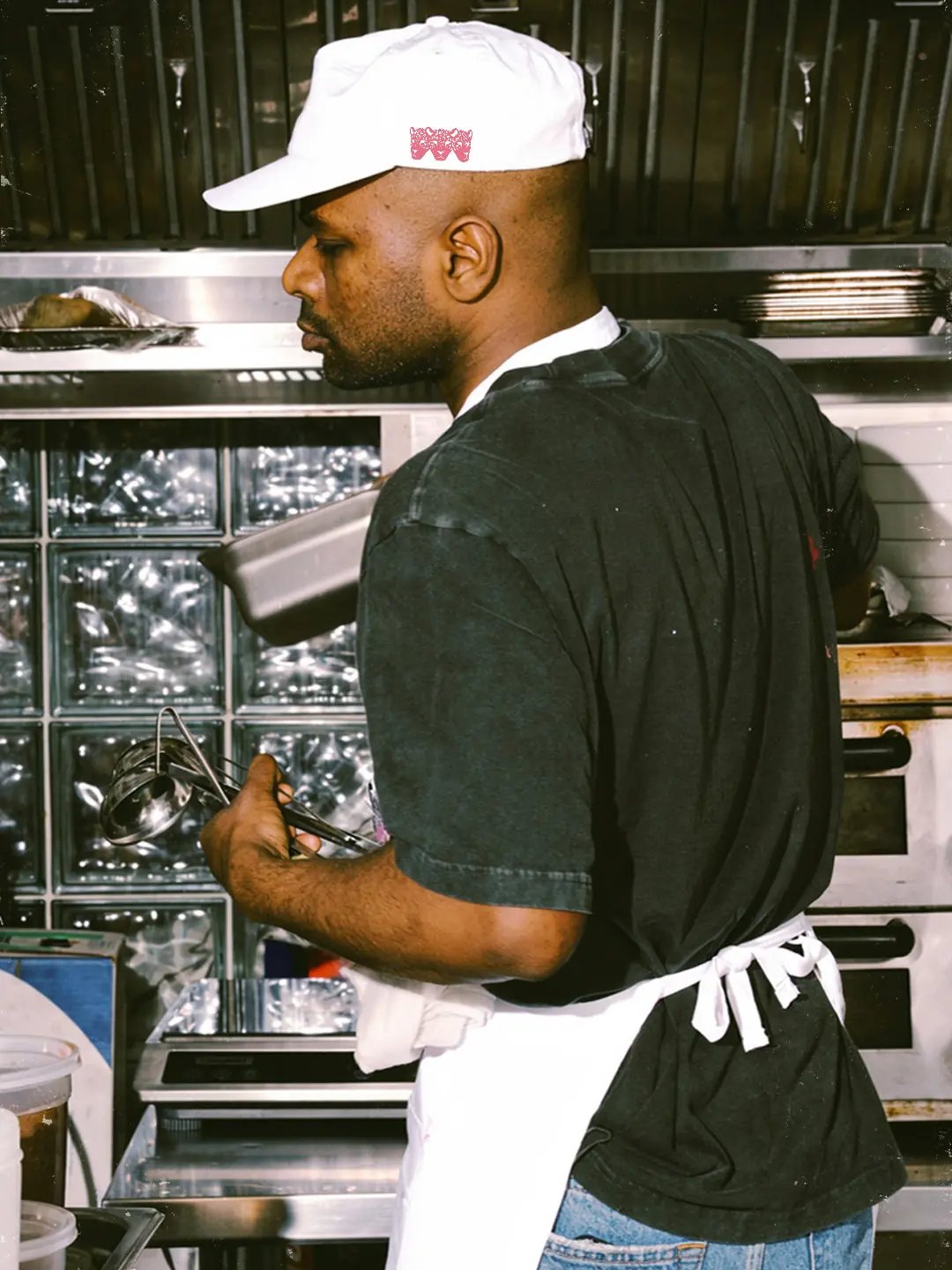
Photography places the identity in use. Direct flash and imperfect framing keep the food immediate. Subway settings place the brand within everyday New York. Quieter editorial sequences slow the pace and give the regional story more room.

Outcome
The final identity works at two speeds. At street level, Poco A Poco has the presence to compete for attention in New York. A closer look reveals a regional story shaped by food and community.
That regional story is designed to give Venezuelan audiences meaningful points of recognition. For new customers, the system creates an inviting entry point into unfamiliar food with more confidence.
Working on something similar?