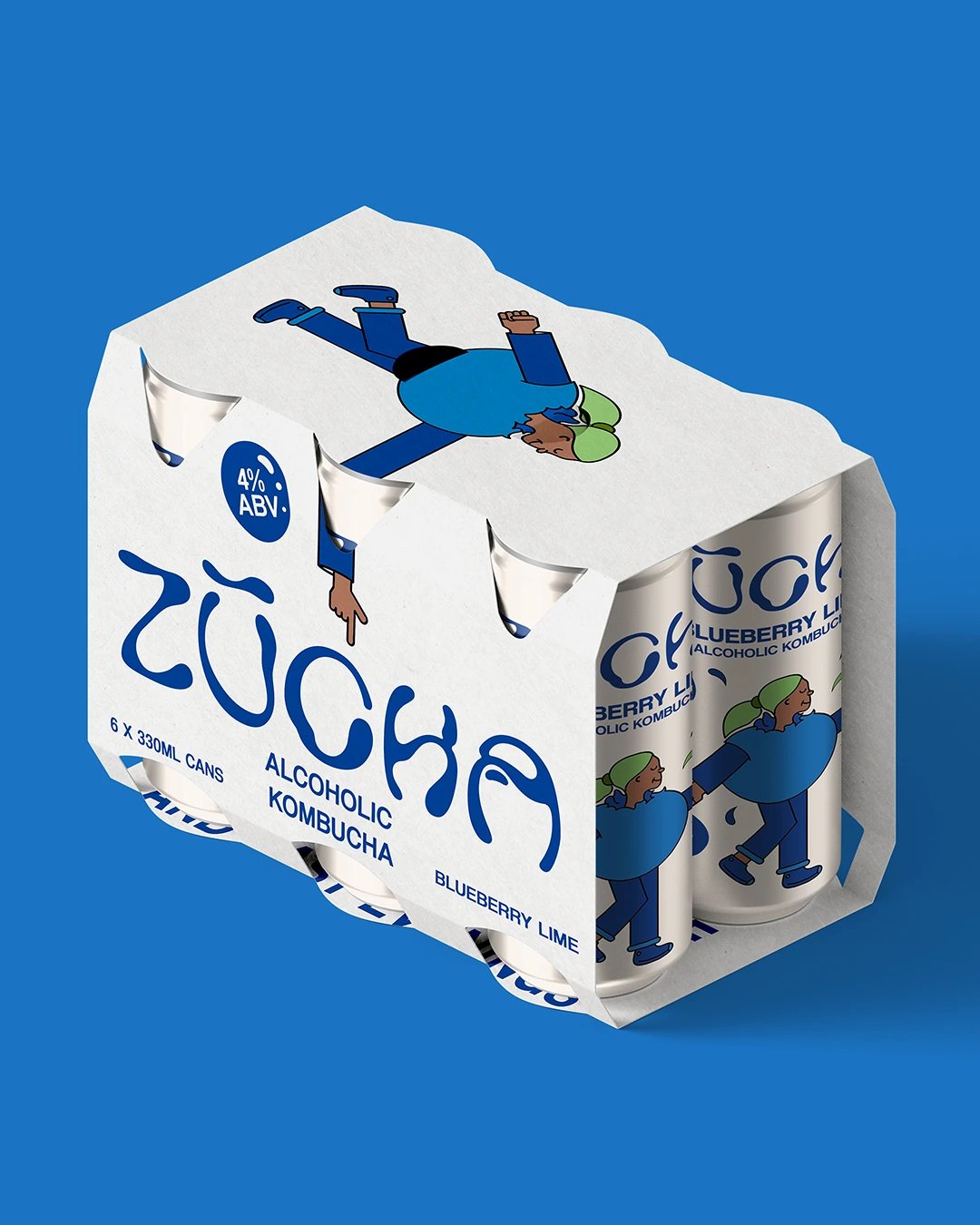
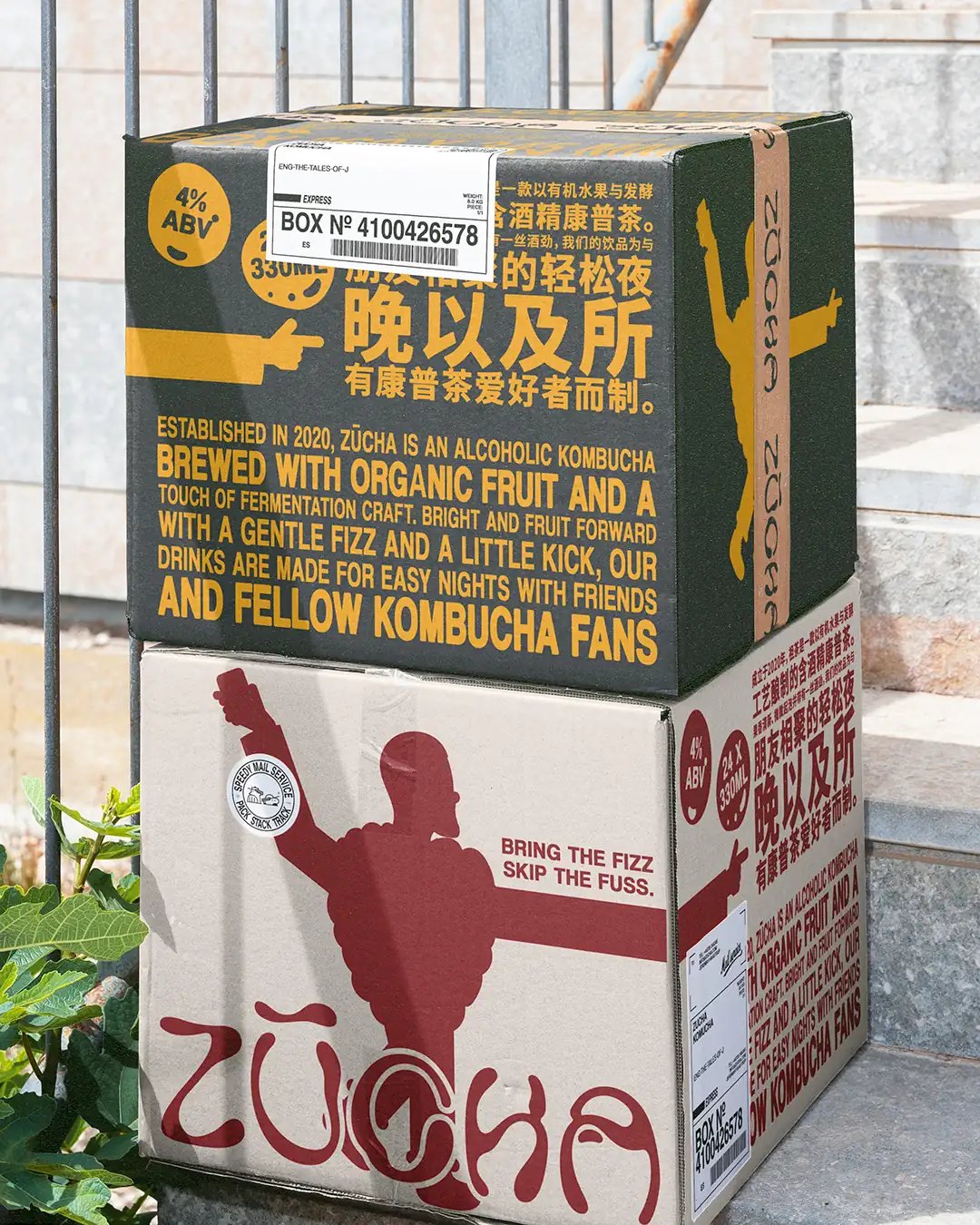
The packaging needed to introduce alcoholic kombucha clearly and give each flavour an immediate point of difference, while leaving enough space for bilingual information.
More info More info More info More info More info
Close
About ZŪCHA The category sits between fermented tea and ready-to-drink alcohol, so the can had to explain what the product was without becoming overly instructional. Proposed UK and China applications added another layer, with both writing systems needing enough room to remain legible.
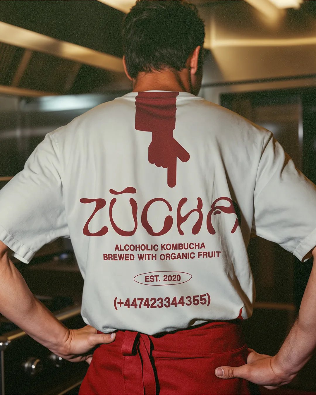
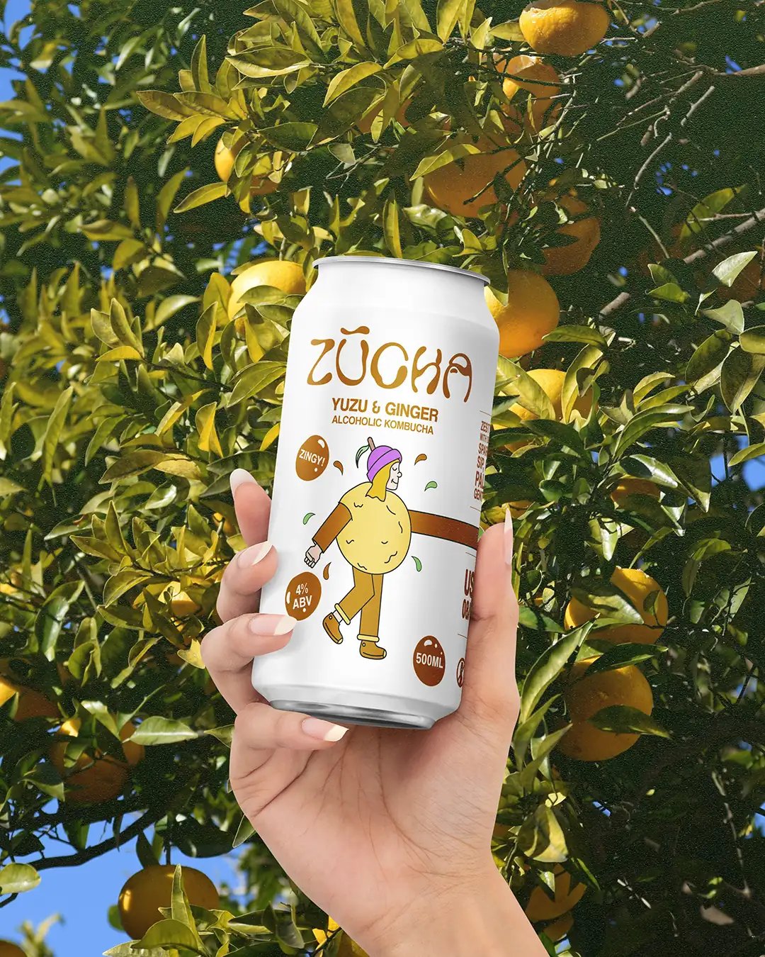
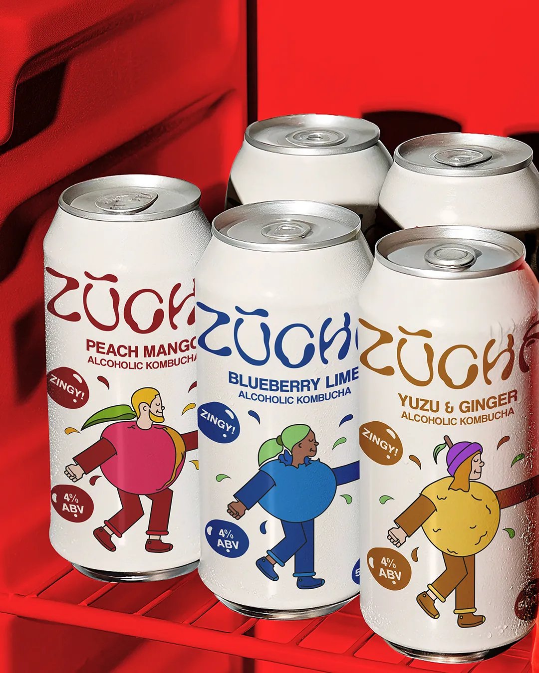
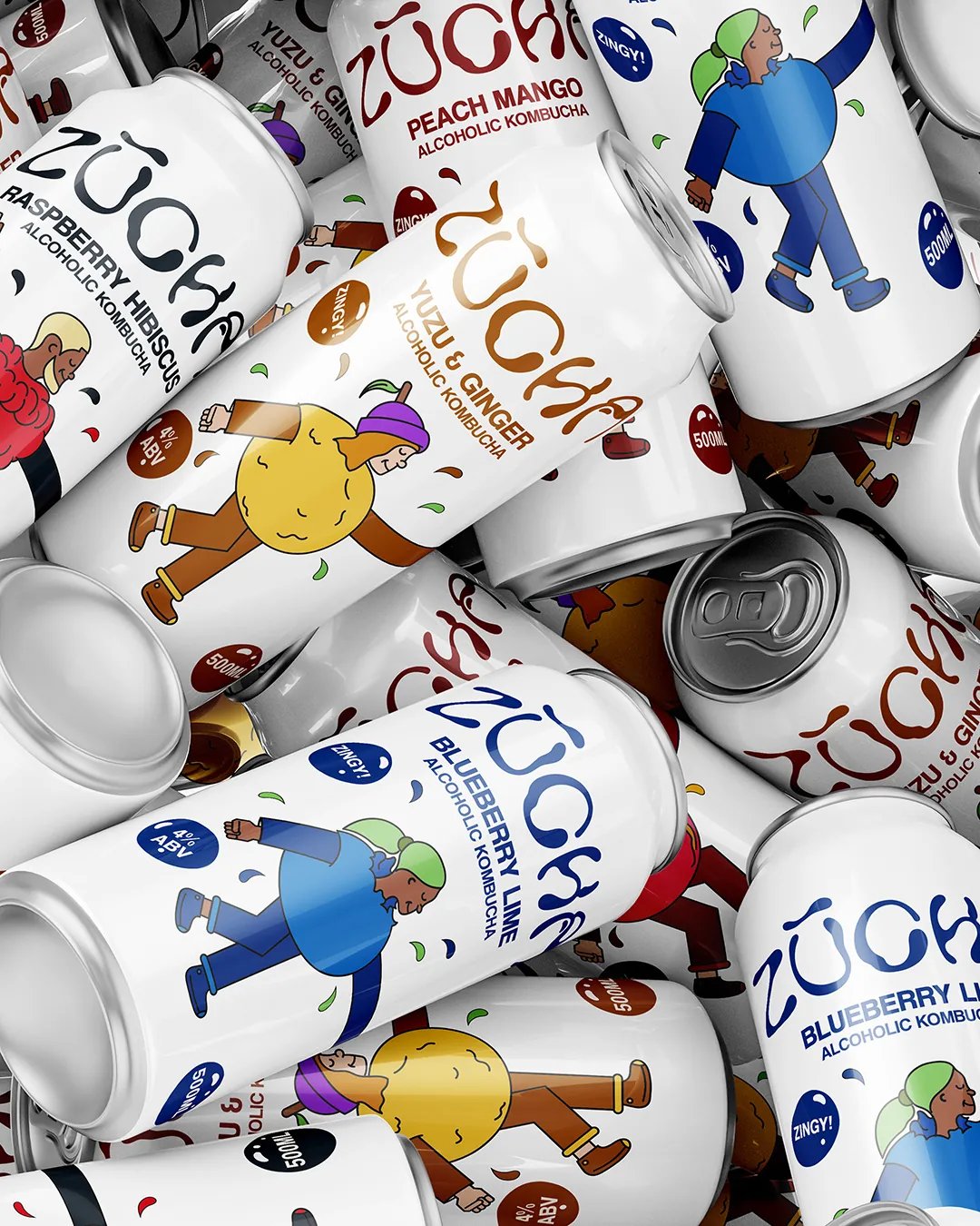
Fruit-shaped characters give each flavour a distinct face and use their pointing arms to direct attention towards key information. The white can keeps the layout open, leaving room for the bilingual structure. The English and Chinese wordmarks were explored together, including the proposed name 祖茶 (zǔ chá). The proposed Chinese naming remains subject to native-language validation.
The system gives each flavour its own character while keeping the range visually connected. The bilingual layouts also test how the identity could adapt across two markets without crowding the pack.
Braaands - Brand Of The Day Packaging Of The World - Honourable Feature